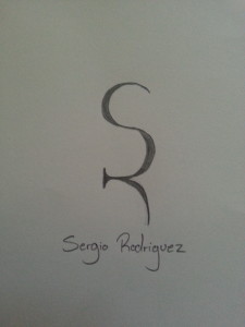
This is my personal logo drawn out. the R was supposed to be a reflection of the S but as i was drawing it i saw the R and decided to keep it like that. i really like how simple the design is and how it flows. hope you all like it too!
GRA 217 Section 5 Group 2
The official blog for GRA 217 with Sherri Taylor


I like the idea of this design. The “R” could use a little more work, but I’d be interested to see how it looks once it’s made in photoshop.
I think it is really clever how you formed the “R” out of the “S.” I like the simplicity of it as well. It is abstract, yet recognizable. I like the fluidity and the delicateness of the design as well. I would not change a thing. Very nice sketch!
Sorry to leave a third comment here, but I don’t see any others that have less than two.
I like how you keep it simple but effective. I really like how the ‘r’ is turned sideways to make the logo work. It has an elegant theme to it that I think adds to the overall simplicity that is making your design work. Good job.