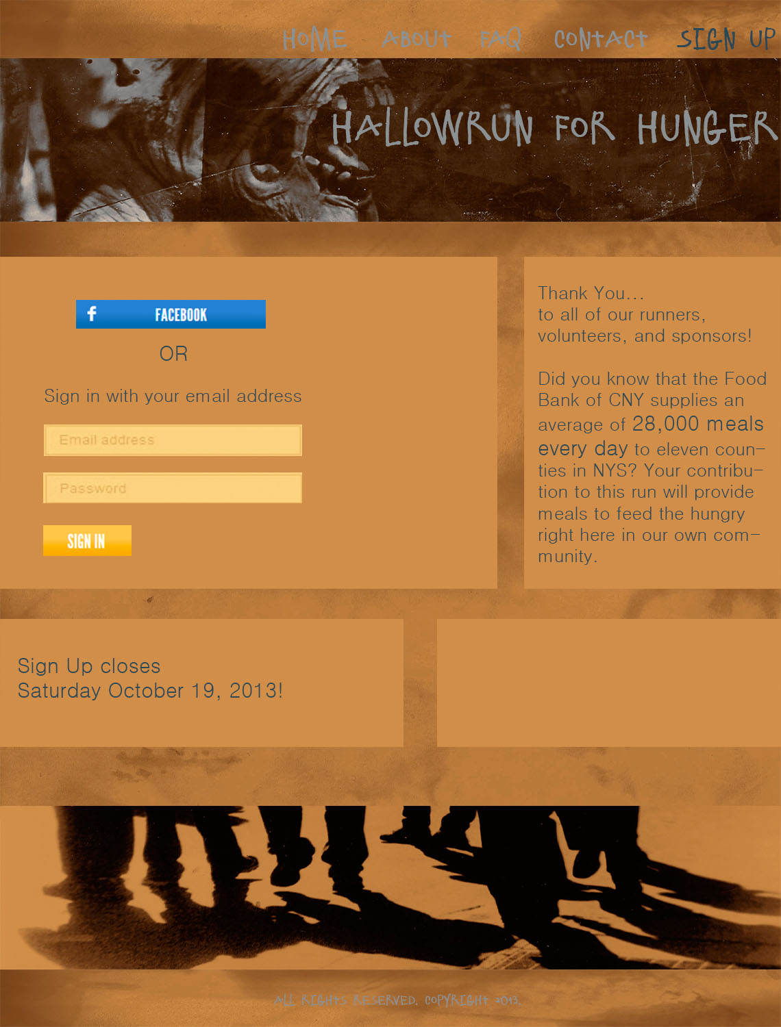
I really like how you used containers for your website. I also like the footer picture you used of the black feet, very cool close-up and gives the viewer a spooky feeling since it’s a Halloween event, yet also a run. The pictures you chose are definitely scary too, (lol).
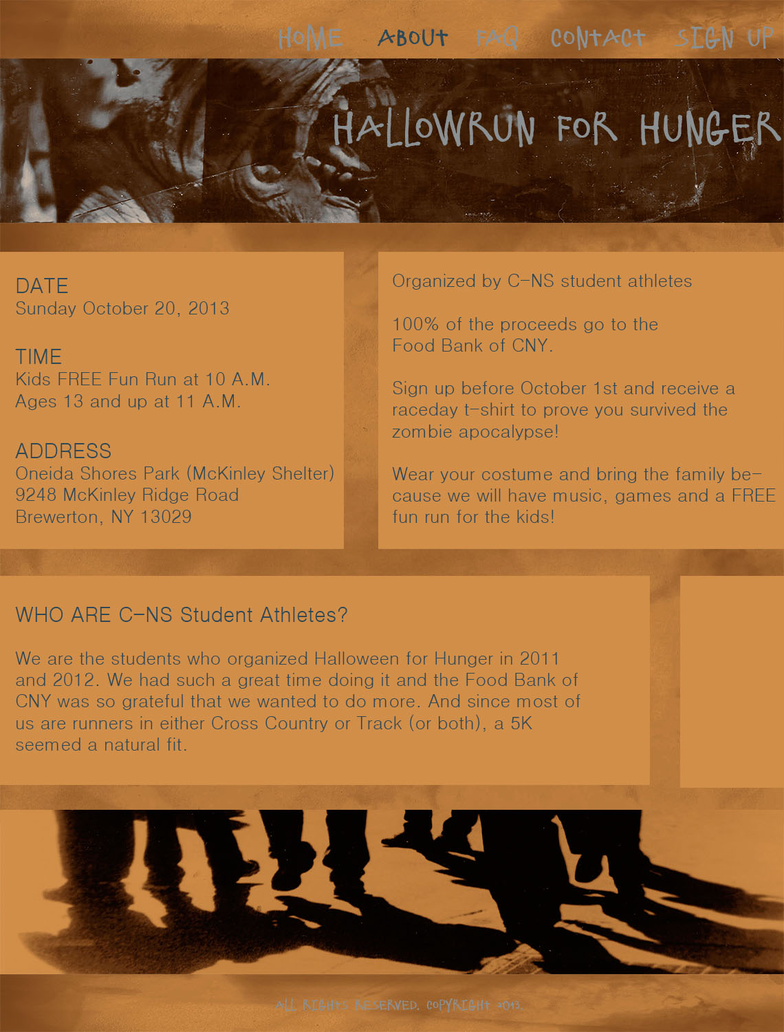
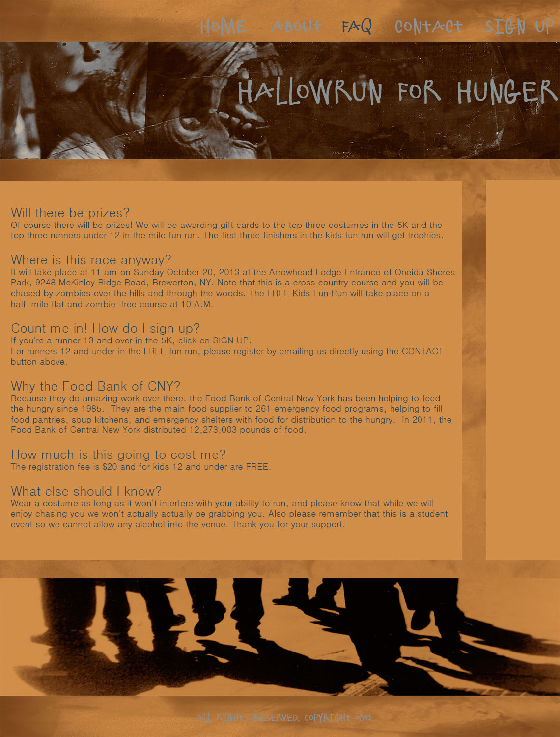
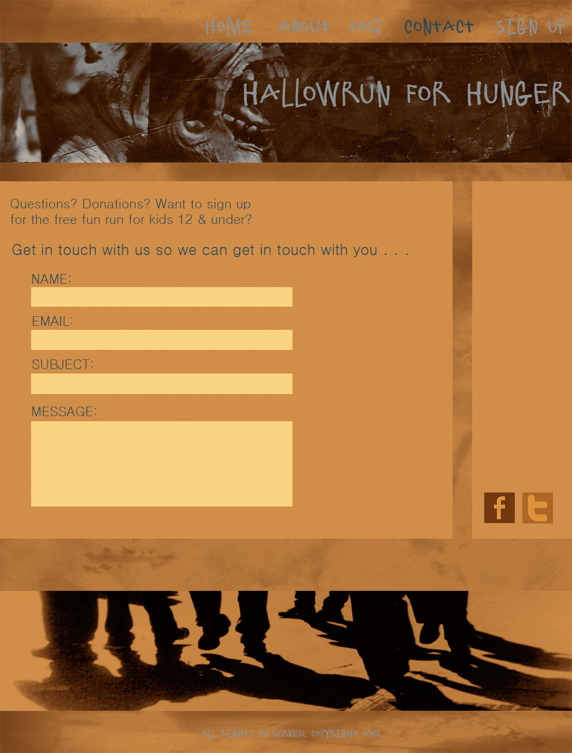
Bridget, this design is absolutely amazing. There is so much detail. Clearly, you put a lot of time and effort into this! First of all, I love the pun on the event name. What make it even better is that you have that monster going in to eat the first part of it. Secondly, the typeface you used for your navigation bar is so spooky and works very well with the rest of the piece. Additionally, I love the photos on the first page and the silhouettes of the legs at the bottom of each page. The only thing I would change is the type of the paragraphs on all the pages. I know it’s important to use simple typefaces in paragraphs so it’s easy to read, but maybe this one is a little too bland.
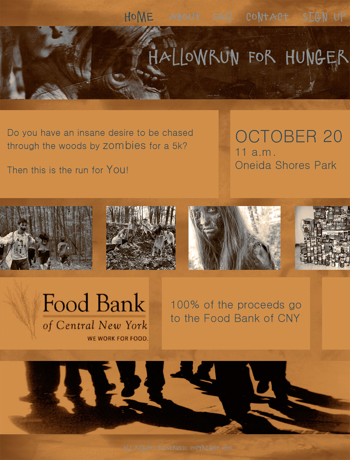

I really like how you used containers for your website. I also like the footer picture you used of the black feet, very cool close-up and gives the viewer a spooky feeling since it’s a Halloween event, yet also a run. The pictures you chose are definitely scary too, (lol).
Bridget, this design is absolutely amazing. There is so much detail. Clearly, you put a lot of time and effort into this! First of all, I love the pun on the event name. What make it even better is that you have that monster going in to eat the first part of it. Secondly, the typeface you used for your navigation bar is so spooky and works very well with the rest of the piece. Additionally, I love the photos on the first page and the silhouettes of the legs at the bottom of each page. The only thing I would change is the type of the paragraphs on all the pages. I know it’s important to use simple typefaces in paragraphs so it’s easy to read, but maybe this one is a little too bland.