Your website is fun yet very readable. You answered all the questions that I had about the event, and you answered them in a very concise way. I also really like the way you implemented the three colors (blue, gold, and white) throughout your website. Great job!
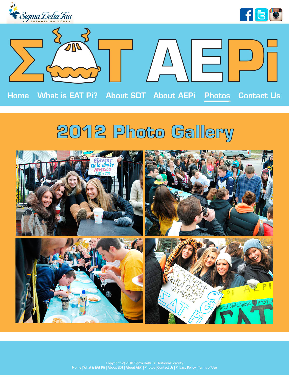
I really like the color scheme of your website. The light blue and yellow/orangeish color are complementary which are visually pleasing to the eye. Each page is very easy on the eye… there is not too much print and you utilize “white space” in an effective way. I also like the visual in the header… how you used the pie as an “A” and the sigma as an “E.”
I like the consistent color driven theme. I few improvements I might suggest is to add other factors to drive users further into the site like multiple options of media. You can get away with using smaller text on websites so you don’t have to sacrifice any of the content you already have. I really like how you put banners on the top and bottom and have a consistent modular flag across the top of each page. It gives a consistent and professional look and was a great way to incorporate the social media icons. Good job.

Your website is fun yet very readable. You answered all the questions that I had about the event, and you answered them in a very concise way. I also really like the way you implemented the three colors (blue, gold, and white) throughout your website. Great job!
I really like the color scheme of your website. The light blue and yellow/orangeish color are complementary which are visually pleasing to the eye. Each page is very easy on the eye… there is not too much print and you utilize “white space” in an effective way. I also like the visual in the header… how you used the pie as an “A” and the sigma as an “E.”
I like the consistent color driven theme. I few improvements I might suggest is to add other factors to drive users further into the site like multiple options of media. You can get away with using smaller text on websites so you don’t have to sacrifice any of the content you already have. I really like how you put banners on the top and bottom and have a consistent modular flag across the top of each page. It gives a consistent and professional look and was a great way to incorporate the social media icons. Good job.