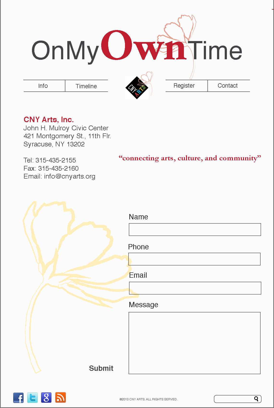
I think this is a clean layout. It’s very simple, but it uses the red very effectively to guide the reader up and down the page.
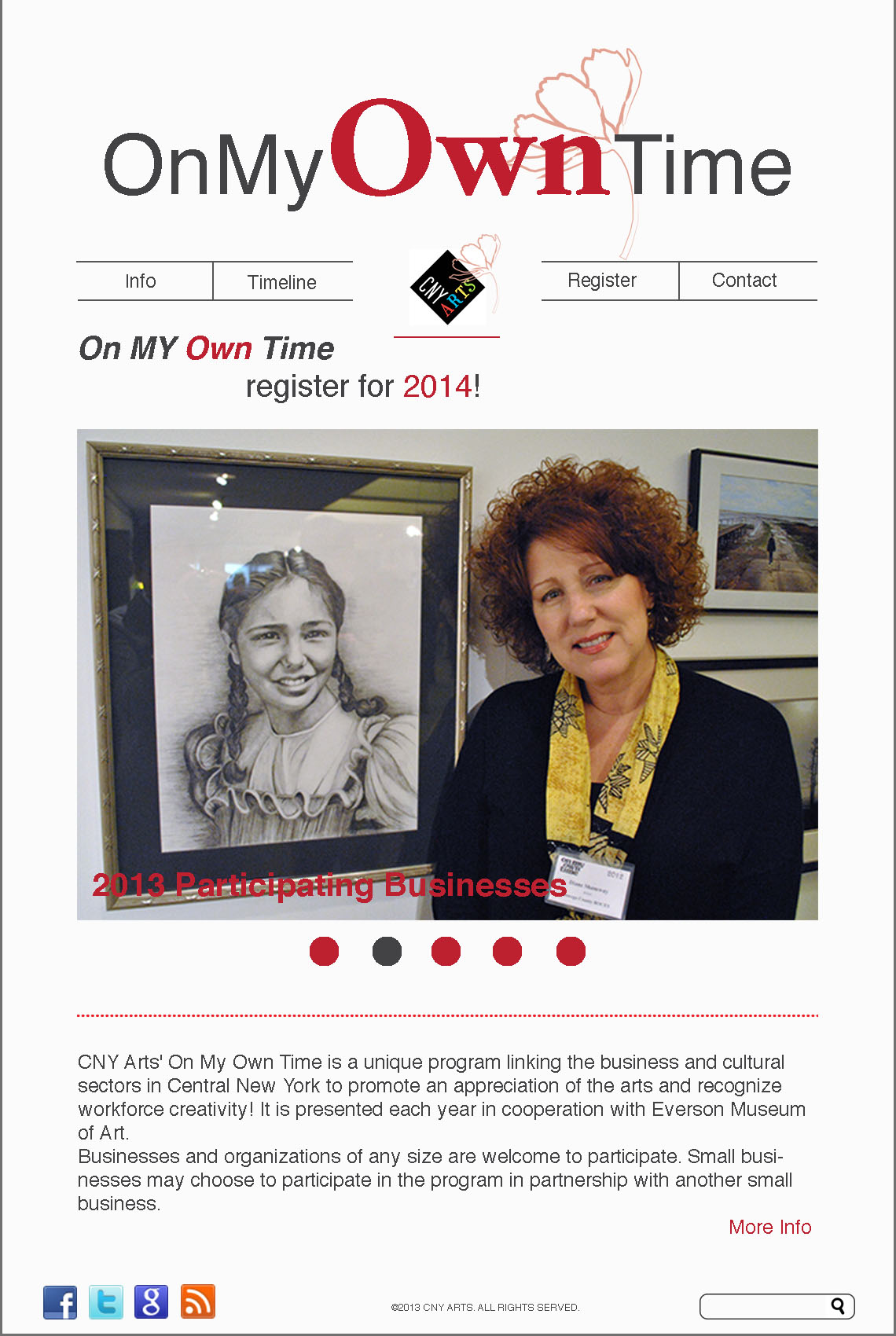
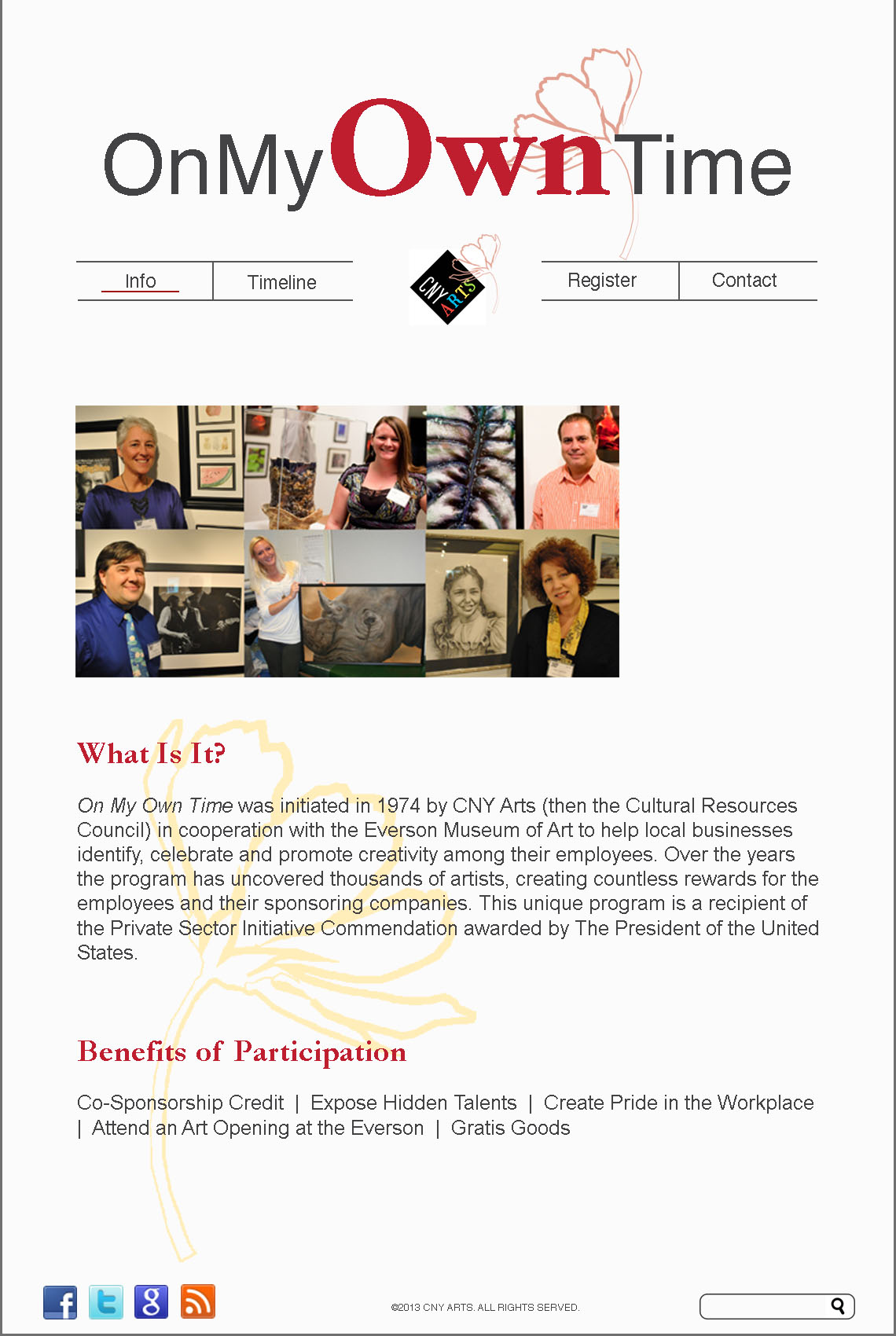
I think the picture on the second page could be pulled all the way across, to span the grid. The header for the webpage – your event name – is very effective in its use of red for the “Own” and that definitely draws the viewer’s attention to want to learn more about what this event is. I love your scrolling picture gallery – very clean. The yellow flower in the background adds a nice touch to the otherwise white background as well.

I think this is a clean layout. It’s very simple, but it uses the red very effectively to guide the reader up and down the page.
I think the picture on the second page could be pulled all the way across, to span the grid. The header for the webpage – your event name – is very effective in its use of red for the “Own” and that definitely draws the viewer’s attention to want to learn more about what this event is. I love your scrolling picture gallery – very clean. The yellow flower in the background adds a nice touch to the otherwise white background as well.