
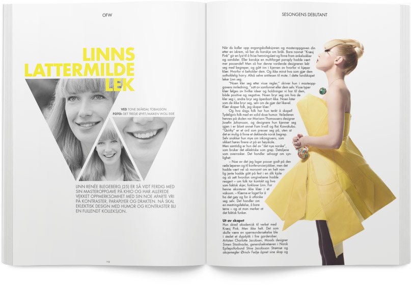
I think this design is perfect. The color of the title and the girl’s dress are consistent, which works very well. This color scheme–yellow, grey and black–is bright and comfortable. Also, the visuals on the left page are triangles shape, while the dress of the girl is designed as the similar shape as those visuals. On the right, the words and the visual combine together creatively. The girl’s eyes lead readers to the beginning of the paragraph. Overall, this design is smartly, using similarity skill.