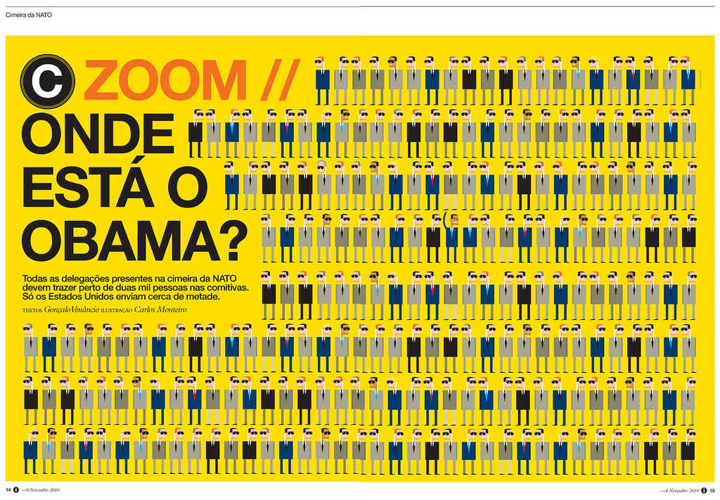
 This Portuguese news magazine, i jornal, is consistently one of the most well designed news magazines in the world. Even their website can be placed among the top tiers in web design. However, at a more fundamental level, this individual spread stands out because of the simplicity, repetition, and the visual connecting with the words. Even if you can’t read Portuguese (I sure can’t) the article is about Obama and his place among other political leaders. This can be seen in the quirky-yet-simple portrayals of the individuals and the contrast of Obama’s arm raised. The yellow background also draws the eye in to see what the fuss is about.
GRA 217 Section 5 Group 2
The official blog for GRA 217 with Sherri Taylor
