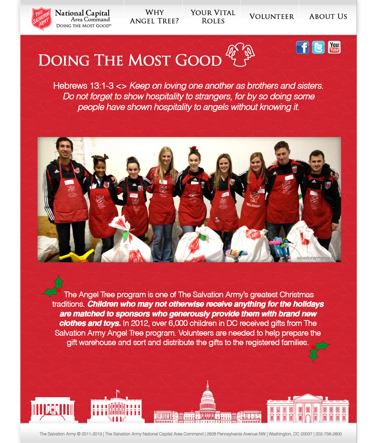
I love the color scheme of this layout. It attracts the eye and conveys a seasonal mood.
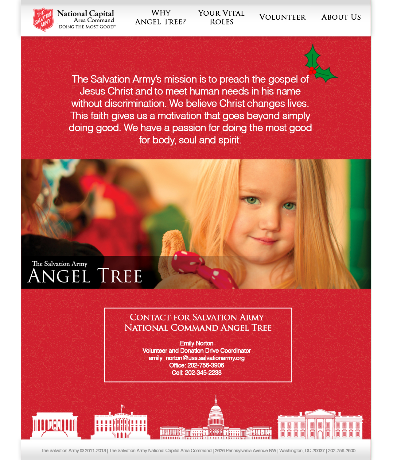
I love your last page, with the large picture of the girl – definitely celebrates the meaning and mission of the organization and this event. The text is short and simple, which adds to the effect of the red and the meaning of Christmas/being festive and giving during this time of year. You focused on the vital parts of this event and this website works towards your goal. Love the red.
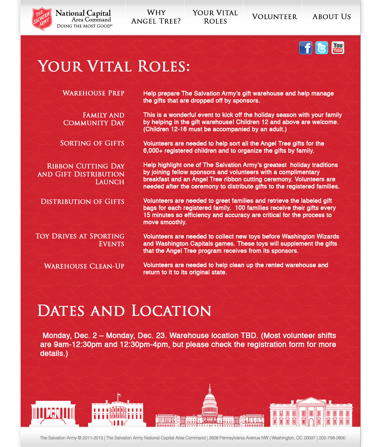
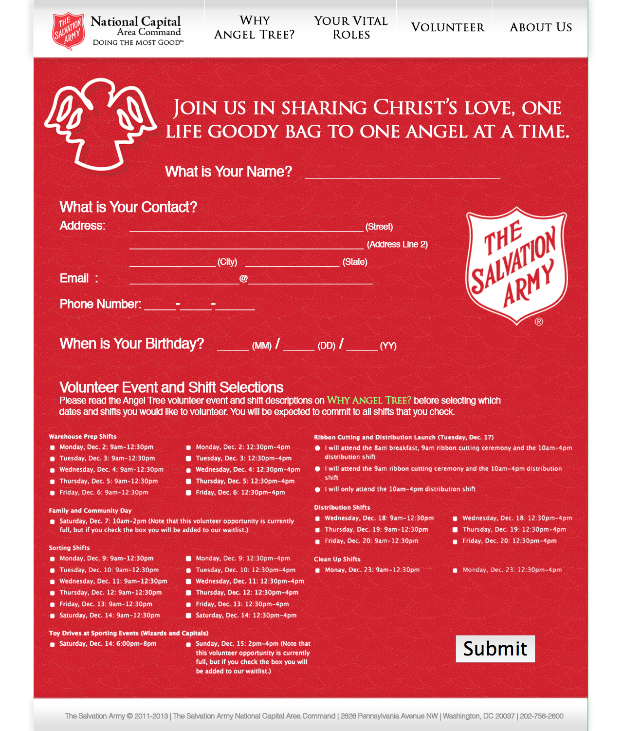
I like the famous buildings of the DC area and how they spice up the footer. The red color of the background does a good job of conveying your event and also contrasts with the text to increase legibility.


I love the color scheme of this layout. It attracts the eye and conveys a seasonal mood.
I love your last page, with the large picture of the girl – definitely celebrates the meaning and mission of the organization and this event. The text is short and simple, which adds to the effect of the red and the meaning of Christmas/being festive and giving during this time of year. You focused on the vital parts of this event and this website works towards your goal. Love the red.
I like the famous buildings of the DC area and how they spice up the footer. The red color of the background does a good job of conveying your event and also contrasts with the text to increase legibility.