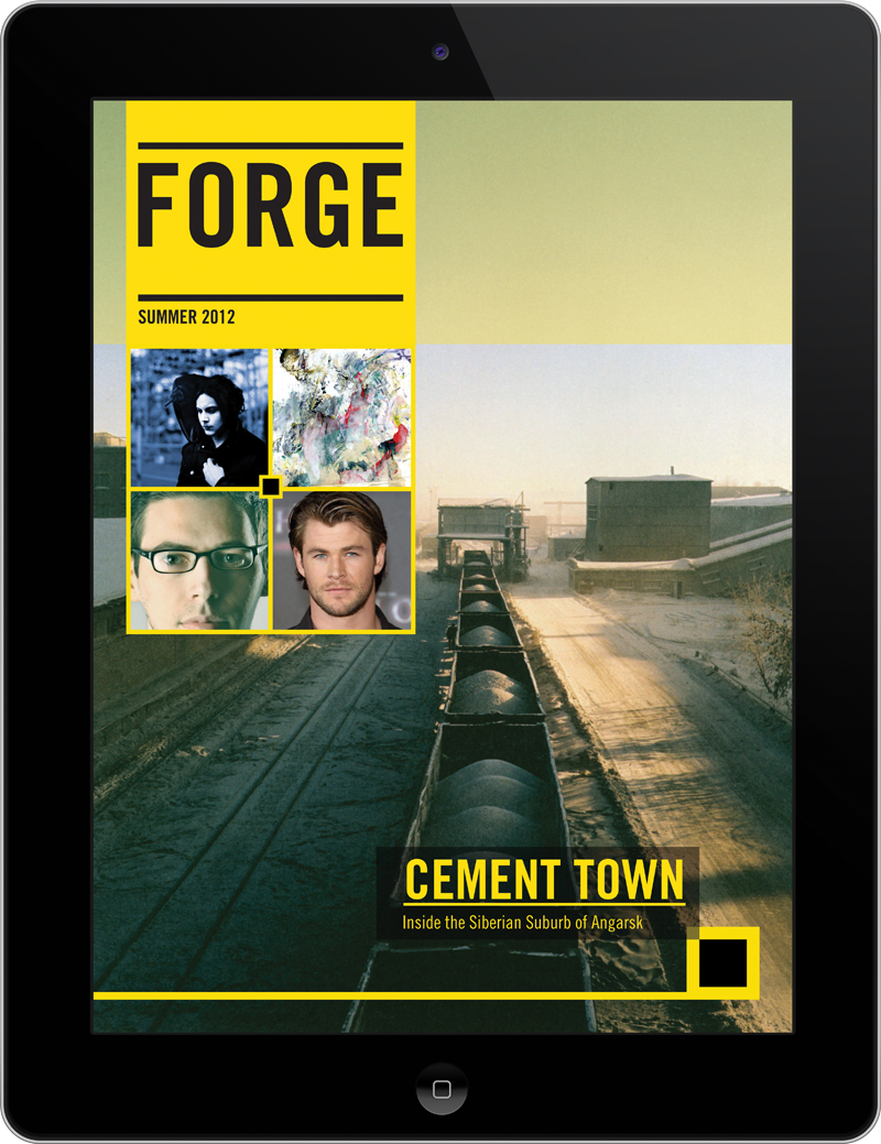
 This cover differentiates itself from other Ipad covers by minimalizing text. Instead of having cover lines, there are photos that I presume can be tapped on to reach the story. Also, the cover makes use of only two primary colors. The combination of black and yellow allows for a sense of illumination, especially when used in text. The photo on the cover has a good amount of perspective, driven by the train cars that get smaller as one looks further back. Often times covers forget that having only a little bit of content on the cover can be good. Covers are often crowded and lack a sense of visual hierarchy.