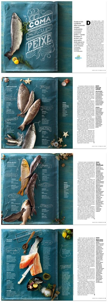
I like this layout especially because of its creativity and originality of using a fabric instead of regular table to display the fish. I also love their use of color, orange, blue (turquois), yellow, and green seems to be complementary and supplementary to each other.
GRA 217 Section 5 Group 2
The official blog for GRA 217 with Sherri Taylor


I like the layout you posted because because of the consistency and how it breaks the middle of the center fold. The different still life’s and information nuggets that are on top of the blue gives a lot for the eye to bounce around and keep on the page.