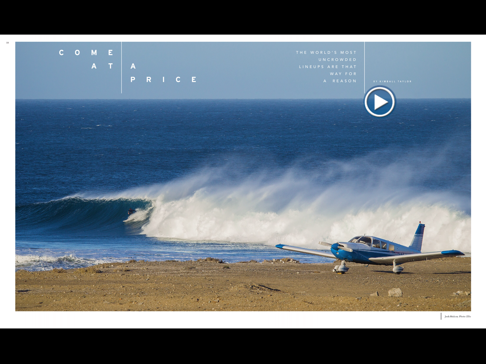
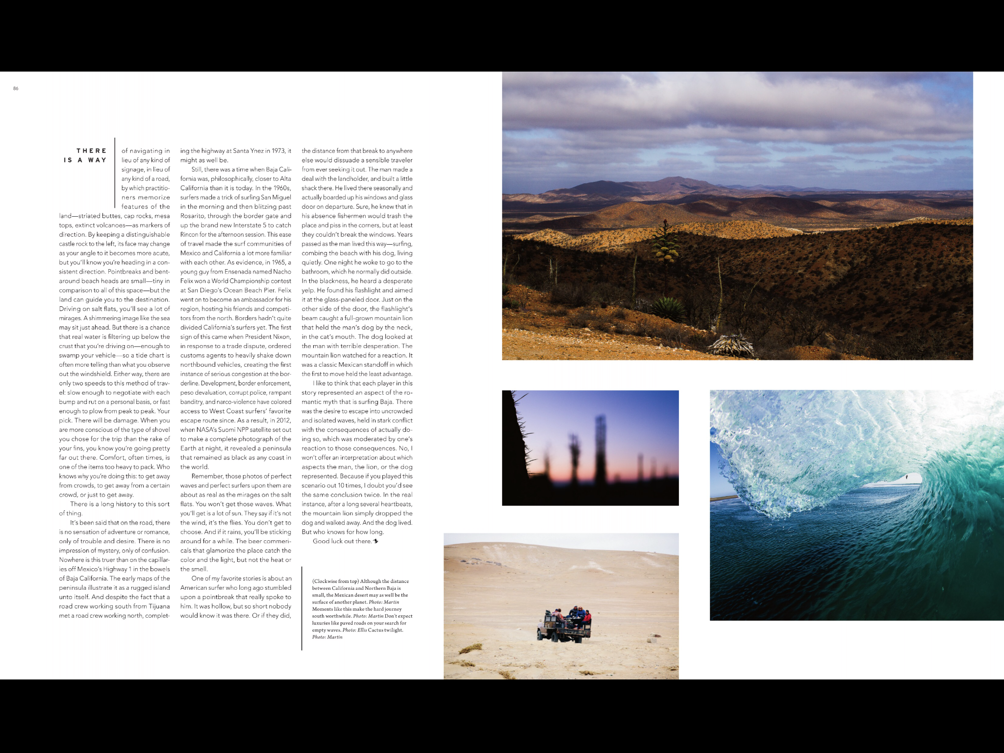
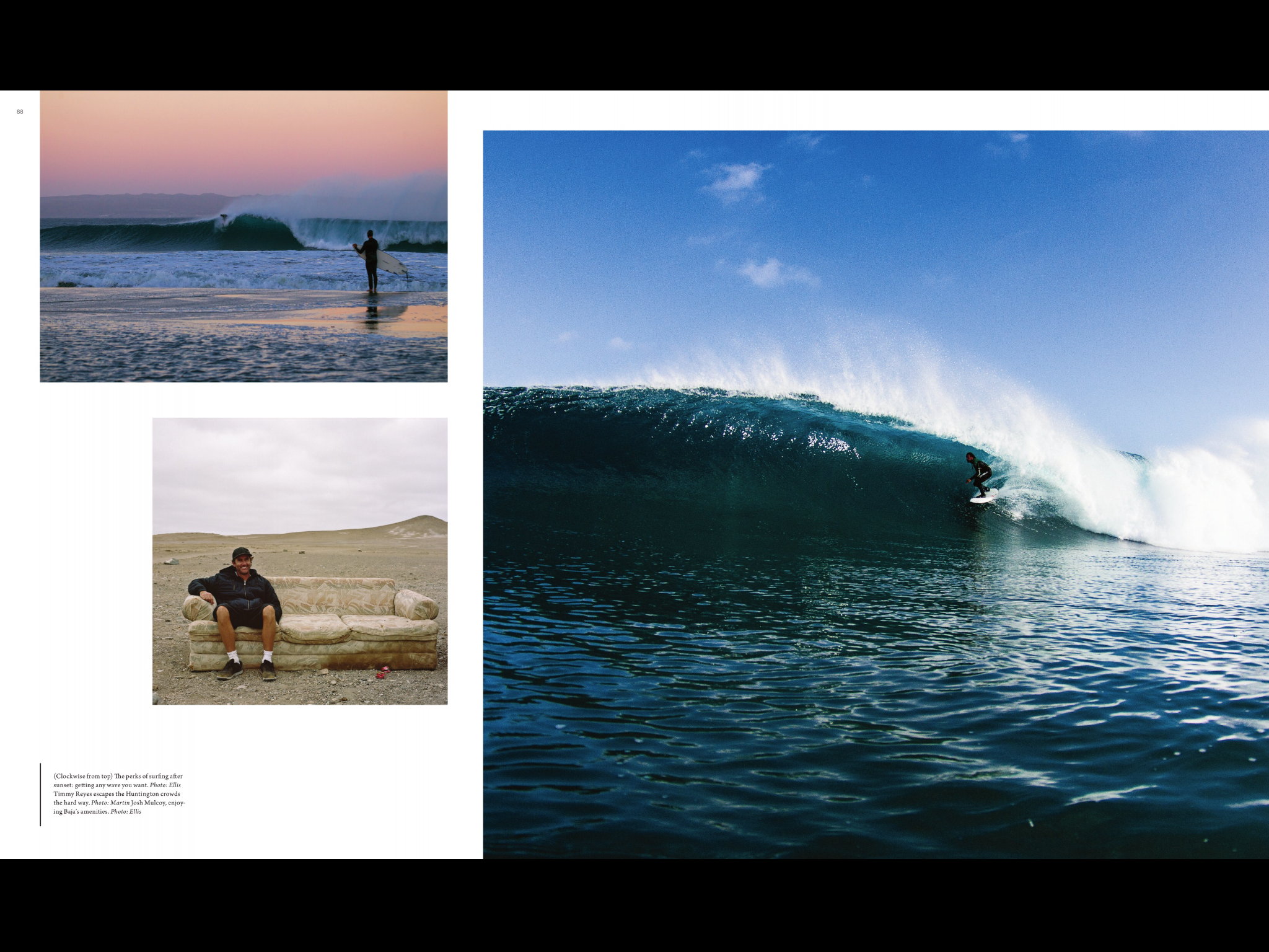
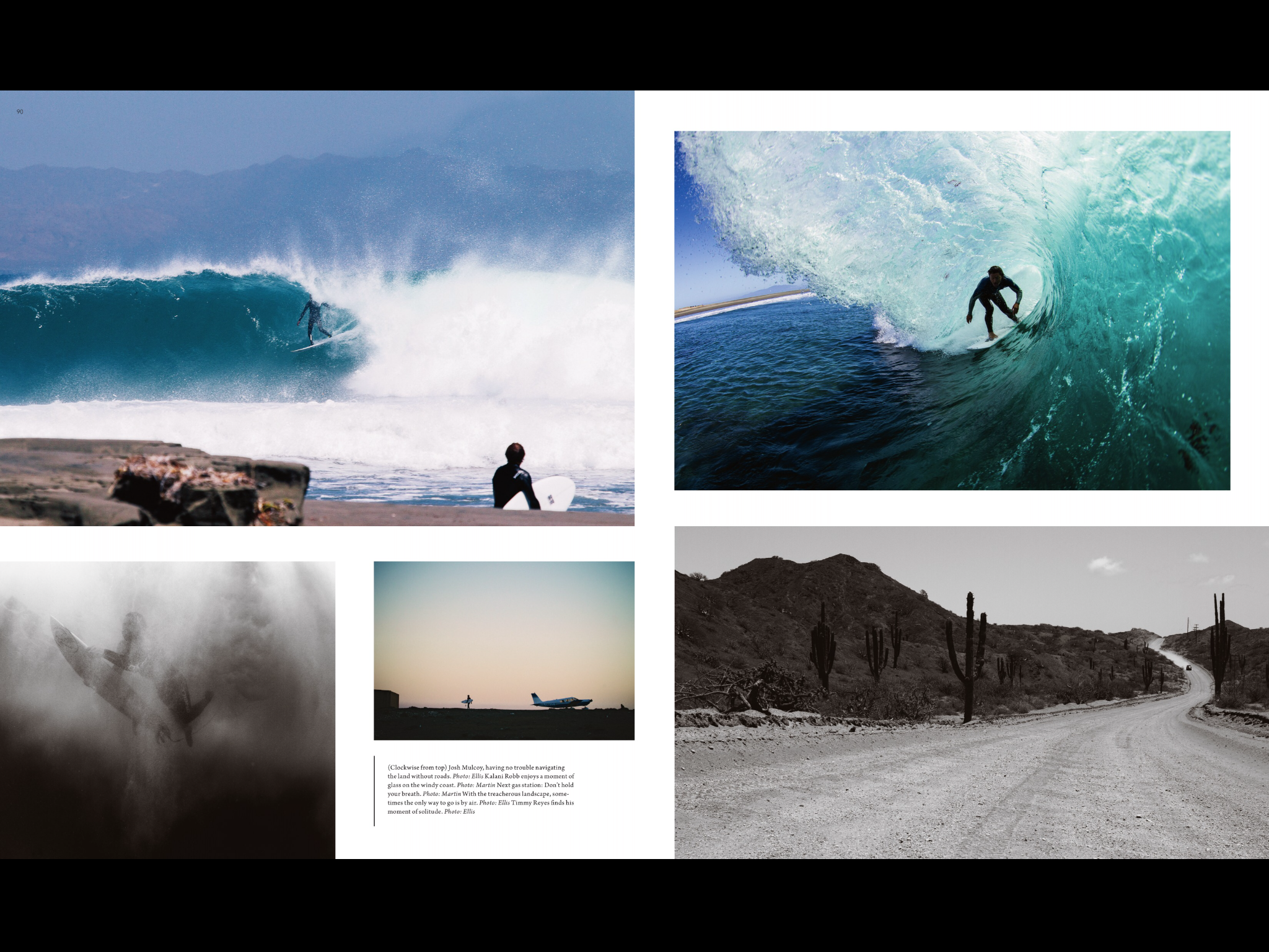
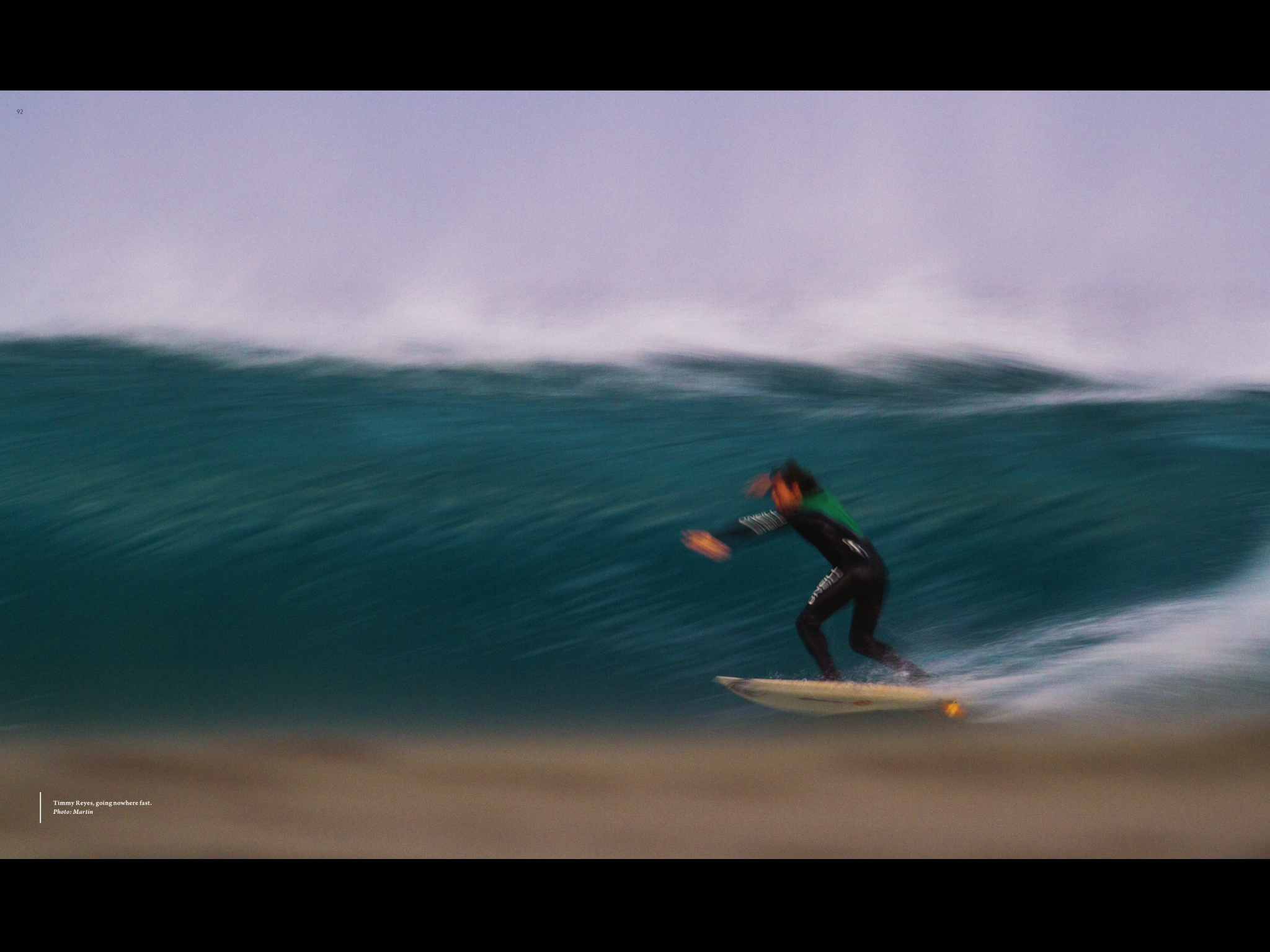
 This is an article from Surfer Magazine. I really like this magazines layout because it uses so many pictures to tell the story and it breaks all kinds of rules for magazine layout. Like the center fold is not consistent and so pulls your eye from one page to the next. I also like that they normally put a sweet double truck photo in most of there articles. I also really like the use of color, there’s always a consistent with creating a theme and a feel to each article.
GRA 217 Section 5 Group 2
The official blog for GRA 217 with Sherri Taylor
