
iPad Magazine Cover: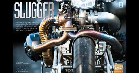
Print Magazine Cover: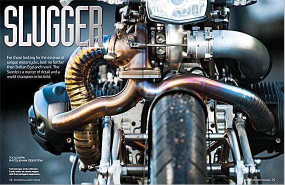
Unfortunately, this magazine cover only had a horizontal layout. I like it a lot though, especially because it resembles what I want my iPad designs to look like. The way the motorcycle bleeds off the top and bottom of the design really gives way to the engine and the pipes. The typography is well-chosen as well because it is sleek and silver; similar to the pipes of the motorcycle. The biggest difference between the digital cover and the print cover is that the type in the digital cover is larger. In addition, the image in the print cover appears to larger than the image in the digital cover.
I love this magazine cover in both print and on the iPad. I like how powerful the picture is and how clean the text is on the cover. I am actually more partial to the iPad because I feel it is just as clean as the print, but has more information due to the interactivity (for example the pull tab for text). It is a very intriguing and visually pleasing cover.
To me, the print seems to be clearer to read, where the white letters stand out better. But, similar to the National Geographic cover, there aren’t may headlines boggling the reader down, rather the headlines feature big stories and keep the reader focused on the front image.
The image is definitely very powerful indeed. i like how there isn’t that much of a difference between the print and the iPad version.