
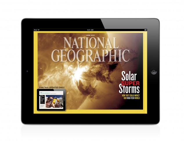
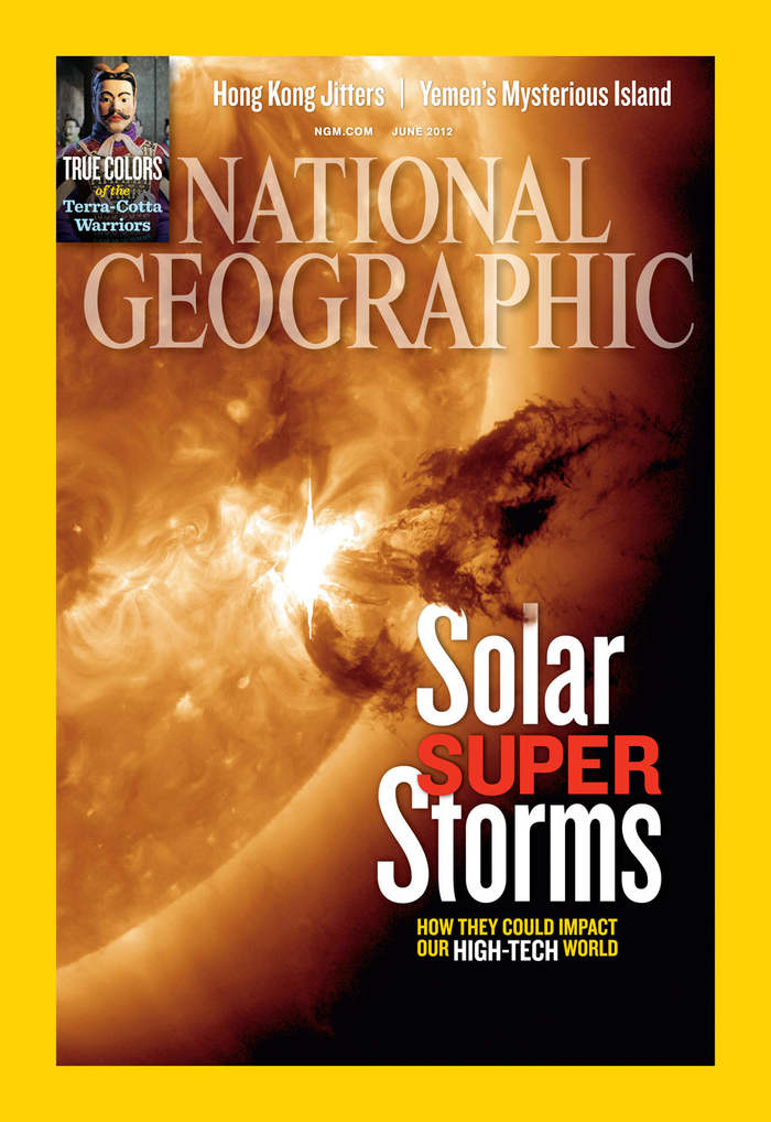
I couldn’t find the vertical version of the iPad design cover, but I did find the print version. I really like the design because the picture is extremely powerful, and the nameplate is cool because it’s opacity is not 100%. There are slight differences between the iPad design and the print. For example the size of the typeface is bigger in print, and the spacing and cropping of the picture is slightly different due to the vertical and horizontal spaces used. I really like how the burst of the solar storm leads to the headline of the article, and I like the leading done on the headline as well. Overall, I really like the cover design done on this National Geographic issue.
Peggy, I really like this a lot also. National Geographic always seems to have very powerful covers and images in general. When I initially looked at these images, the first thing that I saw was the solar storm. With that in mind, I also noticed what you said about the solar storm leading to the headline. I think that is very creative!
I like that National Geographic does not have many headlines on their cover page, rather one or two major stories are revealed on the cover. The covers looks so clean and organized this way. I agree with you on the font used, the iPad print seems smaller than the printed version. But overall, both versions are similar, and attractive too.
I like this magazine cover for various reasons. I especially like the vertical design because I think it speaks with greater audacity visually of what the object is. However, I do like the horizontal design as well because the close-up feel gives more detailed look.