
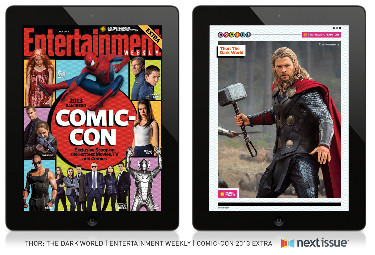
There are slight differences on the iPad magazine cover and the actual magazine cover, like the orange circle that says “Go to ew.com/digitalissue to read on your tablet!” because obviously, you would not need that if you are reading the magazine on an iPad. Everything else, however is the same, just scaled down for the size of the iPad. Stylistically, the red circle matching Entertainment was a bold move, and is smarter than using one of the other square colors as the color of the nameplate. The cut outs of the characters of each movie and show with the different color background adds to the effect of the “comic” portion of Comic Con, as it started as a comic convention.
Courtney, I really like these designs. They are almost identical with minor differences. I love how the magazine title and circle surrounding the headline are red; it makes them pop out. I also like the different colors that are within the entire design. It makes it very interesting!
I like both print and iPad design. It really goes well with the theme and I love the use of bold colors. The typography seems to be one borrowed from actual comic book or the one of similar but in any means, it is great.