
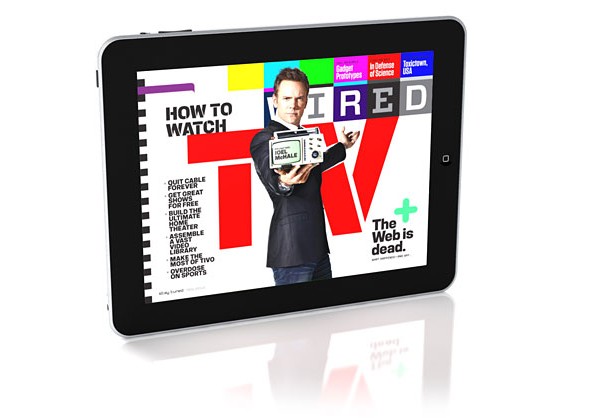
I chose WIRED magazine’s iPad cover. I could not find the vertical version of this photo. The reason I chose this layout is because of its cleverness of the horizontal iPad and layout. The theme of this feature is TV, and the immediate value of association that comes with it is horizontal, rectangular TV. I love how the headlines are unified into one typography that has style that reminds one of technology, IT, and innovation.
I agree, I find the layout very clever with the patches of color at the top representing a tv. I like how the space is used to make the elements pop without being too overwhelming. The interactivity on the patches of the color at the top is very interesting as well. Overall, this design is very innovative and fun.
I think this cover is consistent with WIRED’s style. There’s ten different colors on the page, but it’s not distracting. I immediately associate the colors with the old “test patterns” I used to see on TV growing up. Very clever.