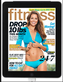
I could not find the horizontal image of this magazine on the iPad.
I like the iPad version better because the colors seem brighter. However, the layout of the images and words are identical in both versions. Even though the text seems clear and easier to read in the print version, I still prefer the iPad colors and overall appearance. The only thing I am not too fond of with this magazine is the multiple headlines all over the cover, I think they distract from the big image on the cover. And there are too many article titles to follow, overall just distracting the reader. Maybe for the iPad version the multiple headlines are safer because they hyperlink to the article but for the print magazine, I think they aren’t as valuable.


The photo is used very smartly. I like the bright blue swimming suit on the cover. It will definitely catch my eye either I’m browsing the ipad newstand or standing in front of an actual newstand. Also the model positions herself very well, lending both dimensionality and energy. But somehow the cover lines appear a bit busy to me, especially the highlighted lines and “24-7” at the bottom.
I think that most magazines struggle when translating their cover to Ipad format. This resembles the traditional layout of a print magazine, which can be both good and bad. Though the layout is familiar, there is little innovation with regards to utilizing interactivity. Ipads allow for more allotted space for content with regards to more pages. Not to mention, Ipads are subscription based, meaning there should be less emphasis on crowding a cover page with cover lines to entice potential readers.