
I learned that you cannot do any project with a subject that you do not like or are not interested in. Therefore, you’re welcome for Chris Evans, aka Captain America. Secondly, I learned that InDesign is irritating and doesn’t like to hyperlink properly. Third, I learned how to use a tiny box to keep my pull tab in place. Go me – or go whoever did the tutorial that showed me how to do it.
Courtney, this design is awesome. All 8 of your pages look great, but the horizontal designs are my favorite. For one, the nameplate on the horizontal is much easier to read than the nameplate on the vertical because Chris Evans is blocking most of the title on the vertical, but not on the horizontal. I also think the jump page is easier to read on the horizontal than on the vertical because the columns are shorter. Good job!
Great choice in subject. On a design note, you did a really great job. The pictures were interesting and your layout was phenomenal. You placed your headlines, deks, and text in appropriate place. Your use of color was consistent and made sense. It looks like a professional made this layout. Great job!
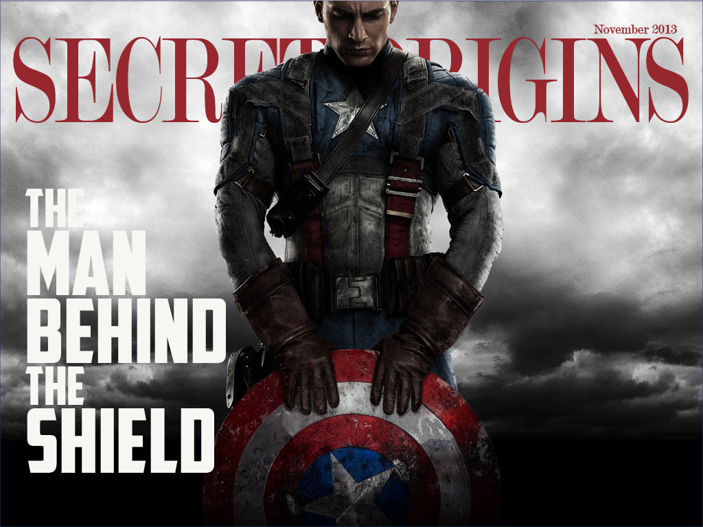
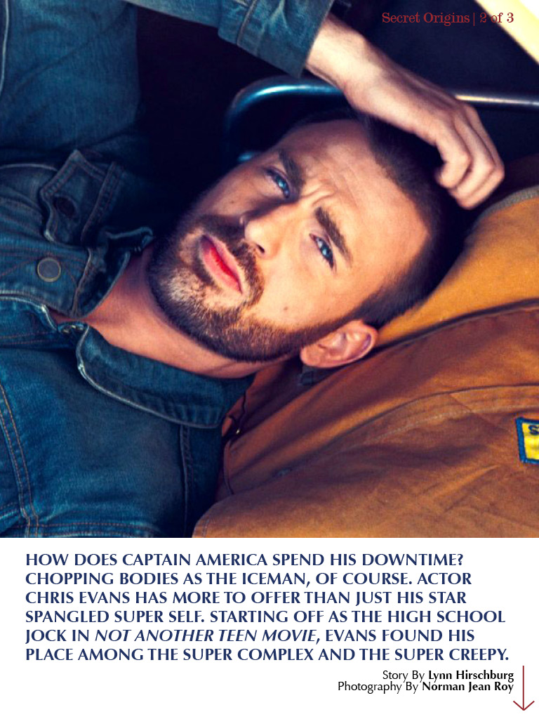
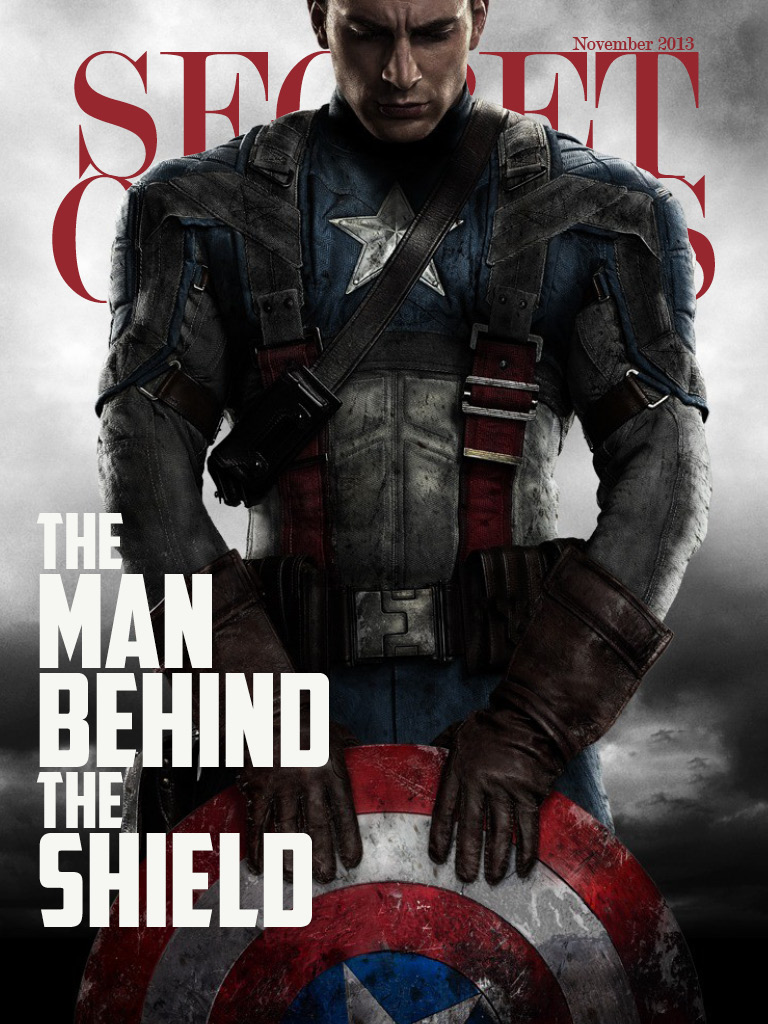
I really love your choice of photos. The amazing resolution and stunning detail really makes your magazine pages jump out to life! I also love the way you designed your coverpage by cropping Captain America in front of the type so that it will stand out!! love it.