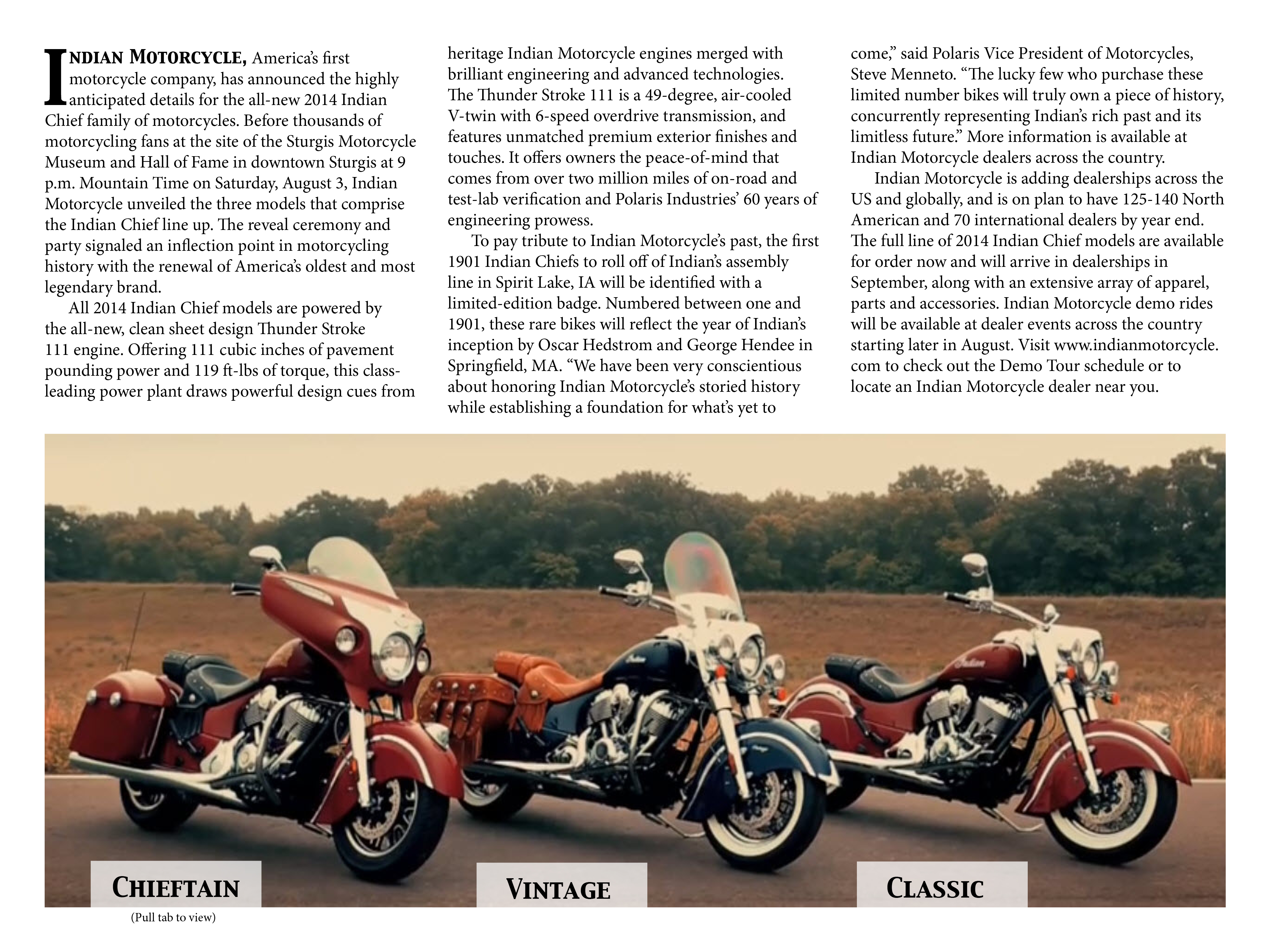
This was definitely my favorite project of the semester. I learned a lot, but one thing in particular that I learned from this project was how to do pull-tabs. It is very useful to know, and it is very cool to see how it is done in real life.

This was definitely my favorite project of the semester. I learned a lot, but one thing in particular that I learned from this project was how to do pull-tabs. It is very useful to know, and it is very cool to see how it is done in real life.
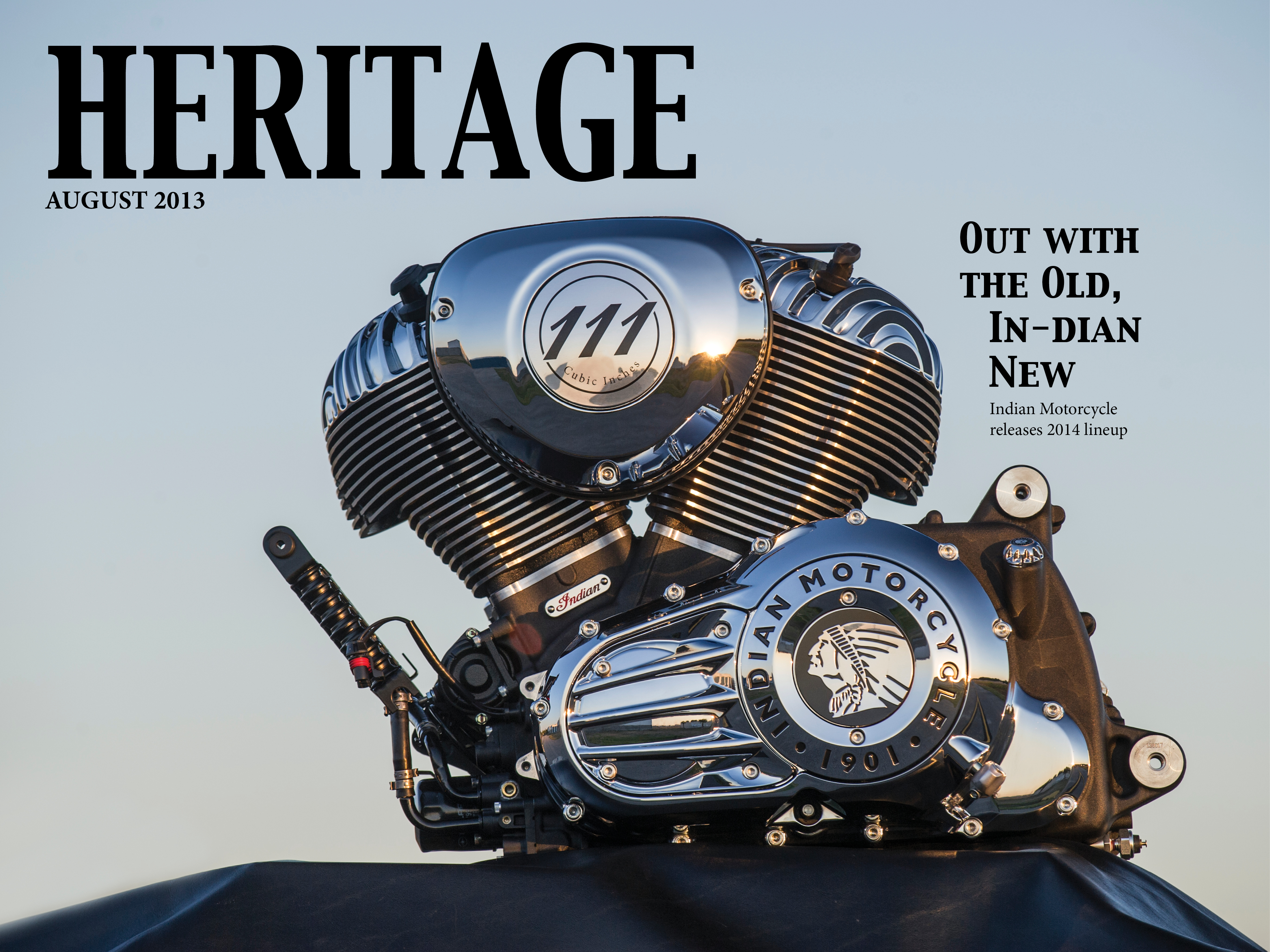
I really like your magazine design. It is very professional looking. I think the subject matter is very unique and interesting as well. The font on your cover is very nice and fits with your image. Your cover line is very clever! I love “out with old, in-dian new.” I like the color palette in all the photographs you chose. All the images you chose are very strong. Your interactivity (although I can’t see it) is a good idea also. Overall, you have a very clever and beautiful magazine design. Great work!
Dena, I love your tablet design. The pull tabs at the bottom of your jump page are really cool and I love that you reduced the opacity of the tab so that we can still see the image. I also really love where you placed your headline and deck on the opening page. On the cover page I think you did a great job of choosing a picture and fitting the nameplate and story headline in the appropriate space. Great job!
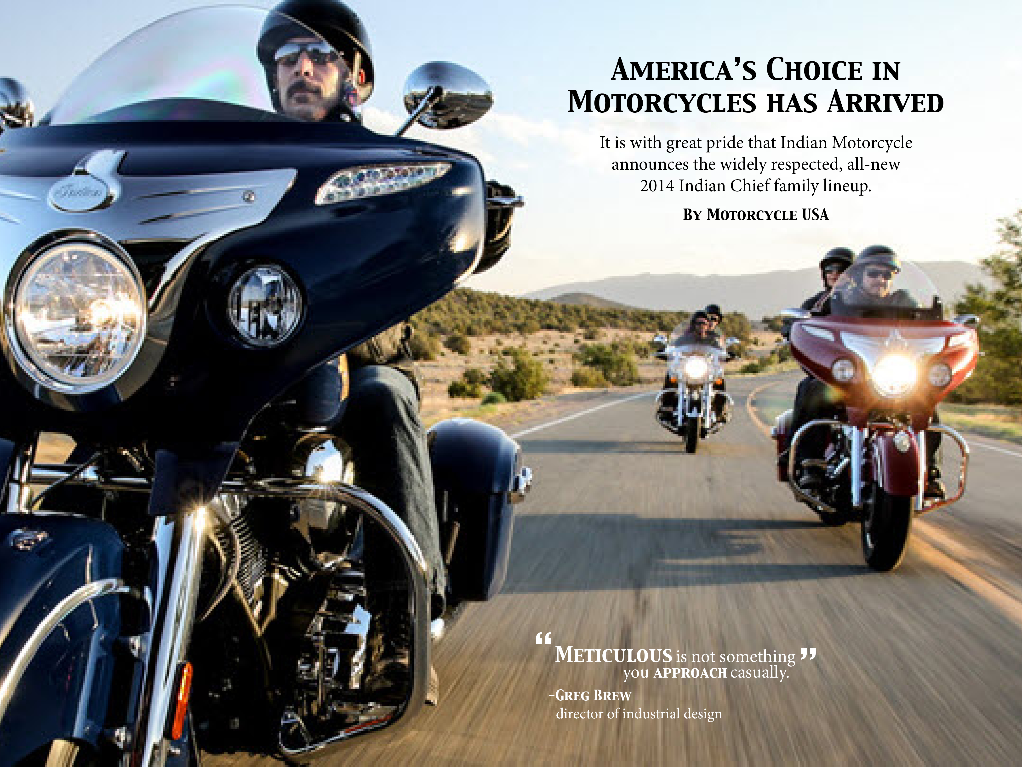
Great job on this project. First of all, I really love the color scheme of the photos that seem to stay consistent and unifies the magazine into one. I really love your choice of high-resolution photos, especially the one for the second page, which seems to jump out of the page. Furthermore, I like your layout for the jumpage. The vertical body and horizontal photo really attracts the readers.