In this project I learned how to create interactivity, which was really cool (when it worked).
2 thoughts on “Zac Efron Tablet”
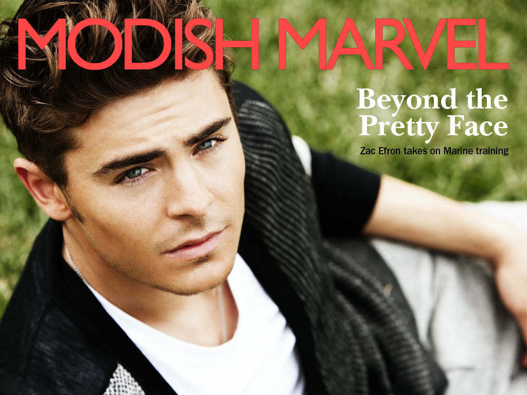
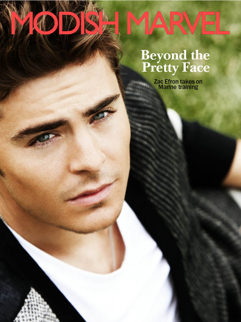
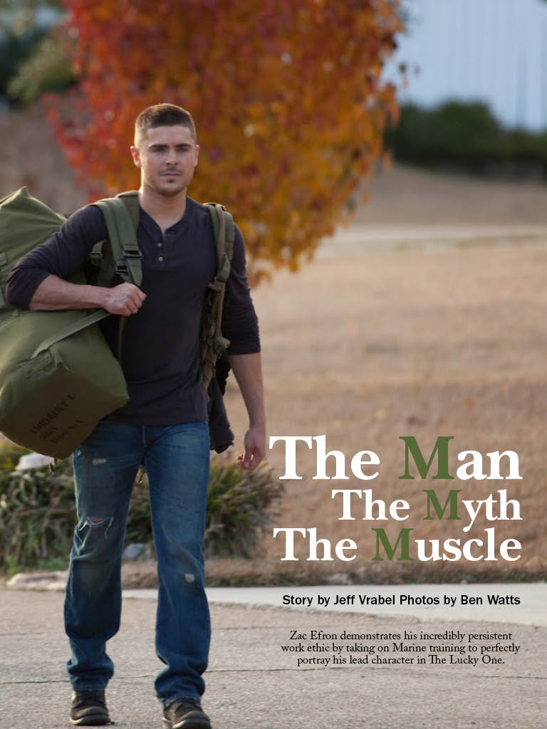
Peggy, great job with your iPad magazine. I love that you chose to focus on Zac Efron,because aside from his hotness, he photographs very well, making all of your images very successful and appealing. I also really like your opening page with the three “M” words. However, I feel the only thing you could change is maybe the font color of the magazine name; I’m not the biggest fan of the red, I just feel there are other colors that would be more blended with your image background colors. Great job though! 🙂
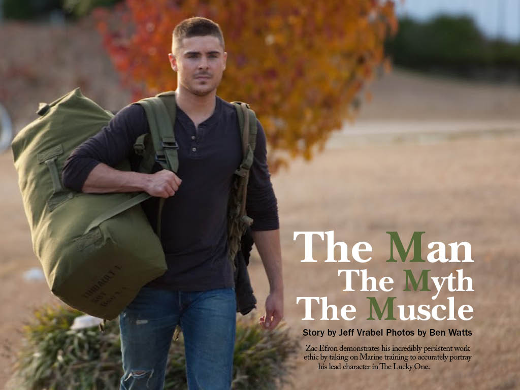
Excellent choice of cover and opening page images! The horizontal cover looks so great. I also like the typeface of the flag — it looks modern while not being too casual. Opening pages both work very well. Also, I like the detailed page info on the bottom. It looks very professional. The only thing I’m not so sure about is the typeface of the body text. It seems a bit crowded and busy for me.

Peggy, great job with your iPad magazine. I love that you chose to focus on Zac Efron,because aside from his hotness, he photographs very well, making all of your images very successful and appealing. I also really like your opening page with the three “M” words. However, I feel the only thing you could change is maybe the font color of the magazine name; I’m not the biggest fan of the red, I just feel there are other colors that would be more blended with your image background colors. Great job though! 🙂
Excellent choice of cover and opening page images! The horizontal cover looks so great. I also like the typeface of the flag — it looks modern while not being too casual. Opening pages both work very well. Also, I like the detailed page info on the bottom. It looks very professional. The only thing I’m not so sure about is the typeface of the body text. It seems a bit crowded and busy for me.