
I absolutely loved completing this project. I learned how to use interactivity and after seeing real iPad magazines, it made me realize how useful these Indesign (and interactivity in specific) are so useful in real life. I now love to read iPad magazines.
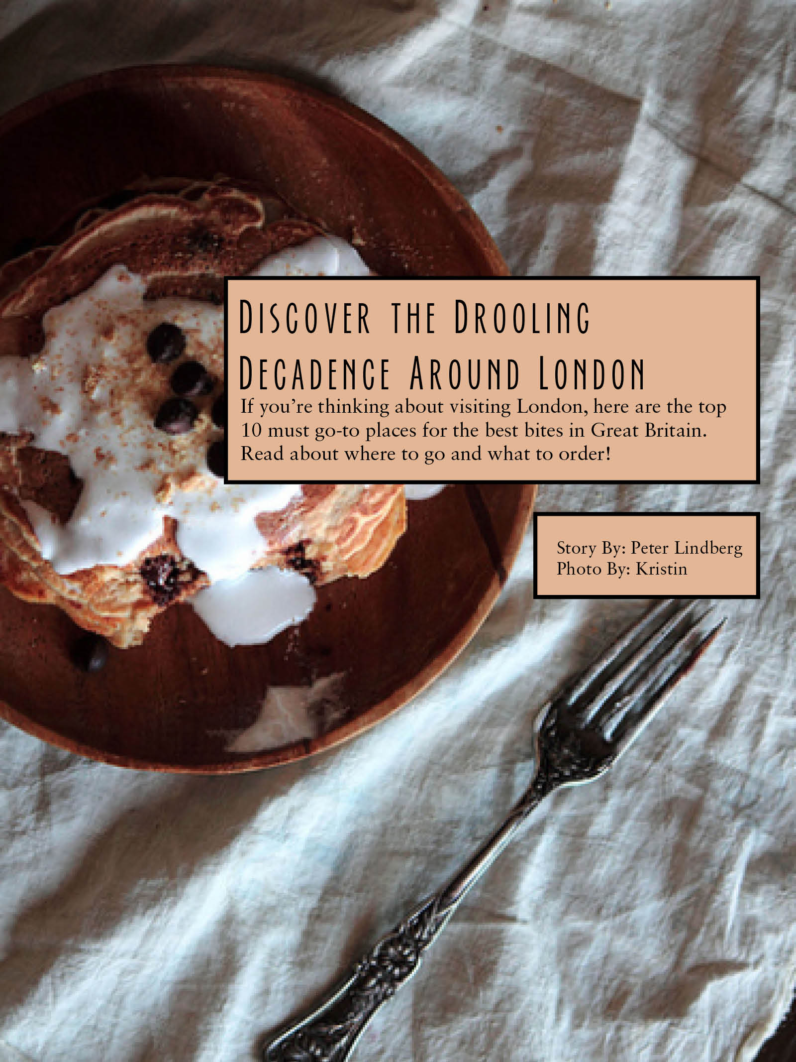
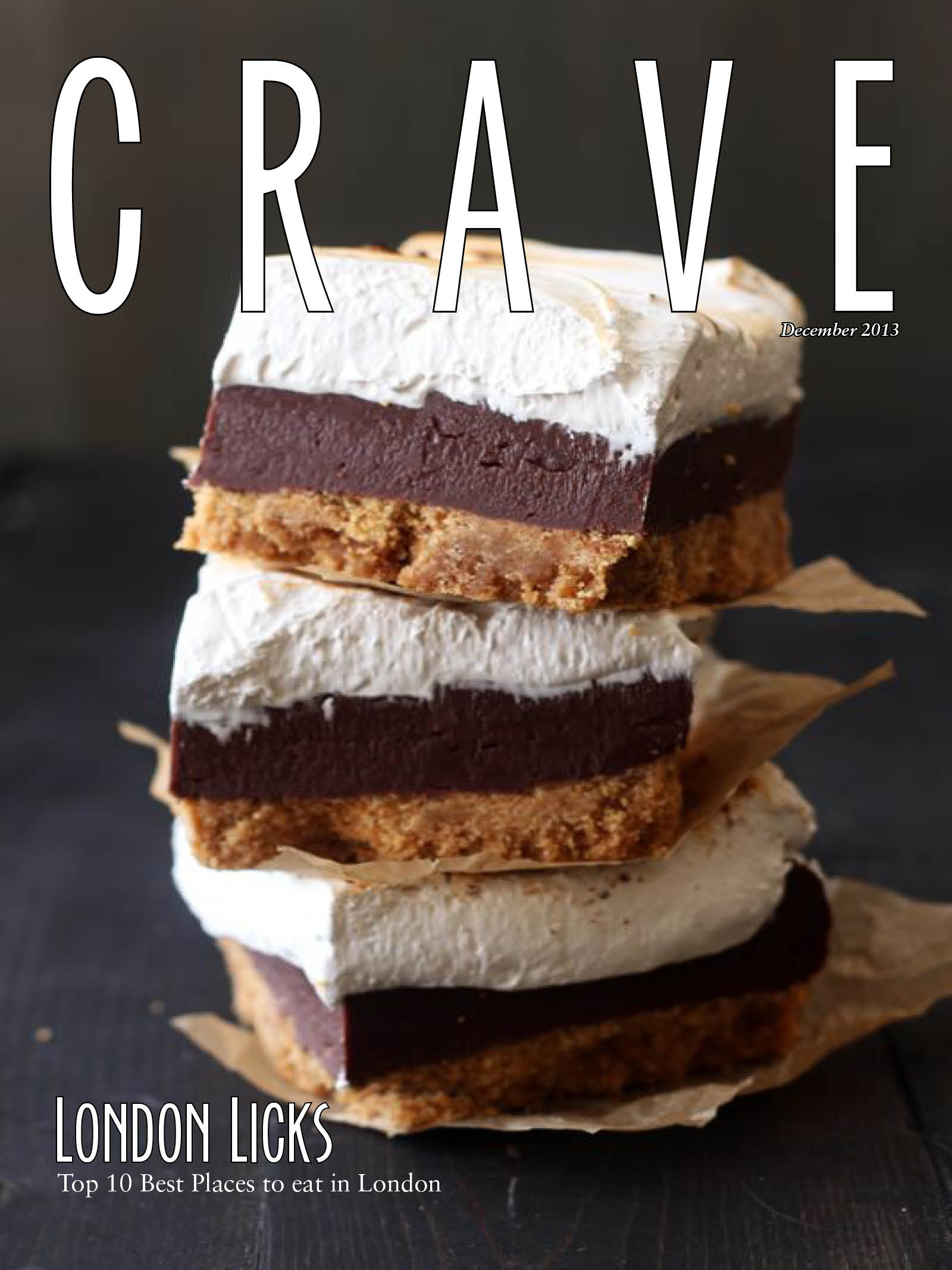
Sarah, I love this! First of all, the title is perfect for the magazine. Also, the images on all three pages look so appetizing. I love how you had the fork pointing to hed/dek/byline on the opening page. I also like how the story is on an opaque image on the jump page. My favorite design is the vertical design. The most important reason for that is the image on the vertical cover is much more appealing than that on the horizontal cover.
I hate it that I’m looking at your design at this point of time — that makes me feel so hungry!!! The cover image is very appealing and I like your choice of white as the flag color, which works pretty good with the dark background. Every image you chose fits perfectly with your theme and design. I extremely like how you crop the images to suit them to vertical/horizontal designs. I think they really work very effectively in both cases. Feeling like leading between headline(s) on opening page(s) could be smaller; otherwise it’s a bit distracting.