It’s great to have learnt creating interactivity using folio overlay in InDesign.
2 thoughts on “iPad project”
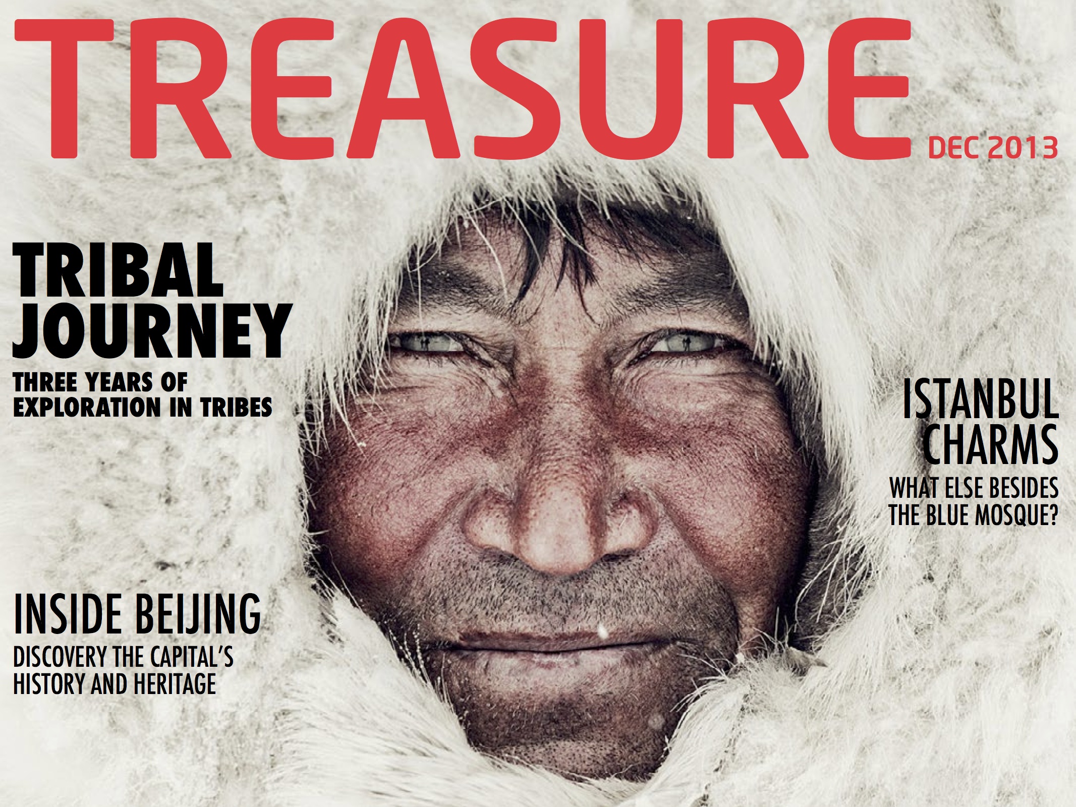
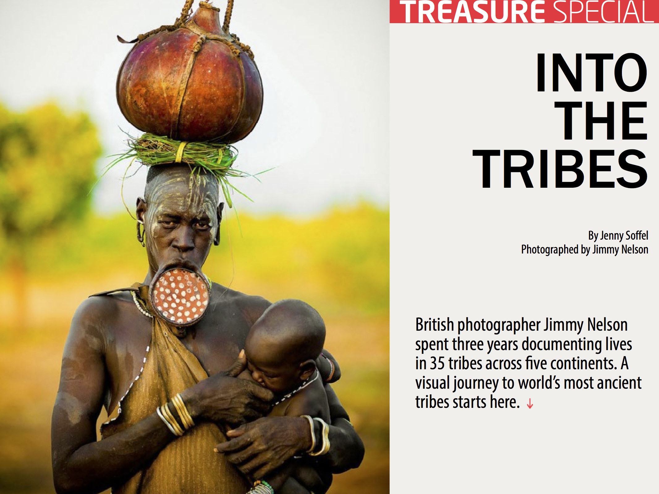
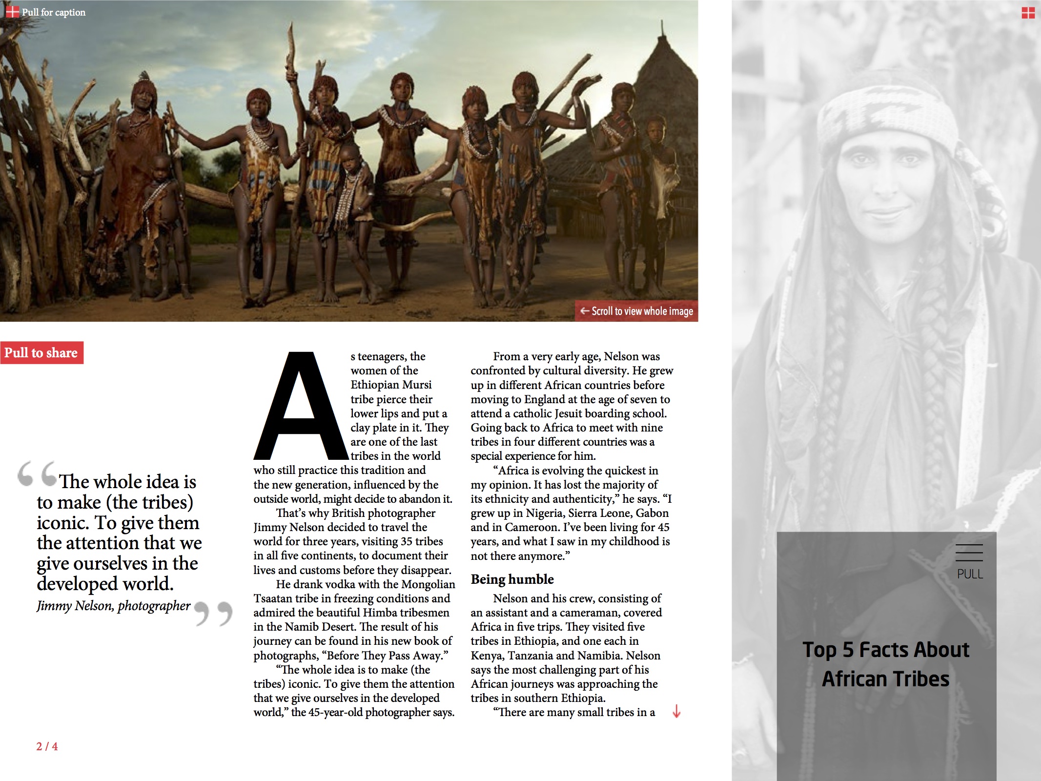
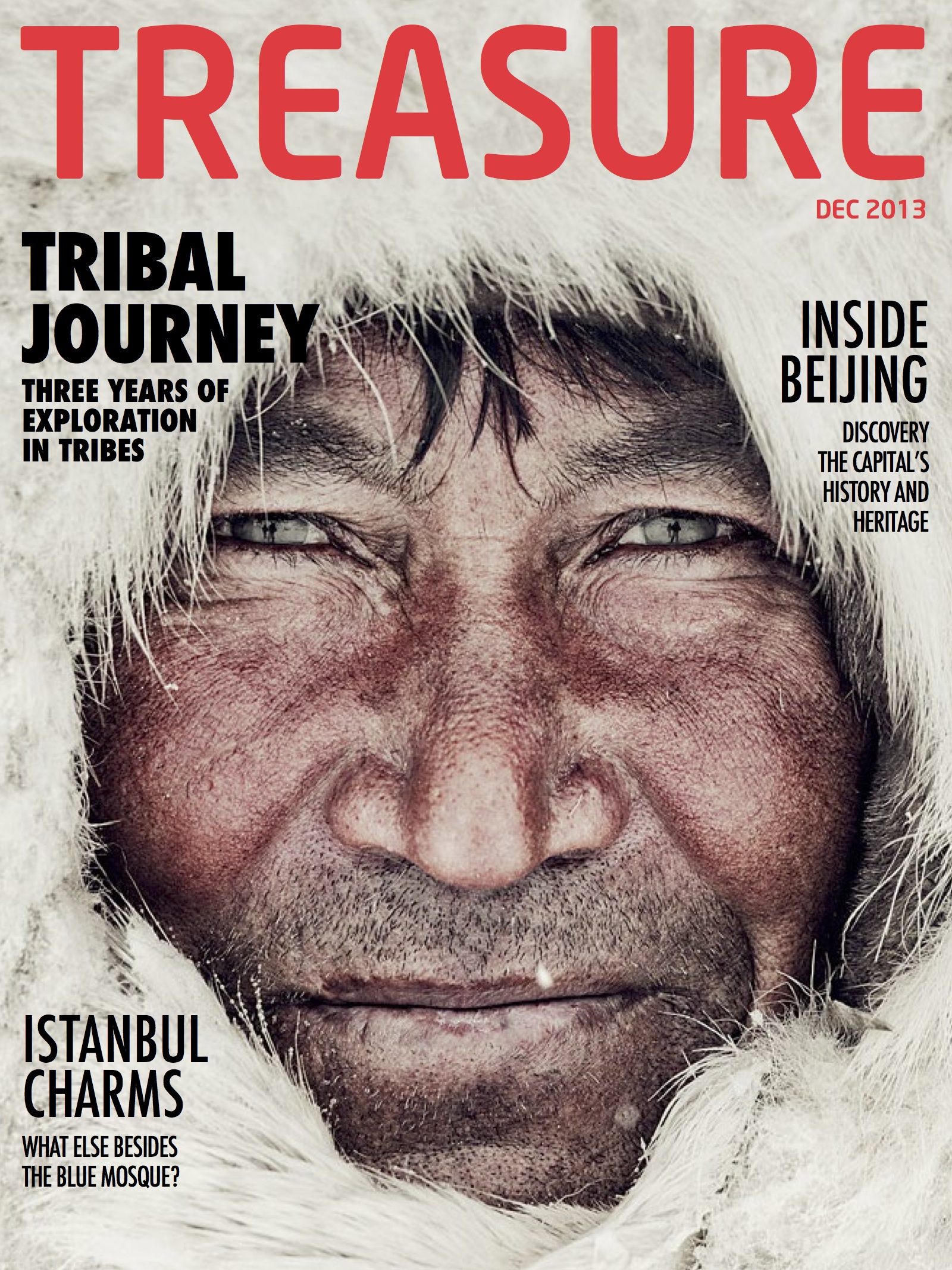
Your magazine design is excellent. It looks so professional! The cover image is so striking and draws your attention. I definitely would read this story. Your choice of type is great as well. I like how you distinguish the feature story from the rest by making it bold. I like you added color to the title of the magazine… the red adds to the image and doesn’t distract from it. Your design works perfectly in both horizontal and vertical. It reminds me of something I would see in National Geographic. Amazing work!
Your magazine looks so real, like it was created professionally! great job! I love the cover page. The image is so strong and captivating that it forces the reader to want to dive into the magazine articles. I feel that all of your images throughout the magazine are very strong and show good continuity, and also the font you chose is so successful and appealing.