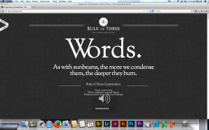
The Rule of Three website applies many gestalt principles. Most notably, visual hierarchy, figure and ground, and proximity and alignment.
The dark background and white letters allows the viewer to easily navigate the website’s text. The layout’s is very simple, and the word “Words,” is the most prominent figure on the screen, It’s also what the website sells. The website is very organized. Even though there’s only one type of font used, it’s used very effectively with grouping. All the areas with like information are equally separated, and the use of different sized fonts helps readability.

