
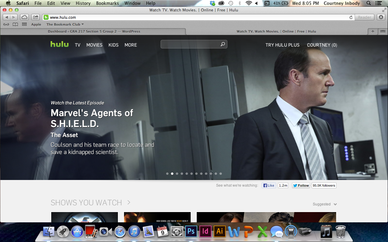
Thinking about the gestalt principles, and because I just had a viewing party of SHIELD in my room 3 hours ago, I decided to use Hulu as my website. Who knew Hulu would have used these principles? Anyway; seeing as these are all video clips, the images themselves stand out against the grey background that Hulu uses on its website. Through all of the clips of what is new that aired this week, the same font is used for the title of the show, the name of the episode, and the description beneath it. The headers of each section, such as “Shows You Watch,” are all the same font, and are all capitalized, creating uniformity. Finally, visual hierarchy is very much used, as the episodes just coming out the day after they air on television take up the entire top half of the website, being the first things that you look at, such as Agent Coulson’s face (#CoulsonLives).
Courtney, I agree. The proximity and alignment principle is used because of the headers of each section using the same font, color, and alignment. Also there is a visual hierarchy because the image of the most recent episodes are the first thing that I looked at when I looked at this image.