
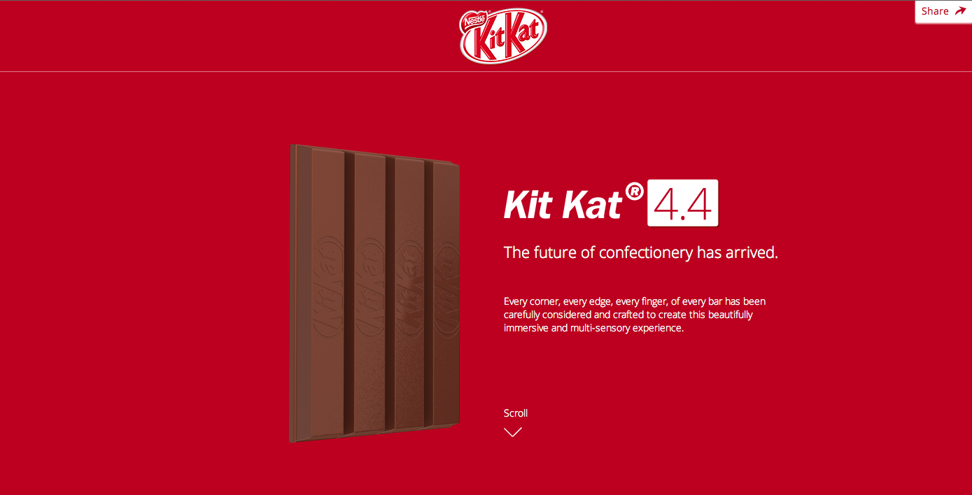
My love for Kit Kat aside, this website applies many gestalt principles. The Kit Kat bars stand out clearly from the background due to the color difference and three dimensionality aspect. The colors are very consistent on the page. They stick to the classic red and white colors that are associated with the Kit Kat brand. The font is aligned well and gives the look of an organized page. Lastly, the hierarchy is very apparent and visually appealing. The words at the top are the biggest, most bold, and italicized. The following line is much smaller and the following block of text is the smallest. Overall, this page is very appealing and applies the gestalt principles very well.