
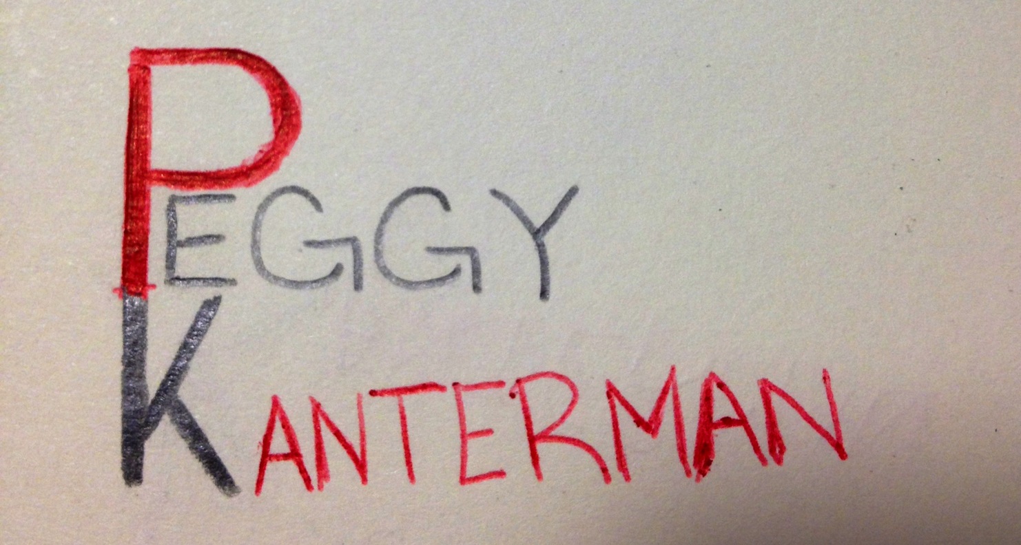
Now obviously this is just a sketch. If I were to put it into photoshop, the text would be straight and the image would be much cleaner. The thought process behind my logo stemmed from my word mark. I used red as my warm color in my word mark and in this sketch of my logo to draw attention to my name. I connected the P and K for stylistic reasons, but to ensure readability, I used black for the K. I also made the P and the K more bold than the rest of my name to draw attention to my initials. I wanted to keep my logo as simple as possible, and I felt this arrangement of my name was the best way to do so.
Peggy, I really like your logo sketch. I like how the “P” and the “K” are connected. I think that was really creative. I also really like colors that are used between the first and last name. An option for making this look better would be to move up the “ANTERMAN” so it’s in between the angle of the “K”. That way, the “EGGY” and the “ANTERMAN” are almost touching one another, which will rid of that empty space in between them now.
I like how you connected your letters, but also made the letters different colors. You have a difficult first and last name that work together, like me, but you definitely made them flow together really nice! Good job.