
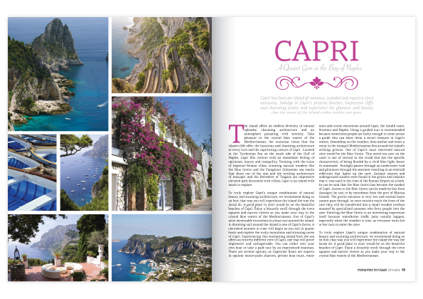
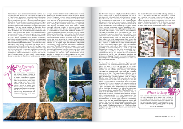
 I LOVE everything travel and this is the quintessential magazine spread that makes you want to pack your bags, hope on a plane and lose yourself in explorative bliss. These two spreads are reasonably simple in their style with a lot of white space, uniformed typefaces and fantastic use of color. Looking at the gestalt theory #6, which says that everything contributes the greater whole, I can really see how each individual component plays its own part to make a really striking end products. Color has been used really effectively in this piece with the designer pulling out the most attractive and vivid shade of each photo and using it in the typefaces of the headings. Photos have been placed in a grid like form with the exception of the third page where it is on an angle, giving the page a very aesthetically pleasing look. Overall I think it is a very appealing and effective spread.
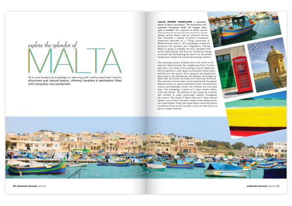
Capri and Malta anyone?
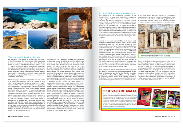
I really like the magazine layout you posted too. It’s modular but not so much so that it’s boring and there’s really effective use of white space. I really like how consistent they are with there article designs. Simple, elegant and consistent color schemes and themes. Very cool mag.