
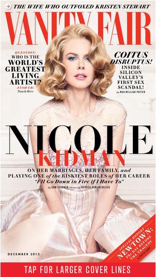
This is the cover of Vanity Fair Ipad version. The photo is smartly shot and chosen, where Nicole Kidman looks directly into readers’ eyes and connects with readers perfectly. Symmetry doesn’t always work well but in this design, it looks great — with the photo at the center dominating the cover, any asymmetry would break the balance; however, symmetry like we see in this design avoid such imbalance. The colors are kind of simple but the combination of red and black, for most of the time, if not always, is very effective and eye-catching. Also, with Nicole Kidman slightly leaning over, the line “Nicole” is made even more prominent — very smart design.
I think Nicole Kidman’s expression is well warranted. There is so much going on on the page, and the text is inundating her. I can see how this cover could be successful in print form, yet I personally believe there is too much content vying for my attention, especially when considering the fact that it’s on a smaller Ipad screen.
I very like the color scheme, black and red. Also, the design of “Nicole Kidman” is wonderful, different colors, different fonts and small leading. However, I agree with Trevor, this cover includes too much information as a digital cover. It may be better if the words beside Nicole’s head can be deleted.