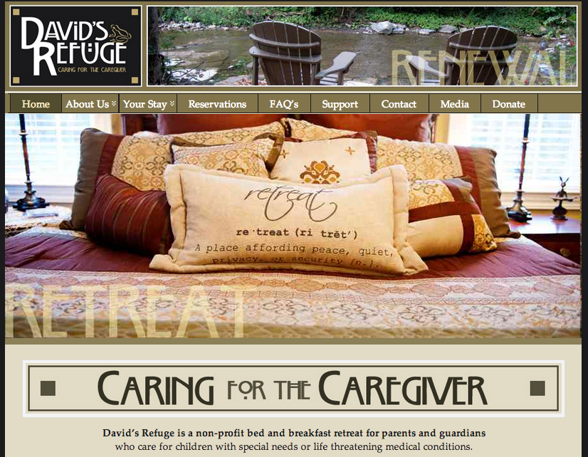
 This designer of this website had gestalt principles in mind as he or she was designing. For one, there is figure and ground because the image of the bed stands out against the tan and dark green backgrounds surrounding it. In addition, there is proximity and alignment because the designer used the same typeface in the David’s Refuge logo and in the “Caring for the caregiver” tagline. Furthermore, there is continuation because the faded words “Retreat” and “Renewal” are placed on lines, which indicates continuation and connectedness. Lastly, there is visual hierarchy because the image of the relaxing bed is the first and most important thing that my eyes look at.
GRA 217 Section 5 Group 2
The official blog for GRA 217 with Sherri Taylor
