
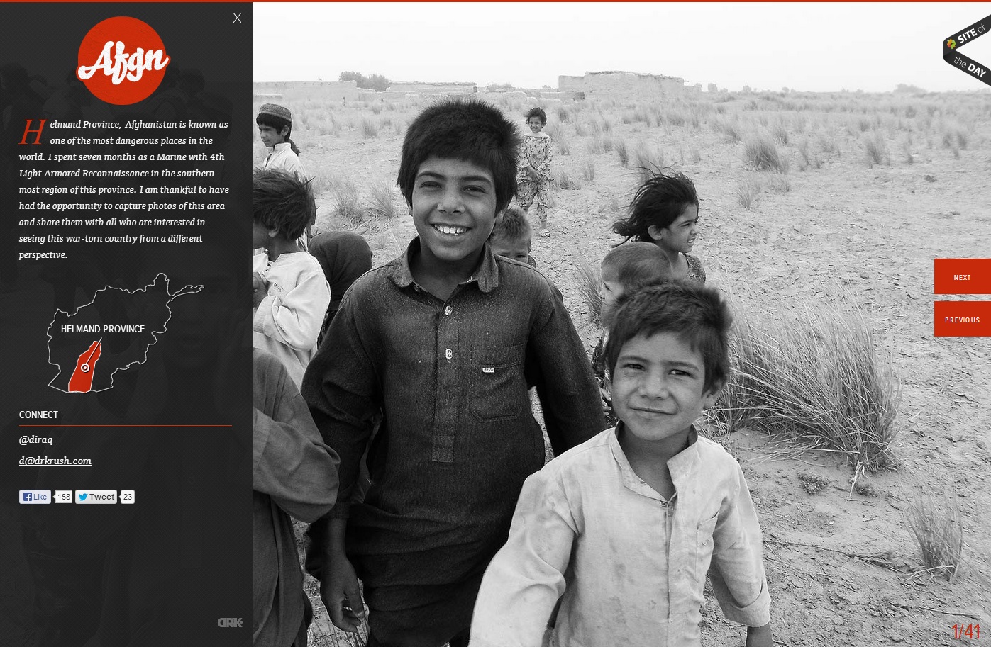
In this website, the photo of the children in grayscale provides a means of emphasis in the orange-red type and graphics. The heat of the color contrasted with the black and white of the photo creates key emphasis of the Afgn logo, the dropcap, the Helmand Province graphic, and the previous and next buttons. All of the emphasized aspects are vital to the webpage. However, they do not stand out from the picture, which creates a friendly face for the area and detracts from the Islamist extremist stereotypes of the region. The photo is covered up by the black transparency on the left, but the whiteness of the boy’s smile captures the initial attention in the site.
Also, the fact that the photo is of children is really appealing. Children are innocent and it is easy for people to sympathize with them. The use of black and white photograph adds drama.
I love the way photography was used here- the faces of children really speaks well for the website and evokes emotions from the viewers. I love that it is also gray-scale because that enhances , the point color- red- used.