
Tag Archives: website
Afgn
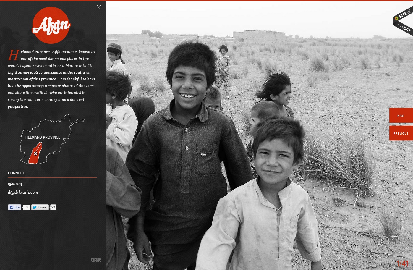
In this website, the photo of the children in grayscale provides a means of emphasis in the orange-red type and graphics. The heat of the color contrasted with the black and white of the photo creates key emphasis of the Afgn logo, the dropcap, the Helmand Province graphic, and the previous and next buttons. All of the emphasized aspects are vital to the webpage. However, they do not stand out from the picture, which creates a friendly face for the area and detracts from the Islamist extremist stereotypes of the region. The photo is covered up by the black transparency on the left, but the whiteness of the boy’s smile captures the initial attention in the site.
Studio MPLS Gestalt Principles
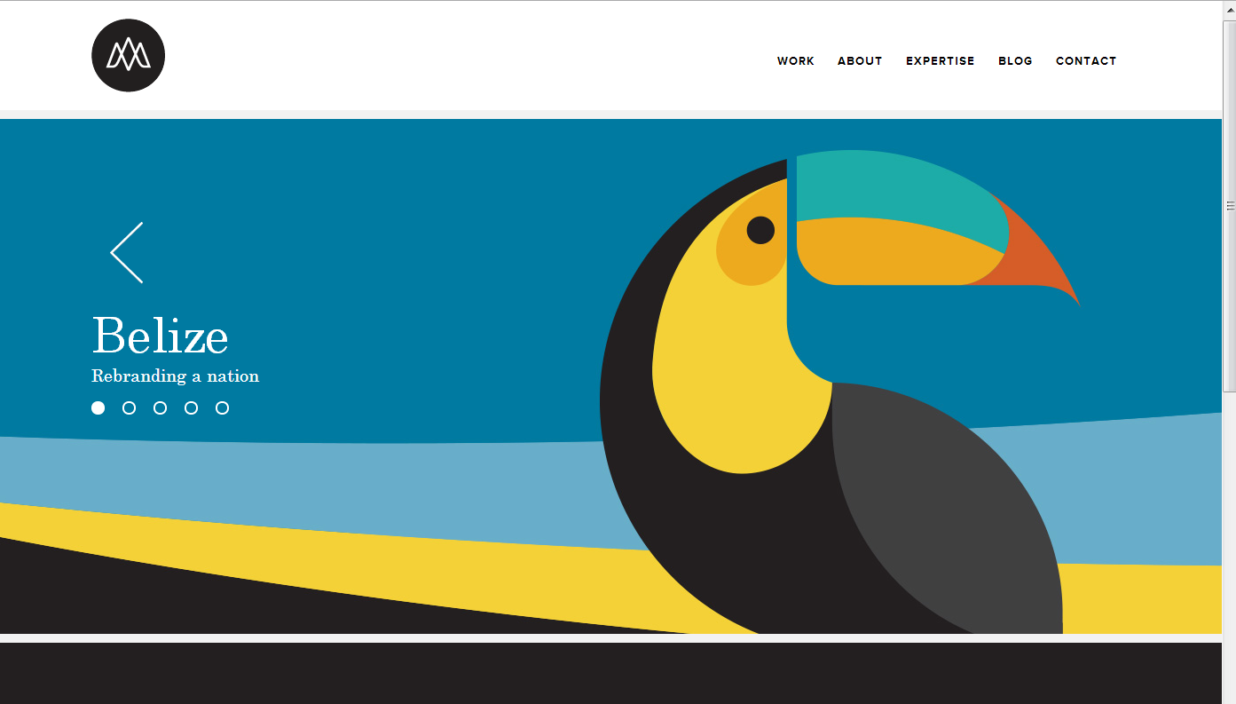
Many of my favorite websites are often simplistic. This website, studiompls.com is no different. A good website also follows gestalt principles. Here are a few examples of gestalt found in this example:
Similarity: This site has panels that change. The grouping of the multiple shapes into the form of the toucan creates a similar shape that distinguishes itself from the rest of the web page.
Closure: The toucan beak is not connected or closed off with the rest of the toucan, so the mind seeks closure and does so to assume the beak and body are one object.
Proximity: The formation of the section words in the top right are close together in proximity, allowing for the mind to group these concepts together.
Figure and Ground: The website easily differentiates the background with the figure because the background is white. Regardless, even with the toucan graphic, the toucan is easily distinguishable from the background because of the vertical vs horizontal contrast.