
Tag Archives: Web
Afgn
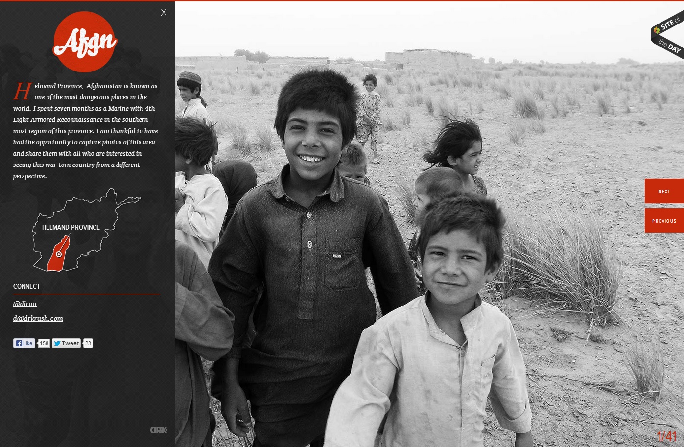
In this website, the photo of the children in grayscale provides a means of emphasis in the orange-red type and graphics. The heat of the color contrasted with the black and white of the photo creates key emphasis of the Afgn logo, the dropcap, the Helmand Province graphic, and the previous and next buttons. All of the emphasized aspects are vital to the webpage. However, they do not stand out from the picture, which creates a friendly face for the area and detracts from the Islamist extremist stereotypes of the region. The photo is covered up by the black transparency on the left, but the whiteness of the boy’s smile captures the initial attention in the site.
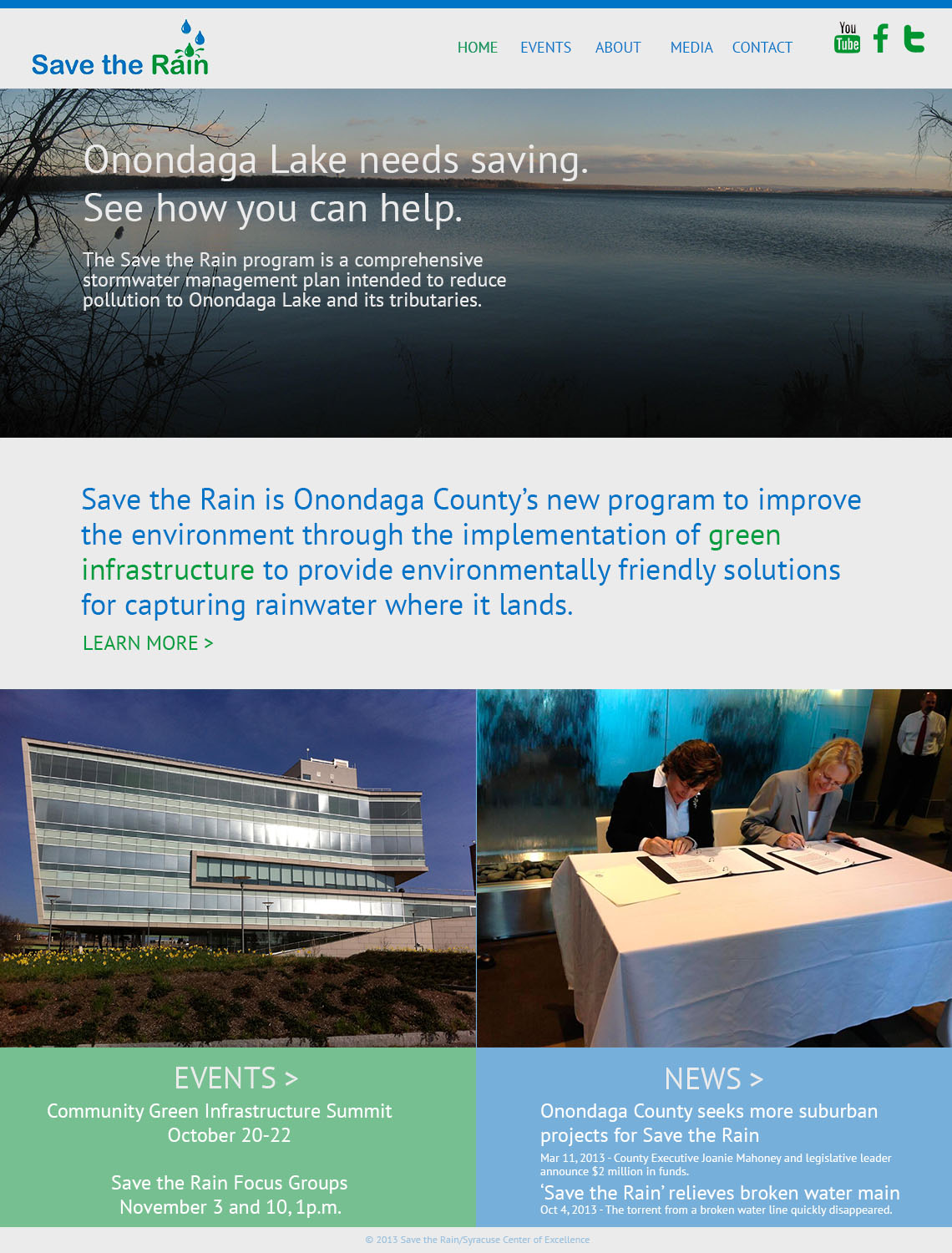
SRCOM – Website Design
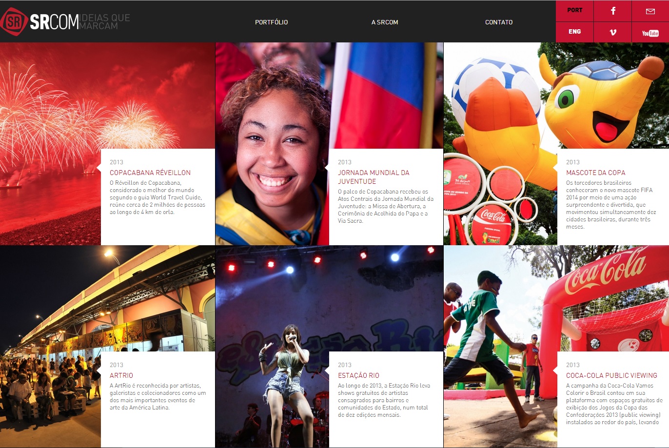
This website proves that web design is a universal language for communication. Despite being in Portuguese, even an English speaker can understand the importance of layout. Boxes may seem initially unappealing in regards to web design, but they can also be the most effective. In separating the text and emphasizing the important parts of the pictures, the web design has a successful visual hierarchy. The eye prefers visuals over text, and managing the layout greatly improves the viewer’s willingness to read the text.