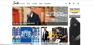
The website Jack Threads has a strong presence with their clothes because of their ability to display them in action. Its unique text illustrates sales that instantly grabs the viewer’s attention and entices them to click and see more. Furthermore, their use of different lenses such as black and white or a faded background gives different categories various feelings such as rustic or classy. Overall, their use of multiple images provides viewer’s a specific insight into not only how their clothes look, but how they look in different situations.


As a user and lover of Jack Threads, I also really appreciate their design. Jack Threads is constantly updating their site with new products every single day, and they have to continue producing interesting new photos to display their products. Their photos are always pretty strong, the lighting is always good, and they’re extremely efficient at using tons of photos to compliment their layout. While the products on JackThreads are often cheap, and/or marked down, their photography does not at all suggest this, giving JackThreads the image of a quality source of clothes and accessory. For the website layout, the typeface choices are always interesting, complimenting the design of the site. The site is also fairly easy to navigate, and I agree that their use of typeface with their layout appeals to users curiosity, and encourages them to further explore the site.
I think the use of photography has a very strong and positive effect on the website’s design. The typeface on the photography is consistent throughout, which is extremely important. I definitely think that the top photo is the best, however. I think it does the best job matching with the logo and the header.
The photos do add a sort of sleek and cool effect. It is very clear who Jack threads is trying to cater to. They want the clothes to appear classy and sporty to the casual man. I like how you reference the different lenses used because the pictures with different lenses do give difference effects.