Category Archives: Poster
Poster Design
poster project 2
Poster
Poster Project
Poster Project
Poster Critique
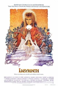
The poster I chose to critique is the movie poster from Jim Henson’s Labyrinth. This poster is well designed because it effectively conveys a lot of information about the movie: The design of the labyrinth in the background, Jareth on top demonstrates that he’s the one in power, the complexity/overlapping of the creatures exemplifies the tagline, which is “where anything seems possible and nothing is what it seems.” I think the text that was chosen is appropriate to the film. It’s a novelty type, but the use of all capital letters and the brassy ombre fits in with the aesthetic of the rest of the images.


