
Throughout this semester, I have struggled with almost everything Adobe has to offer. Finally, I can say that I feel confident in myself in using Photoshop, InDesign and Illustrator. Every TA was always there to help me learn and Professor Taylor’s daily office hours were a life saver. Essentially, what I have learned this semester is to appreciate all of the designs and advertisements I see in the world because they all most likely took days and even months to create an idea and then execute it properly.
Author Archives: Kevin Claffey
Magazine
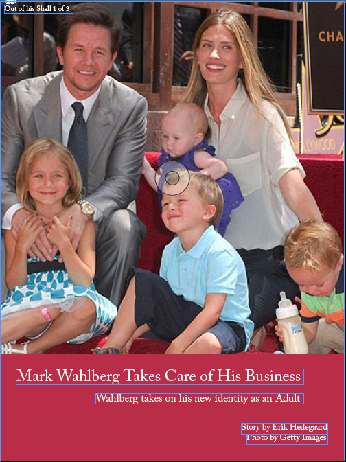

This is the vertical orientation of my magazine about Mark Wahlberg

This is the horizontal orientation of my magazine and my final version.
The interactivity on both my pages is a slide show on the third page picture.
iPad Cover
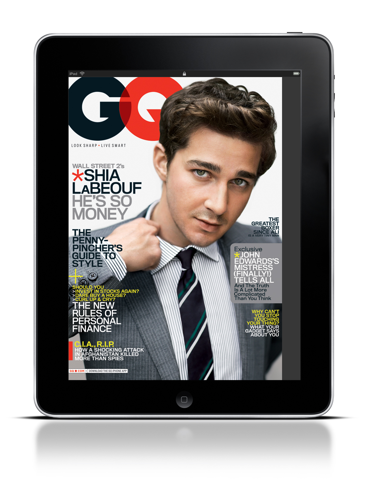
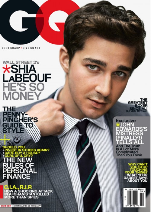
The iPad and GQ magazine use this photo for several reasons. First, the GQ logo leads directly into Shia LaBeouf. As the reader’s eye’s move to the left, they instantly grab the headline and subsequently move down the page, reading each section of text. In addition, Shia’s hand leads directly into another blurb of text. Truthfully, there is no major difference between the iPad and the actual magazine. The only argument for potential difference is that the image may be slightly cropped on the iPad screen.
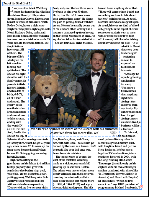
Deck and Headline
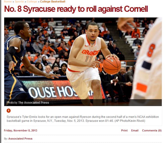
This deck and headline work well together because the headline gives the essential information for someone to understand what the article is about. The deck goes further into detail by giving background information about the topic as well as the name of who took the photo.
Website
Magazine feature
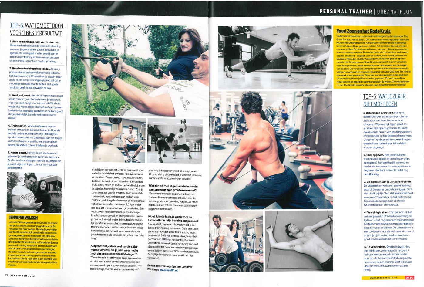
Above is Men’s Health’s article published every month on a specific workout. The layout of this two page article is what attracts my eye. Men’s Health not only utilizes the directions of how to properly perform each workout, but has pictures to give readers an accurate description. This simply layout and placement of text and pictures creates an easily navigable article that will entice readers to read all the way through.
Logo

My thought process behind my logos were that I wanted them to be simple, yet grab attention. In my first logo, I made it similar to the fast food chain KFC because I thought people would look at the logo, realize it is not KFC and be curious to see what this new brand is. The three letters stand for the initials of my name and I connected them all to create fluid motion between letters.
For my second logo, I cut my last name in half and drew it in cursive. The cursive font gives the logo a level of elegance and high quality. It is short and sweet and depicts myself in a manner that would impress others.
Photography
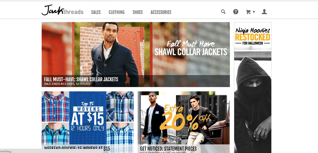
The website Jack Threads has a strong presence with their clothes because of their ability to display them in action. Its unique text illustrates sales that instantly grabs the viewer’s attention and entices them to click and see more. Furthermore, their use of different lenses such as black and white or a faded background gives different categories various feelings such as rustic or classy. Overall, their use of multiple images provides viewer’s a specific insight into not only how their clothes look, but how they look in different situations.
Resume 1B
Gestalt Blog Post
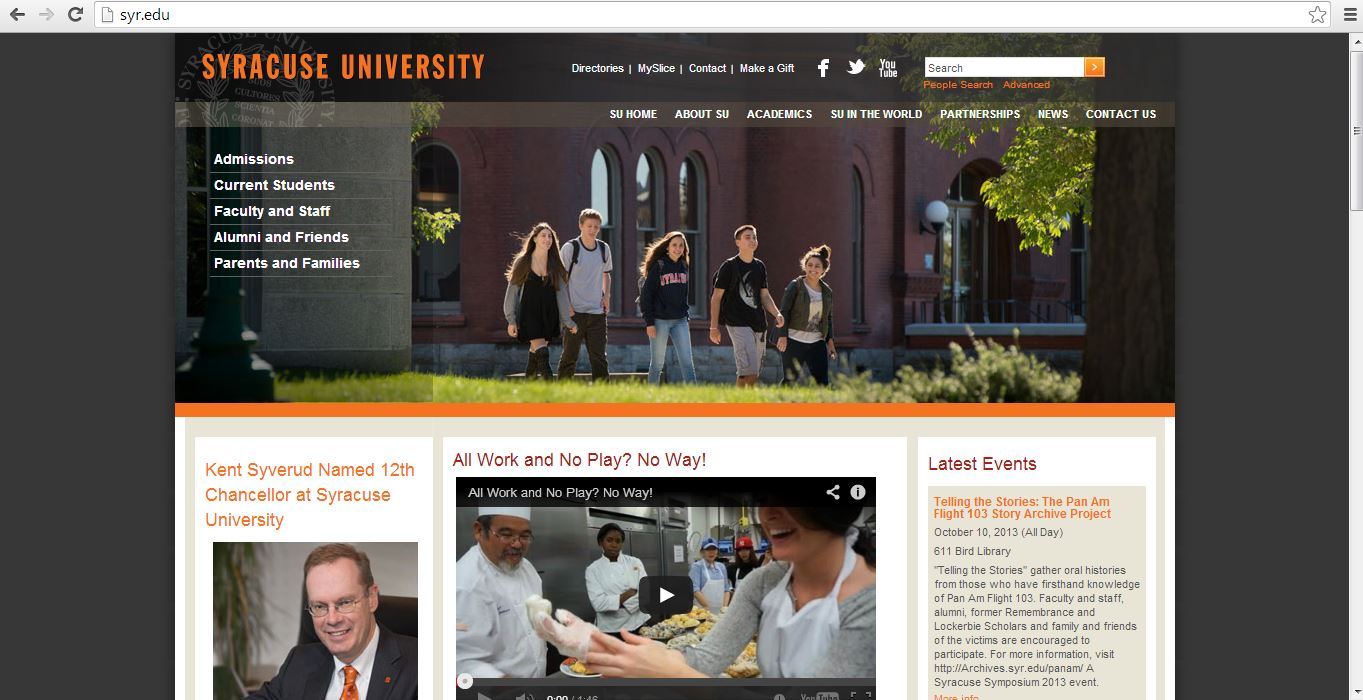
Our own Syracuse University website is a great example of the gestalt principle. First, every important header on the website is the color orange, the school’s main color. Second, all of the headers match in font type and the subtext under each header is consistent throughout the entire page. Third, the constantly change picture at the top of the page takes up a large space in order to attract the attention of the viewer. Lastly, the video link is placed in the center for interactive use with the viewer for the purpose of truly giving him or her a full perspective on Syracuse University.