Typography

typographic-map-us
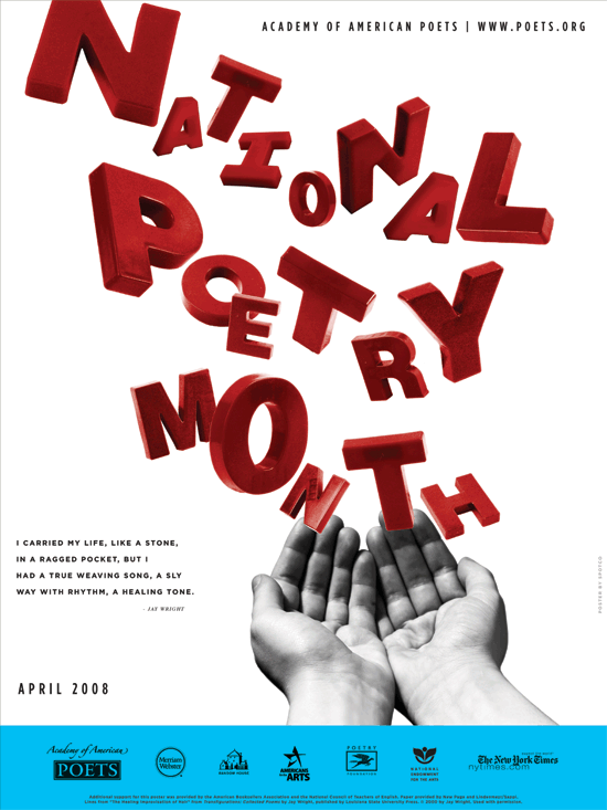
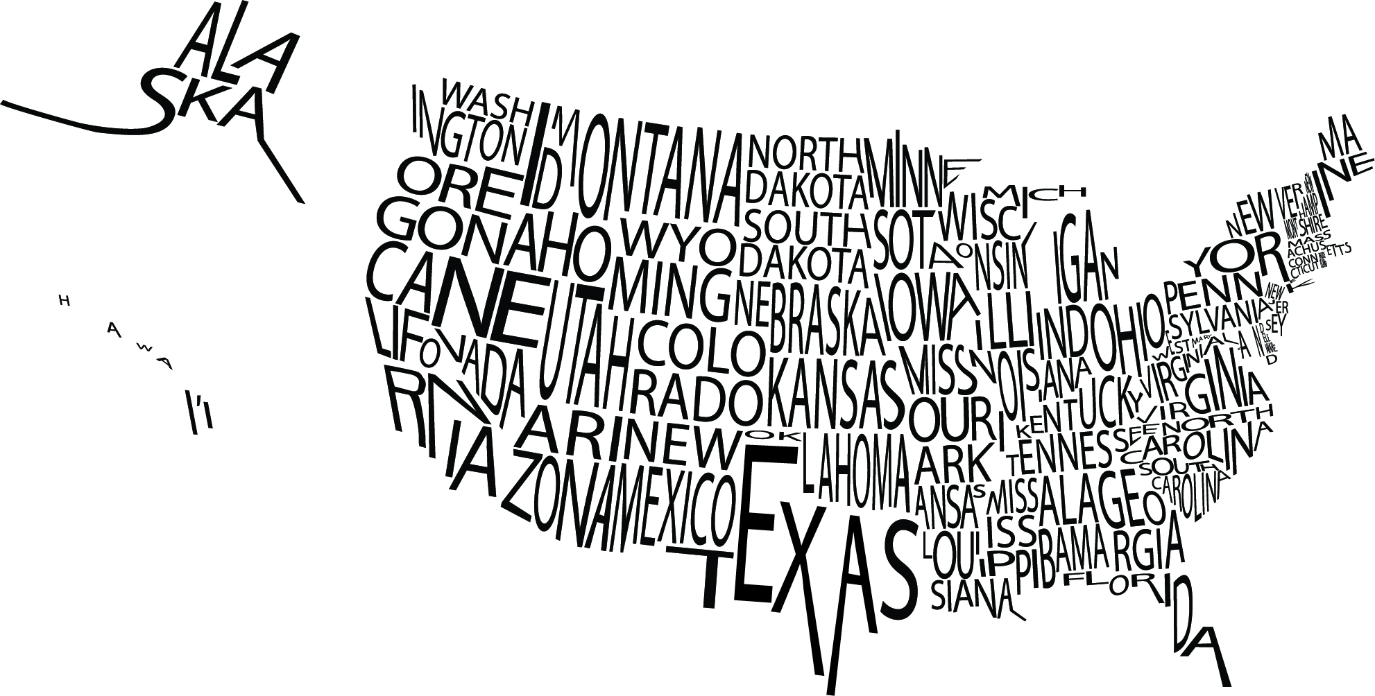
I was particularly drawn to this image because of the visual image it creates not only with the type, but with the white space as well. The letters in the names of the states are kerned close enough together that the overall image is understood while not making the graphic seemed too squished. If you take the time to actually read each state name, they are all legible which must have proven to be a challenge for the designer.


Week 3 poster design

playbill_2267_72272055This is not just one of my favorite broadway shows, but one of my favorite posters. The aesthetic of Elphaba the bad witch and Glinda the good witch fitting together to create one image shows the idea of how these characters were once allies. The contrast in black and white counteracts this though and shows the good and bad characters, white being good and black being bad. Also, the big title and not much other text doesn’t overwhelm the viewer. The text font used for the title, being almost a gothic design, represents the eeriness of the play and mirrors the actual word “wicked.” There is not too much color so you are not overwhelmed, and the way the negative space reflects the green in Elphaba’s face is very cohesive. Overall, this simple but thought out poster truly reflects the aesthetics of the play.

Week 3: Poster

in-time-movie-poster-uk-01


“In time” is a science fiction movie. The whole color in this poster it kinds of dark. The watch in green words is very attractive and it matches with the name of the movie. The special gun and the unique watch could let me easily to tell that this is a science fiction movie. From the poster, I could easily tell that the story is also a love story.

Even though the poster is 2D, it seems that the actor is in the very front and the city is at very far away. I think this is a very good design. It could let me imagine the relationship between the actors and the city and motivate my imagination of the story of the movie.The wordmark of the movie title is very cool and matches the style of the movie.

Poster Blog Post

ROCKY POSTER


My infatuation with this poster comes from it’s creative use of white space to attract the viewer’s eye to the important information and imagery on poster. Firstly, the text is one color which makes it easier for the audience to read and understand what the poster is about. Secondly, the artist plays with two colors (red and white) to create the actual picture within, and makes a symbolic image of “Rocky” the boxer at the top of a set of steps; reminiscent of a critical moment in Rocky’s training in the film. And finally, the artist specifically used the color combination of red, white, and blue to convey the message that the movie is about an “all-american” boxer fighting to win something.

Week 3 Post: National Poetry Month Poster

NPM_2008_poster_550

The poster promoting National Poetry Month is creative and unique. The eye is immediately drawn to the large red type displayed across most of the poster, which stands out against the plain white background. The letters look “messy” in a variety of sizes and angles, but this design works effectively for the poster because poetry is supposed to be creative, unique and individual. The letters seem to be floating out of the image of the hands, which connects to how poetry is supposed to flow. The designer probably chose a sans-serif font since the letters would look messy, chaotic and hard to read with added serifs. The sans-serif font also keeps the poster from looking too formal. I like how the rest of the poster is simple – minimal black text in an attention-drawing font with a white background. The black text matches the black-and-white image of the hand nicely, so the hand doesn’t look out of place. Also, the blue box on the bottom of the page provides separation and serves as a nice contrast to the red “National Poetry Month” type. I think the poster does a good job at promoting National Poetry Month and capturing the essence of the event.


Poster Critique

labyrinth-poster21_7824


The poster I chose to critique is the movie poster from Jim Henson’s Labyrinth. This poster is well designed because it effectively conveys a lot of information about the movie: The design of the labyrinth in the background, Jareth on top demonstrates that he’s the one in power, the complexity/overlapping of the creatures exemplifies the tagline, which is “where anything seems possible and nothing is what it seems.” I think the text that was chosen is appropriate to the film. It’s a novelty type, but the use of all capital letters and the brassy ombre fits in with the aesthetic of the rest of the images.

Week 3 Post

Dave-Matthews-Band-Saratoga-Springs-John-Vogl-Postermethwestpalmleft

For my poster critiques I chose the concert info posters for Dave Matthews Band. What draws me to these posters is that illustrations are changed to fit the concert venue. For example, the poster to the left has racehorses because the concert was to be held in Saratoga, which is known for its racetrack. The poster to the right has wave because it was to be held in Palm Beach. These posters do their jobs well. Immediately you’re attracted to the picture. Next, the giant Dave Matthews Band at the top. If you’re interested in the concert its very easy to look next to the date and venue written right next to the title. Both posters use a serif typeface that’s easy to read and draws the eye. They both have a very relaxed tone to them, which is consistent with the relaxed feel of the artist’s music.


Week 3 Gelb

poster-designs-29{Save Water…Save Life}

In this poster, the eco-friendly message is conveyed through its simple and clear design. Combining the natural element of the growing life of the budding seedling coming out of the faucet represents the need for the seed’s need for water and our need to conserve Earth’s limited fresh water supply in order to create a more sustainable future. The chrome of the faucet against the blue and white background is shiny, clean and even reflective–possibly of a more sustainable future? Portraying the give and take relationship between nature and modern technology, the poster’s design effectively raises awareness to remain conscious of our water usage and cognizant of our environmental impact. I like the way that the reader’s eyes are drawn first to the vibrant green leaves growing from the faucet which is turned upside down so as to not let any water escape which continues the theme of the poster.

Power of Words

1995-GENERAL-Amnesty-Inte-003

This poster struck me as standing out from all other posters I searched primarily due to its color and white space. The first image I saw was the bigger white hand which intrigued me because I was wondering what the hand represented. After I saw the smaller hands reaching up and the type below the message hit me. The message the this poster conveys for Amnesty International is simple, yet powerful. The color is enough to grab your attention, but not overwhelming. The white space is what makes the poster so powerful. I feel as if the poster did its job and the message of the organization is clear.


WWF Posters

80_grdI’m a big fan of Word Wildlife Fund posters. You might need to enlarge it to see it, but all those tiny colorful dots represent “all the world’s tigers.” I thought this was especially effective to their message, because it shows the viewer visually that there aren’t too many tigers left and that we need to save them. I also think this poster works well as an infographic, because it splits up the amount of tigers by region funneling down to South China–where only 20 tigers inhabit. It is incredibly minimalist, which I think makes it also look more modern and striking. The black, bold capitalized “ALL THE WILD TIGERS OF THE WORLD FIT ON THIS POSTER” at the bottom of the page gives it a very ominous tone and leaves the viewer with an empty feeling in their stomach. The design gives the issue and element of surprise and prompts the public to help the cause.