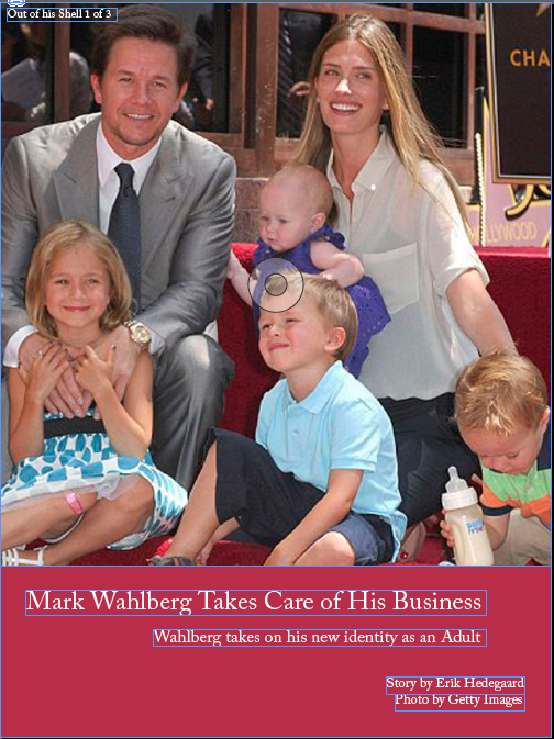

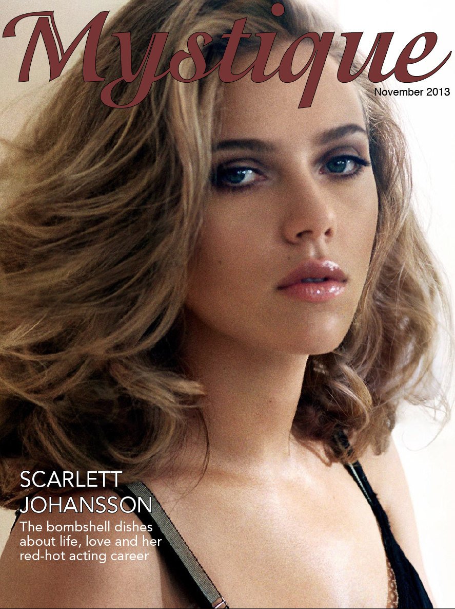
This is the vertical orientation of my magazine about Mark Wahlberg

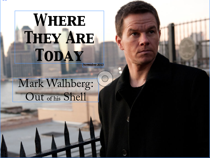
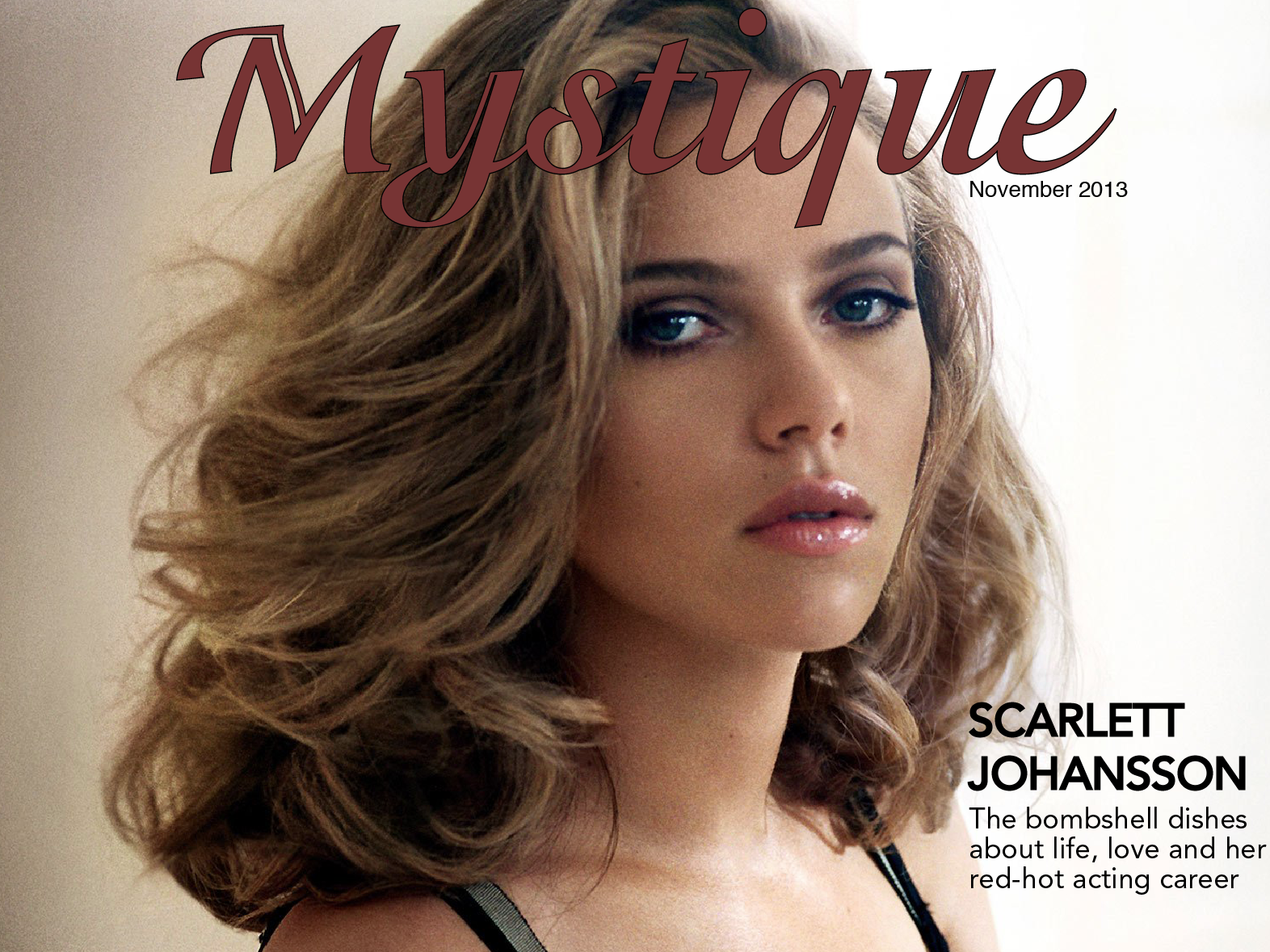
This is the horizontal orientation of my magazine and my final version.
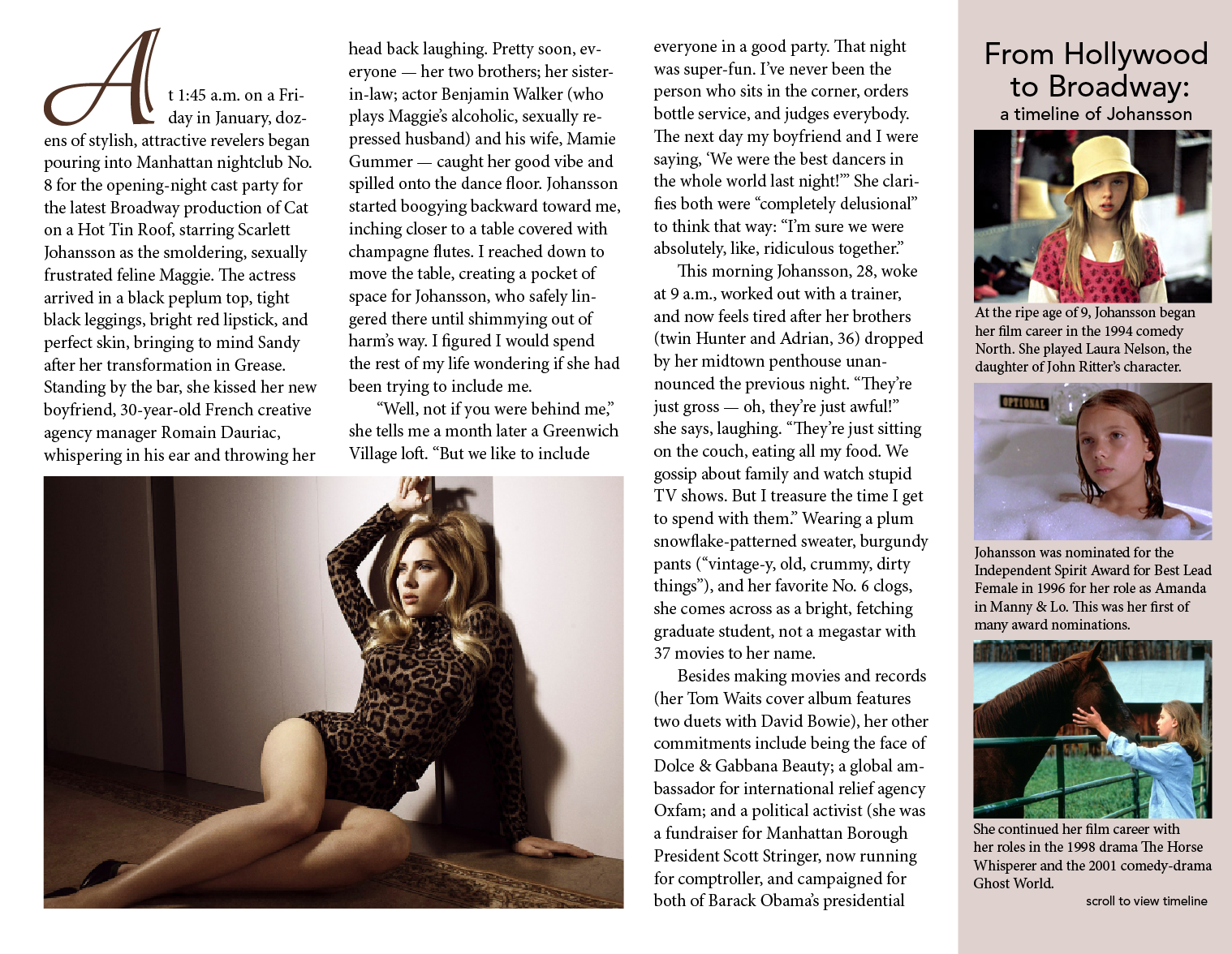
The interactivity on both my pages is a slide show on the third page picture.

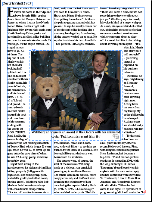
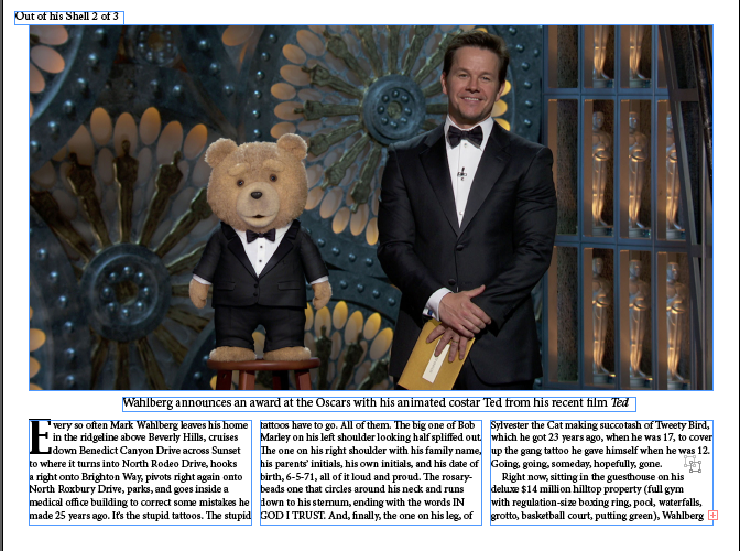
This is the vertical orientation of my magazine about Mark Wahlberg
This is the horizontal orientation of my magazine and my final version.
The interactivity on both my pages is a slide show on the third page picture.


From this assignment, I learned the difference between magazine design in print and on tablets. Tablet magazine covers often have fewer (if any) cover lines. Cover lines exist to sell the magazine to the reader, but tablet readers have already bought the magazine and therefore don’t need to be convinced to buy it. Tablet covers often only have an image and the magazine’s name. Also, magazines have unlimited space on tablets so the designers can space out the type by adjusting leading and put fewer elements on each page. Interactivity promotes reader engagement, and allows designers to fit more content on the pages.
The main thing I learned with this iPad design was to be patient with learning new Adobe software. I prefer Photoshop to any other program, but this project allowed me to be a lot more hands-on with InDesign than the resume project did. Though InDesign is still not my preferred program, but I am lot more comfortable with it now than I was back in September.


During this project, it was definitely good to learn about the interactivity feature of InDesign and know that those features are there. I also learned a lot more about InDesign and the tools that it has by doing the resume and this project in that program.
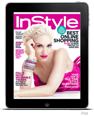
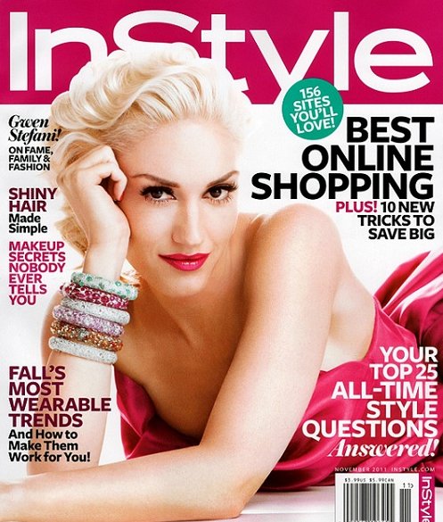
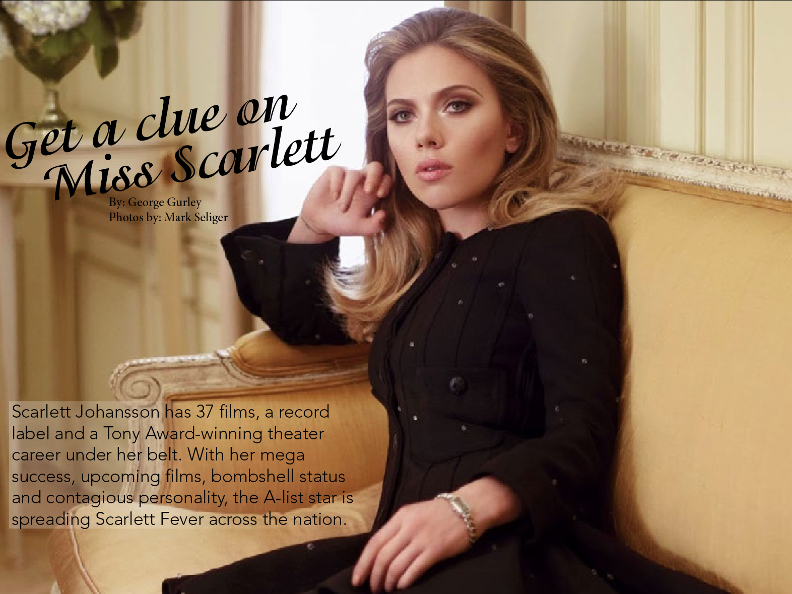
These two covers are essentially the same, minus the iPad design excluding the barcode and date on the cover of the magazine. However, I don’t think that all of the headers look bad on both the print and iPad designs. All of the text surrounds the subject, and though it is mostly taking up white space, it makes the cover look very cluttered. The pop of color that her dress gives is the only thing that would make me want to pick up the magazine.
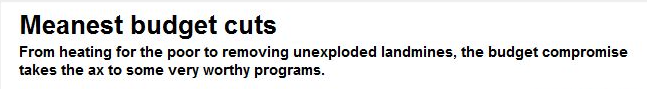
I think the headline relates very well to the deck, with the key word being “meanest”. The cuts that they describe just in the headline, such as cutting heating for the poor, etcetera, tie into the idea of of dastardly budget cuts, and it makes me want to read the article to see what other “worthy” government programs were cut.