Week 2 Blog Post

iron man 3


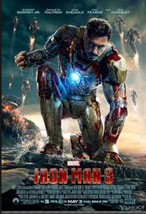
While I am a huge fan of the Iron Man series, the posters are what originally got me to see the movies.  The layout of the design attracts your eye to the warm color and the largest figure.  In addition, the eye is attracted to all the commotion in the background.  The color of the type fades in from top to bottom and truly illustrates the tone of the movie.  Furthermore, the type at the bottom is the perfect size so it leaves enough room for the picture and it is still legible.

rocky


Being from Philadelphia, I am already a huge Rocky fan.  The type is very simple and casual, just like a man from Philly.  The poster utilizes the white space, while making enough room for the iconic main character.  The reason this poster is so powerful is because a person does not need to have seen the movie to understand; he or she can look directly into the main character’s eyes and feel the emotion.  This is the epitome of graphic and type combination.

WEEK 2 The Phantom of the Opera

phantom_of_the_opera

The beautiful poster for Andrew Webber’s opera-adapted film – The Phantom of the Opera – features fabulous design. The mixture of red and black conveys a mysterious, sad and dark phenomenon, which fits the touching but hopeless love in the film. Half of the phantom (the man in the poster)’s face is inside the dark color and the other half is behind the mask. It is just like him in the movie that he always lives in the darkness and hides the true self behind the mask.  The light on the girl, Christine’s, face implies that she is the only hope inside the phantom’s life. He wants to touch and own her.

The typeface also fits the poster and the story. Since The Phantom of the Opera talks about a classic love story happened in an opera house back to the 19th century, the classic font fits the story well. The larger size of “phantom” and “opera” highlights the main character and place of the story.


Comments:

屏幕快照 2013-09-15 下午09.33.39

屏幕快照 2013-09-15 下午09.56.04

Wordmark

SUPREME WORDMARK

Supreme is a leading brand in the street-wear industry and is popular among a varied range of demographics. Many would argue that this is a result of their use of simplicity in their designs, and this is perfectly exemplified in their primary Wordmark. What I like about the simplicity of the Wordmark is that it doesn’t just strive to be simple, it emphasizes the word “Supreme” by doing so. It’s saying, “instead of cluttering up the word with fancy blots and scripts, let’s just allow the word speak for itself,” and it does. I can also appreciate the fact they decided to not just write the word in a nice front, but almost cut the word out of the red square so that the red color makes the word more pronounced.

BLACK SCALE WORDMARK

Black Scale is another well-known street-attire brand and has a very unique style. In their clothing, they make an effort to be dark and give their designs a kind of “classic” feel; this is also especially represented in their Wordmark. The plain, serif text accomplishes the “classic” feel to the brand and is further amplified by the script writing in the background. To add to the distinctiveness of the brand, turning the “A’s” into “V’s” was a clever decision and further contributed to the sharpness and feel of the Wordmark. Not to mention, they attempted to stay in a darker range of colors when making their design.

Week 2: Wordmarks

pinkberry-logo


The first wordmark I chose was Pinkberry’s because its a logo that I’ve always been attracted to. The sans serif typeface makes it fun and easy to read. The colors and simple side logo add a refreshing look. This logo represents the company well because I would want to go get a nice froyo after looking at this.

images

The second wordmark I chose was Tostitos. I’ve always liked this logo because at first glance it seems pretty typical- a sans serif typeface with a bit of novelty thrown in. However at second glance you realize that the T’s and I’s are actually people sharing chips and salsa. Hence, a total representation of the company.


Wordmarks


washington post logo

Like New York Times, The Washington Post has one of the most memorable wordmarks in the news industry. As a news agency of a long history of almost 100 years, The Washington Post enjoys a public image of great reliability. This gothic and old English-like wordmark reminds people of its long history which helps them trust its reputation. This old English like logo also reminds people of some classic novels written in old times. It fits the image of a news agency, which runs the business in writing industry.


Visa-logo

Visa changed its logo in 2006. The company simply capitalizes all the letters and made it all in deep blue. The capitalized letters in slightly italic typeface is very clear and easy to remember. Deep blue color gives people an impression of profession and business. The yellow represents the richness. As a credit card company, it easily builds an image of profession, richness and simplicity by its logo.


My Comments on classmates’ blogs:

屏幕快照 2013-09-08 下午09.45.43 屏幕快照 2013-09-08 下午09.45.57

Wordmarks

Sharpie_Logo_BW_v2

The sharpie wordmark is effective because the font looks like stroke of a sharpie marker/pen. The designer also chose to use only black because the traditional sharpie marker was black. The loose cursive writing also makes the word look handwritten. The font that is used is also easy to read and unique so it makes it easier for the consumer to recognize it.

black_harry_potter_logo


The harry potter wordmark goes along with the aesthetics of the entire movie. The font’s jagged footings make it seem as though it could have been written using a quill, and the “p” has a lightening bolt, just like Harry does. The uneven quality to the letters with the jagged edges also makes the font look spooky.

Week 2 Post: Wordmarks

Screen Shot 2013-09-06 at 4.52.22 PM

The wordmark for Tiffany & Co. represents the high-end jewelry store very nicely. The large serifs and thin letters make the typeface look formal and proper, which signifies the elegance and class of the items in the store. The plain black type, simple letters and uniform kerning between letters also show how the merchandise at Tiffany’s is classic and traditional. Every letter is a capital letter, which draws attention, but the “T” and “C” rise above the others to create a bit of separation.

Screen Shot 2013-09-06 at 4.27.14 PM

The wordmark for Little Tikes is very colorful and bold. Since the company manufactures young children’s toys, and since the word “little” is part of its name, all of the letters in the wordmark are lowercase. Red and blue are colors often associated with children, especially young boys, so it seems fitting that these colors were chosen for the Little Tikes wordmark. The bold and unique letters, especially the letter “e,”  also give the wordmark a childish vibe. The tight kerning allows the reader’s eye to skim quickly over the company name and allows both words to easily work together as one name.

Word Marks

This watermark for the car company Porsche gives a very strong and bold presence when you first look at it. Its tight kerning along with stretched out characters add to its strong appearance. Being a very high end performance company I think this watermark suits the company very well. This water mark is also featured inside their cars which reinforces its identifiably.


The New York Times watermark is one of the most recognizable in its field. The Gothic or Old English font implies the media is a very educated and sophisticated in appearance. The creaters of this word mark defininately had that in mind when they created it so readers would be more attracted to it. Seeing that this is on the top of every paper the NYT produces along with its website, it is very recognizable and fits the company well.

WORDMARKS

Screen shot 2013-09-05 at 5.59.55 PM

Instagram ditched their old stock font wordmark for a more refined custom-drawn one. The new wordmark stays true to Instragram’s brand but looks cleaner and less choppy. The original typeface was script, but did not connect throughout the name. The new wordmark encourages the eye to flow effortlessly through the name. The old typeface “Billabong” gave the brand a retro feel, which carries over into the new wordmark so that the brand’s personality is not lost. The old I in Instagram could be confused for a G, but the new one is clearly an I without loosing character. Using blue also enhances the brands wordmark because it is easier on the eye and also can change appearances using Instragram’s different filters. The old wordmark looked the same in each filter, which did not represent the company’s concept of representing the same image in different ways.


Screen shot 2013-09-05 at 5.57.50 PM

The Disney wordmark represents The Walt Disney Company perfectly. The typeface gives the wordmark a whimsical feel and the choice to mix both upper case and lower case letters makes it feel fun and friendly. Making the D the longest and widest letter draws your eye to the start of the wordmark first. The I’s dot gives it a playful feeling and resembles Walt Disney’s real signature I. The curve of the S brings your eye in the direction of the N, which is tilted in the opposite direction of the following E, again reestablishing the companies playful feel. The Y at the end ties into the signature feeling of the entire wordmark making it feel personal. The thickness, lettercase, whitespace, and color all add to the feel of childhood and imagination, which is what Disney is all about.

Week 2 Post

Unknown-2Unknown-3

I thought the difference between Pacsun’s new and old wordmarks were quite interesting. The first wordmark uses the color yellow to emphasize the fact that most of Pacsun’s merchandise is used in the summer time or when it’s sunny. Hence why the S in Pacsun has rays around it as though it is the sun. On the other hand, the second logo is very simple, using plain black, bold typeface. This second wordmark gives Pacsun a cleaner and more prestigious look as though they are trying to change their look and target a demographic with a higher income. However, both wordmarks still hold some of the same characteristics. They both mix lower case and upper case letters within the wordmark. These letters are scaled to be the same size as well.

michael-kors_3747.jpg


Although this wordmark is very simple, it is known by many people, especially those of the higher income demographic. Michael Kors’s wordmark uses a thin typeface that displays simplicity and class. The letters in the wordmark are also all upper case letters to emphasize the importance of this brand name. Also, the kerning between each letter is the same, except between Michael and Kors. This is so that you can distinct the first and last name. Although these words are separated, they still work as a unit. This wordmark is very simple, but because of the name and style of the typeface it attracts the attention of it’s targeted audience.