
I have learned so much this semester in this class. Before, I had no conceptual understanding what so ever on how images were designed, and why some visuals are more effective than others. Walking down the street I now, have a better understanding when I look at posters, signs, logos, etc. as to why they are designed the way they are. I now can see how typography plays an important role in design, and the smallest change to a font can make a big differnece in the overall design. I now have a greater appreciation for all graphic designers, and all the minute details they consider when creating visuals. While I am glad I was able to be expoed to the graphic design process it is safe to say, I will leave it to the professionals in the future.
Category Archives: Posts
What I have learned
Throughout this semester, I have struggled with almost everything Adobe has to offer. Finally, I can say that I feel confident in myself in using Photoshop, InDesign and Illustrator. Every TA was always there to help me learn and Professor Taylor’s daily office hours were a life saver. Essentially, what I have learned this semester is to appreciate all of the designs and advertisements I see in the world because they all most likely took days and even months to create an idea and then execute it properly.
Concluding Thoughts
Coming into the class I did not have more than an elementary knowledge of graphic design and the softwares involved. After learning about the powerful ways in which the principles of design affect all aspects of life, I now recognize the value and worth in being able to manipulate public perception through the use of design tools and techniques. Prior to this class, I did not analyze and understand graphic design in the same way that I do now as I now am able to make the best use out of design principles and tools such as kerning and leading. Also, I now blame this class for how I will never be able to look at text the same way–now type is more than type. Now I find myself looking at typefaces and am able to recognize whether it is a serif, sans-serif, or another possible typeface. Counters, kerning, x-heights, margins, the rule of thirds, complimentary and analogous colors–forever stuck in my head thanks to this class!
Scavenger Hunt: Carli Aluotto, Sarah Richheimer, Kevin Claffey, Eric Gordon
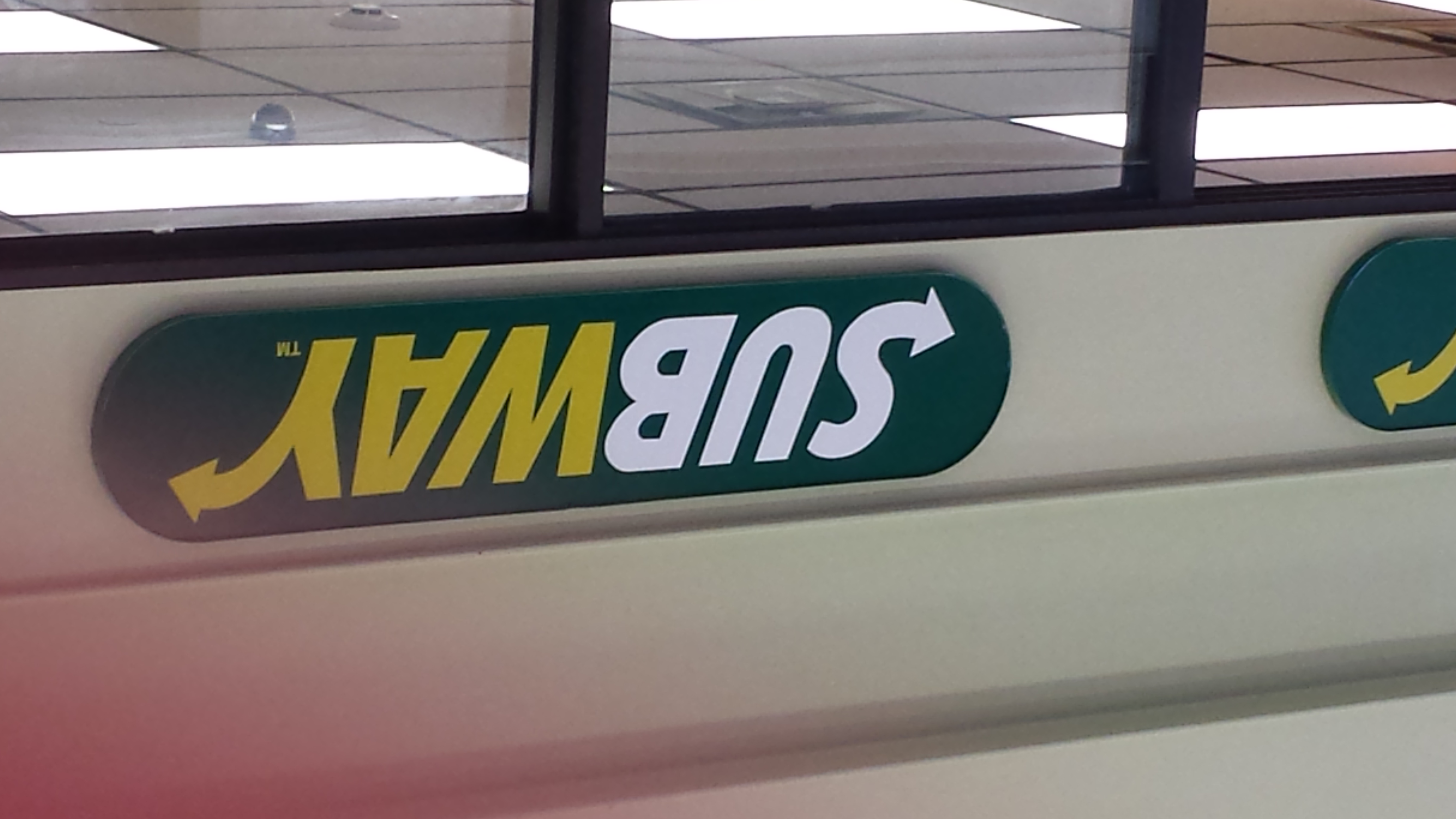
1. Old Style serif type in signage
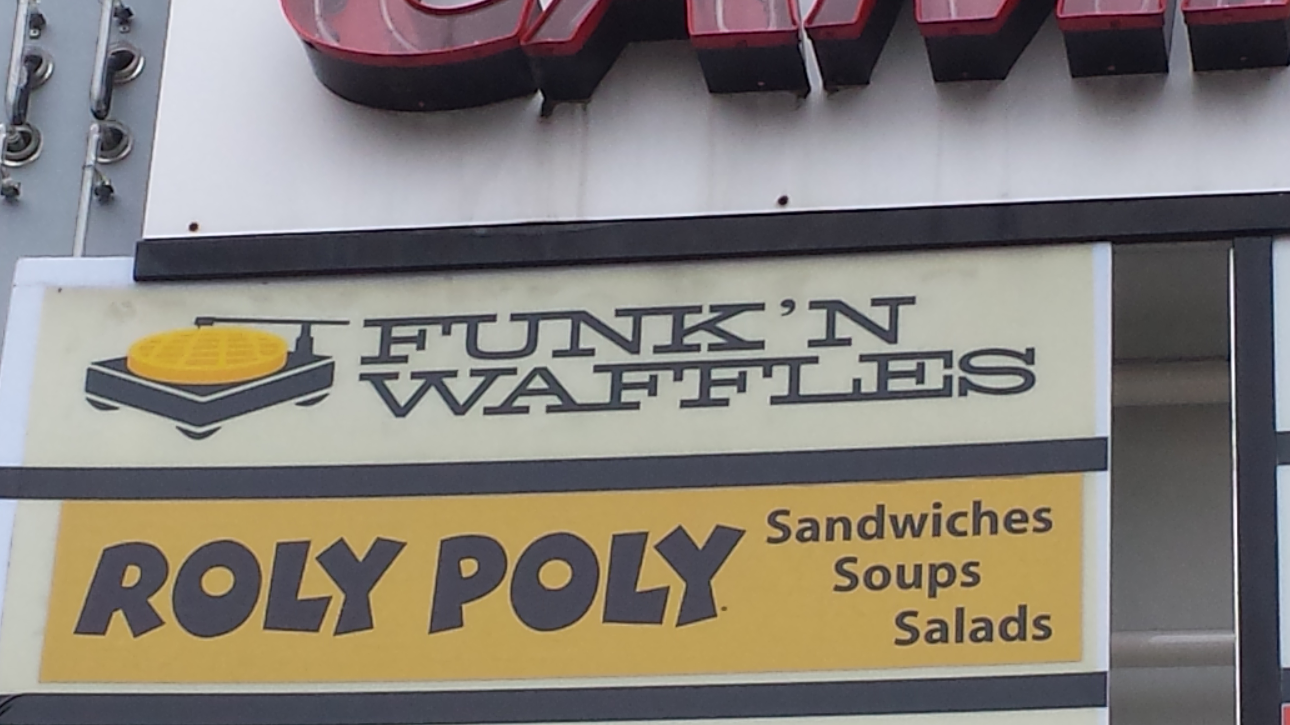
2. Modern Serif type in signage (Funk’n Waffles)
3. Script or cursive type in signage

4. Slab serif type in signage

5. Pictographic logo

6. An effective logo
7. Silhouette form in a logo
8. Analogous color use
9. Complementary color use

10. Color repetition from visual to type

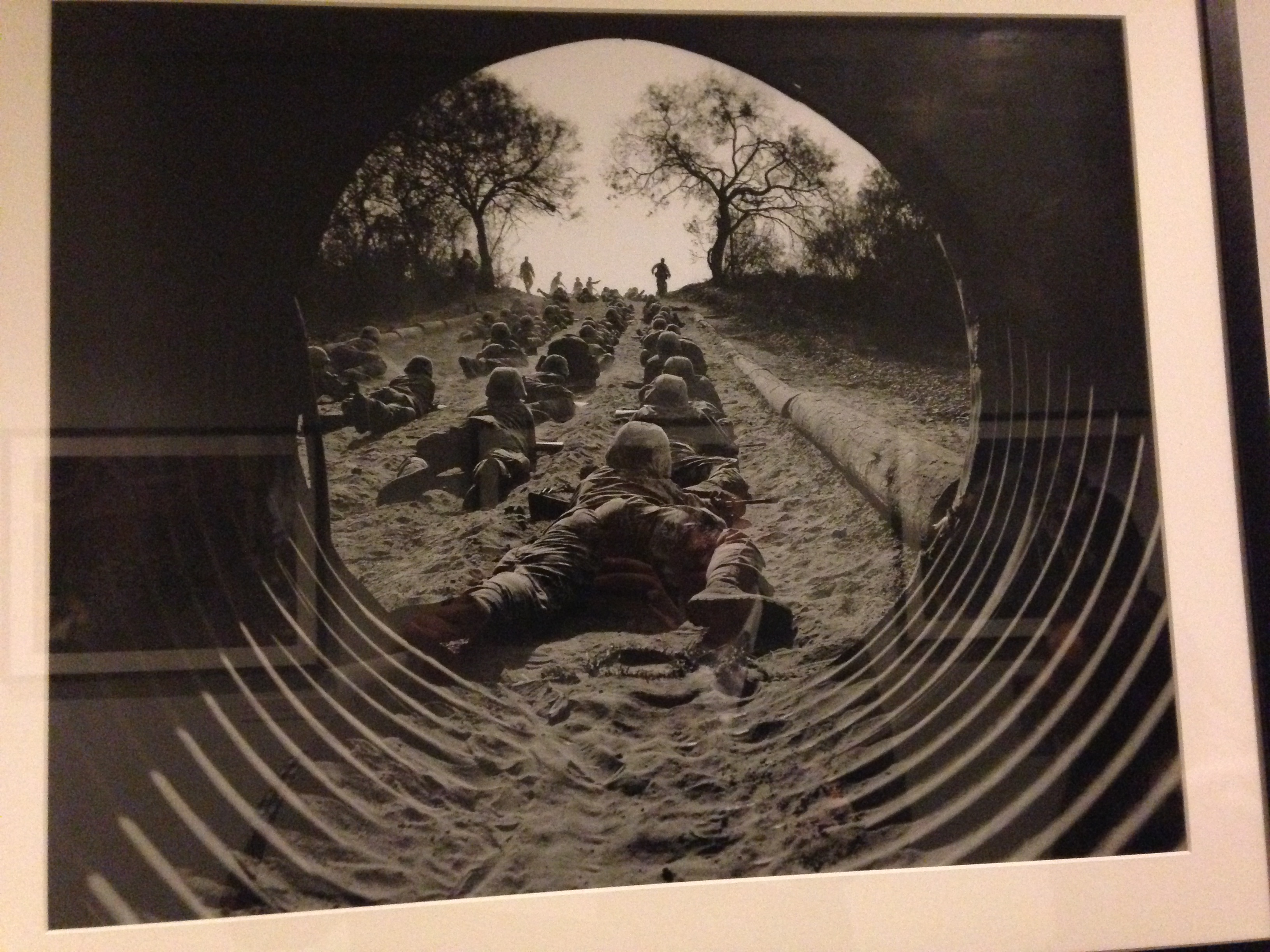
11. Isomorphic correspondence in visual use
12. path or continuation in visual use

13. Word emphasized in type size in a headline display
14. Word emphasized in color in a type display
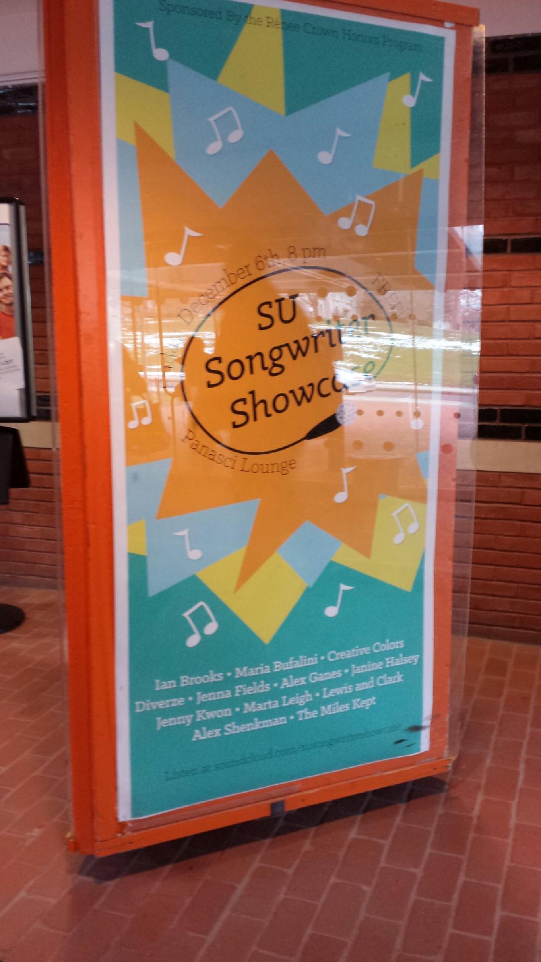
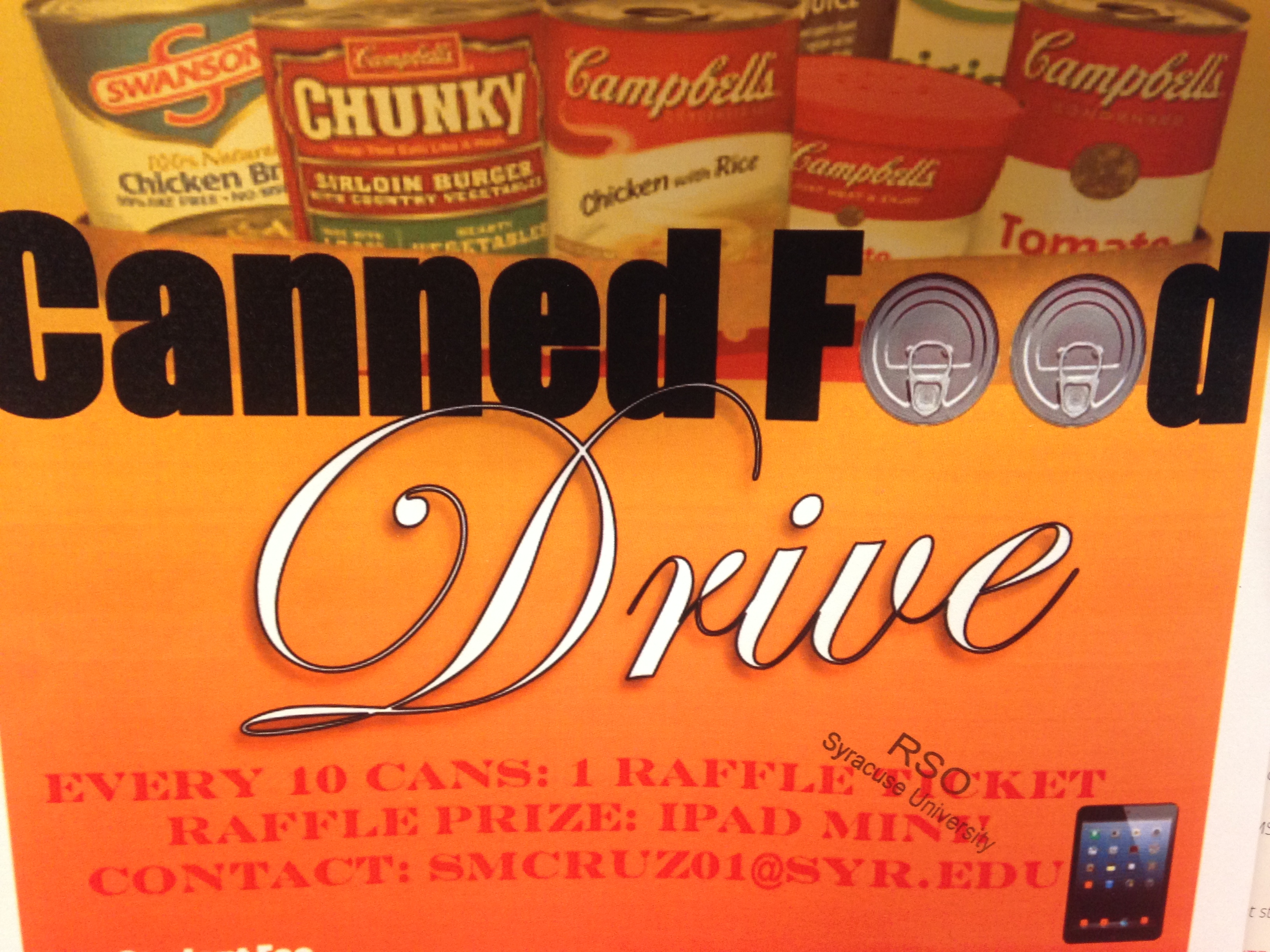
15. A good poster design
16. Use of a picture showing rule of thirds
17. Use of a picture showing leading line
18. Use of a picture showing stopped action

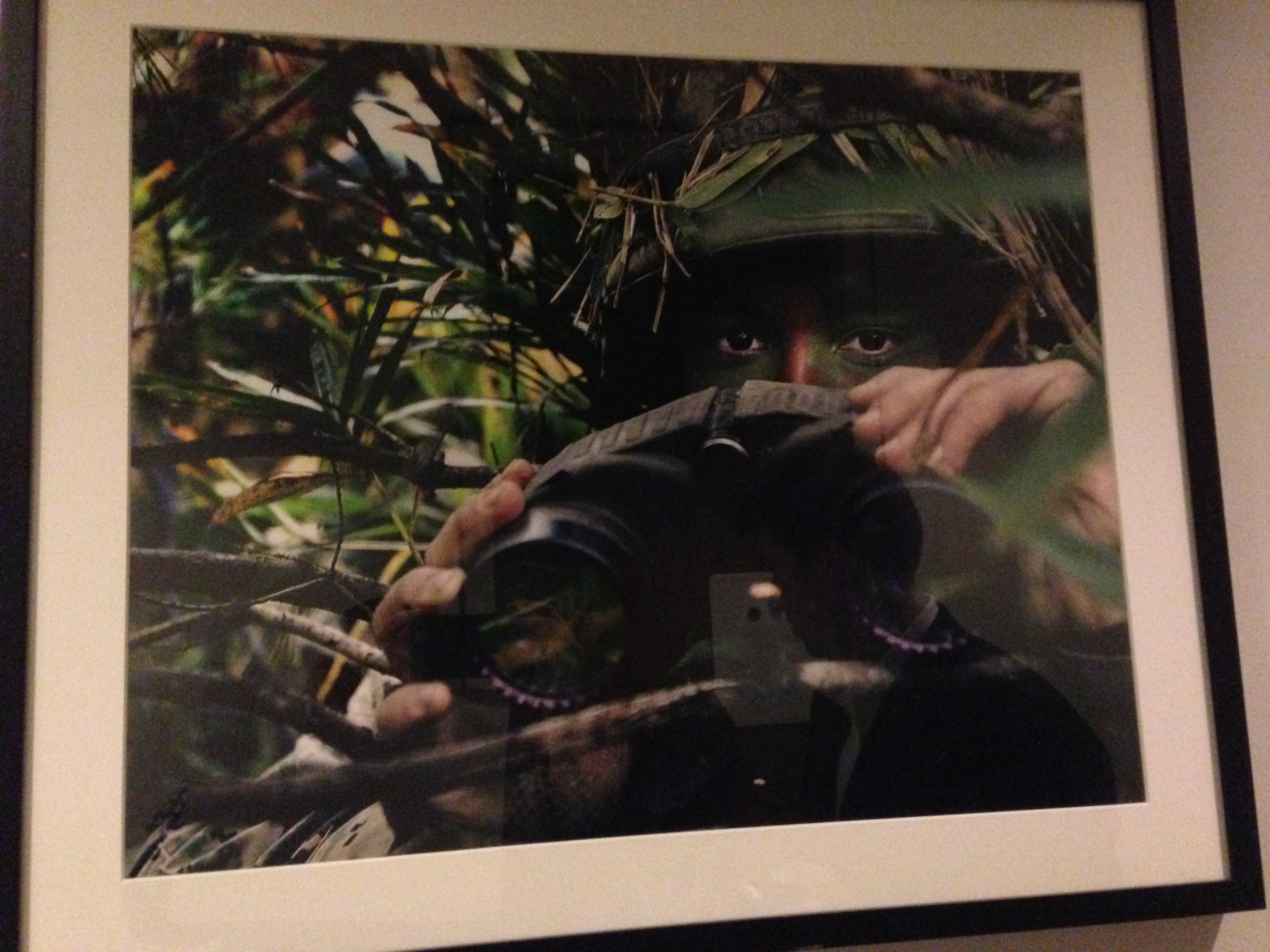
19. An environmental portrait
20. Something in nature that looks like a letter (Y)

Nora Horvath, Emily Capobianco, Dean Carney scavenger hunt
The photos are in order of number.


This is my iPad magazine design on a car magazine specifically oriented towards the drifting car culture. The magazine is called SIDEWAYS.
iPad Mag Cover
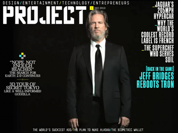
The greatest strategy put into use on this cover would have to be the use of empty space in the background; with all the black space to the designer’s advantage, the text at the front becomes that much more emphasized. The lightly colored text comes out vibrantly against the black background, and the lightly toned face of the subject at the front comes out a lot more against the dark background and the black suit.
iPad Cover
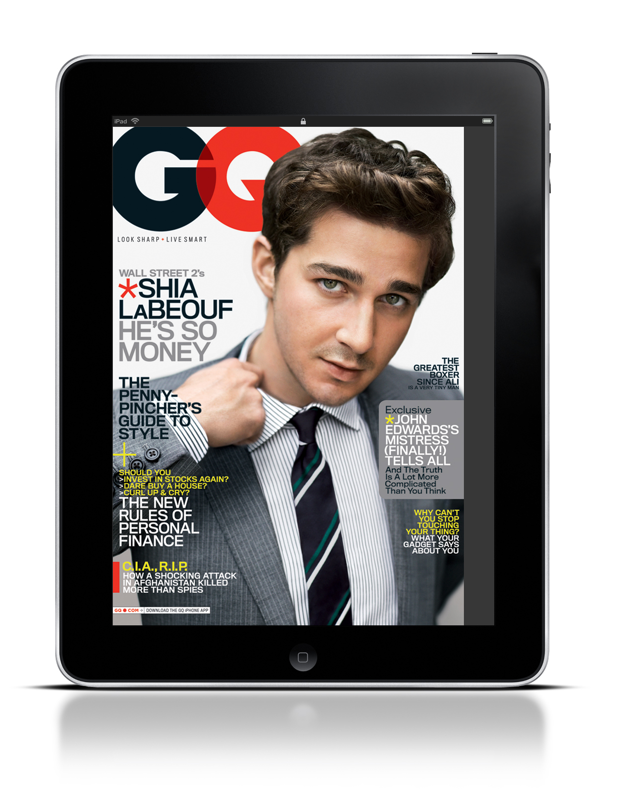
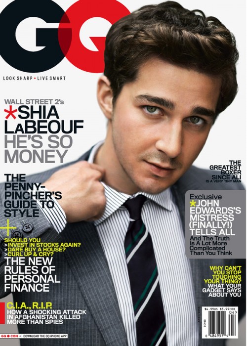
The iPad and GQ magazine use this photo for several reasons. First, the GQ logo leads directly into Shia LaBeouf. As the reader’s eye’s move to the left, they instantly grab the headline and subsequently move down the page, reading each section of text. In addition, Shia’s hand leads directly into another blurb of text. Truthfully, there is no major difference between the iPad and the actual magazine. The only argument for potential difference is that the image may be slightly cropped on the iPad screen.
Magazine Cover

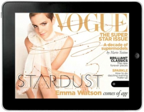
I chose this specific magazine cover because I felt that the designer kept design principles in mind when shooting the photo. The image works both horizontally and vertically in my opinion because the overall image is kept the same, and does not look distorted in the horizontal version. I also liked how the designer used the rule of thirds when creating the horizontal version. I favor the horizontal version because it is less cluttered. I like how type isn’t placed over Emma Watson as much as it is in the vertical version. I also am captivated by the extension of the typography that weaves and winds over the cover. It brings Emma’s potrait in contact with the type, and unifies them which gives the cover an overall more connected feeling.
Headline
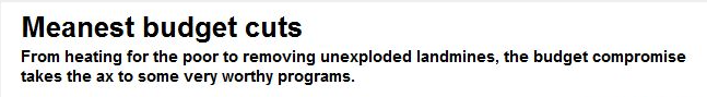
I think the headline relates very well to the deck, with the key word being “meanest”. The cuts that they describe just in the headline, such as cutting heating for the poor, etcetera, tie into the idea of of dastardly budget cuts, and it makes me want to read the article to see what other “worthy” government programs were cut.