From this assignment, I learned the difference between magazine design in print and on tablets. Tablet magazine covers often have fewer (if any) cover lines. Cover lines exist to sell the magazine to the reader, but tablet readers have already bought the magazine and therefore don’t need to be convinced to buy it. Tablet covers often only have an image and the magazine’s name. Also, magazines have unlimited space on tablets so the designers can space out the type by adjusting leading and put fewer elements on each page. Interactivity promotes reader engagement, and allows designers to fit more content on the pages.
GRA 217 Section 5 Group 1
The official blog for GRA 217 with Sherri Taylor


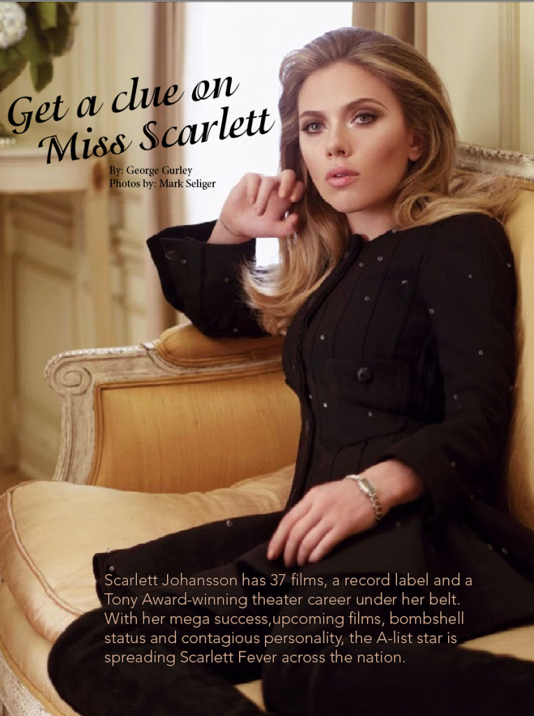
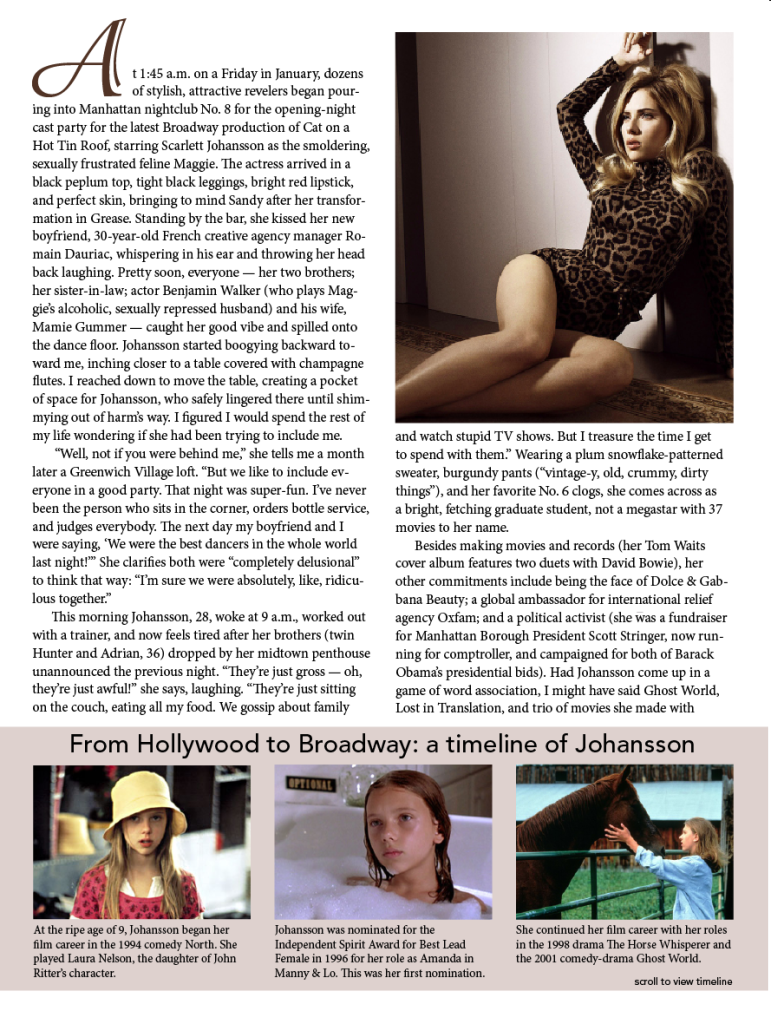
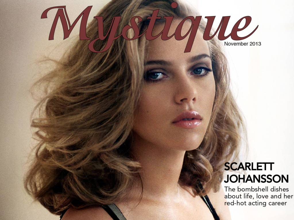
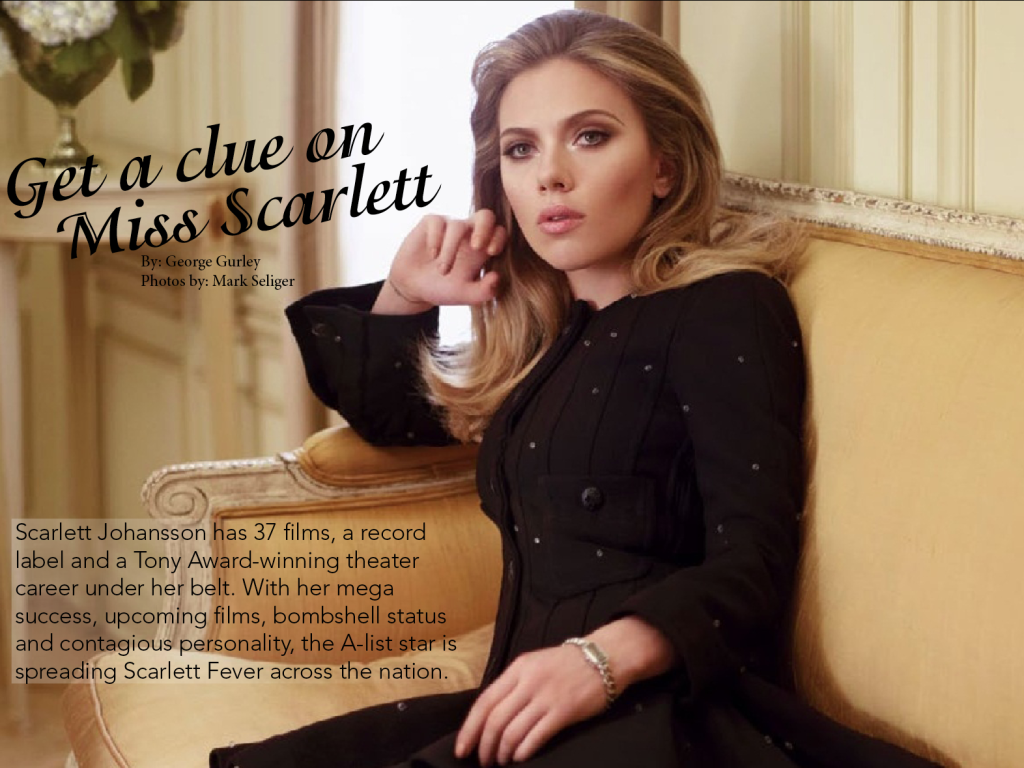
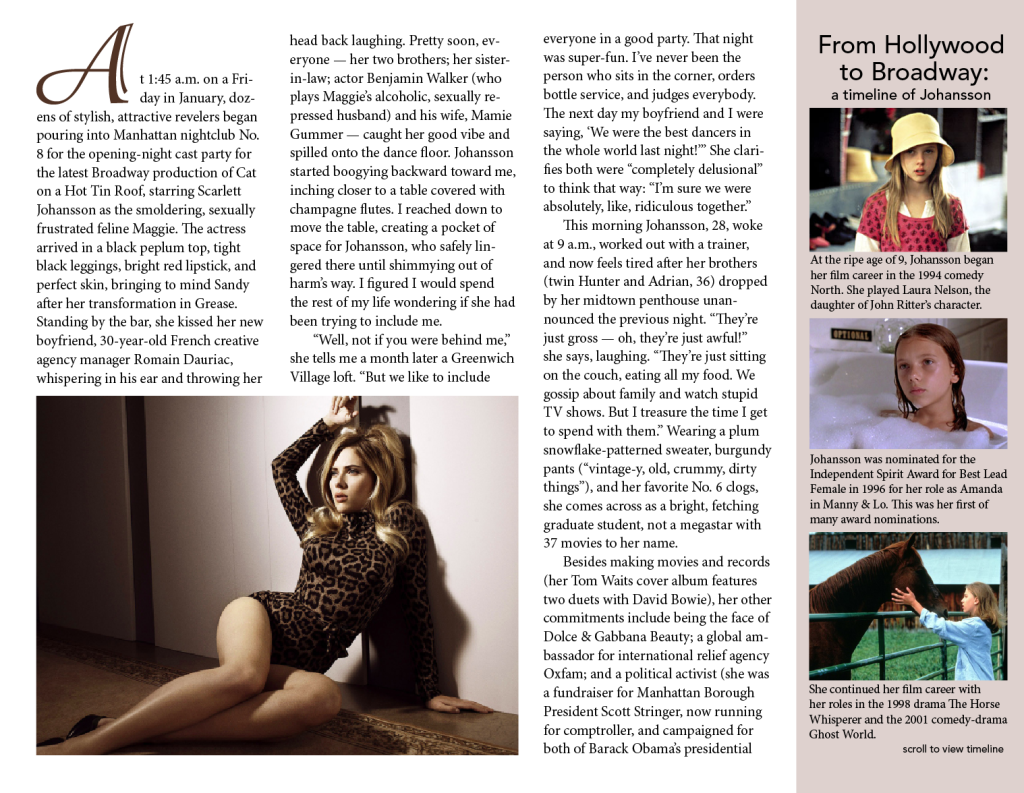


I think the horizontal version of your magazine is still quite effective, as you were able to get even closer to Scarlett Johansson’s face in converting it to a horizontal cover, making it even more personal. There’s only one image of her not posing, which I probably would have liked to see more of. Otherwise, I like the design, and I like the idea of having a timeline to show the range of her life experience.
Firstly, the name of your magazine is very creative and fits perfectly with the type of story you are using. I love the consistency in the colors that you use as well as the types of photos. All the photos you used fit perfectly for both the horizontal and vertical designs, and you also have no widows which makes the page look very structured. The typefaces you use also fit perfectly with the story and are very fun, but yet simple and easy to read.