Before taking this course, I knew a little about InDesign and Photoshop but nothing about Illustrator. Now I feel pretty confidant about using all three programs. I learned that creating a visually appealing design isn’t easy; designers have to think about color, typefaces, visuals, making sure the page is navigable and not overly crowded, etc. I never realized the importance of white space before, and I used to fill almost every inch of the pages I designed with content. Now I know that simpler is always better. Also, I learned how about all of the different typefaces available, and which ones are suitable for different occasions. For example, I know now that modern serif typefaces are used for fashion publications, and script typefaces are not effective for headlines. I will use what I learned in GRA217 through the rest of my school and professional careers.
Author Archives: Nicole Harris
Magazine Tablet Design


From this assignment, I learned the difference between magazine design in print and on tablets. Tablet magazine covers often have fewer (if any) cover lines. Cover lines exist to sell the magazine to the reader, but tablet readers have already bought the magazine and therefore don’t need to be convinced to buy it. Tablet covers often only have an image and the magazine’s name. Also, magazines have unlimited space on tablets so the designers can space out the type by adjusting leading and put fewer elements on each page. Interactivity promotes reader engagement, and allows designers to fit more content on the pages.
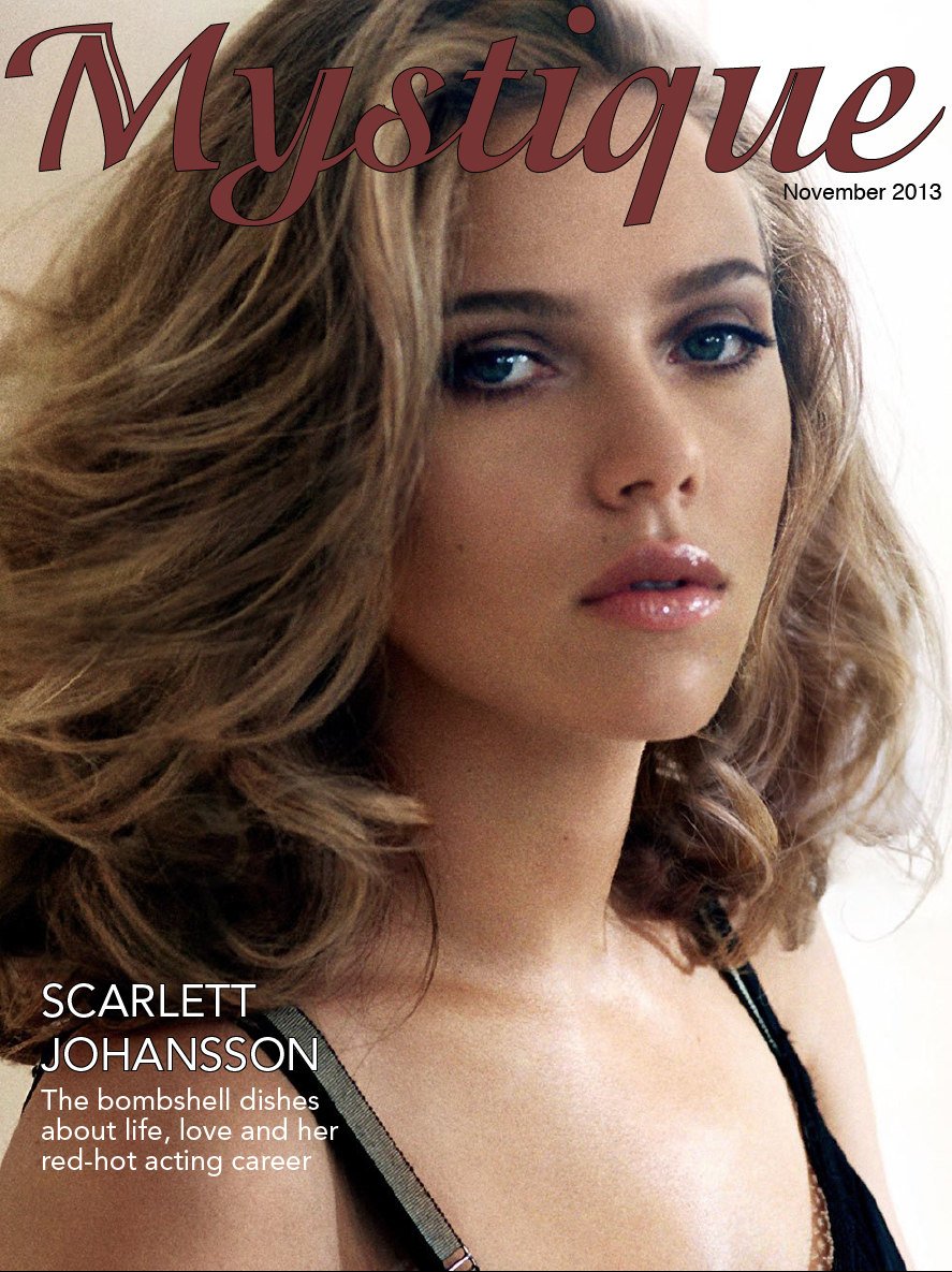
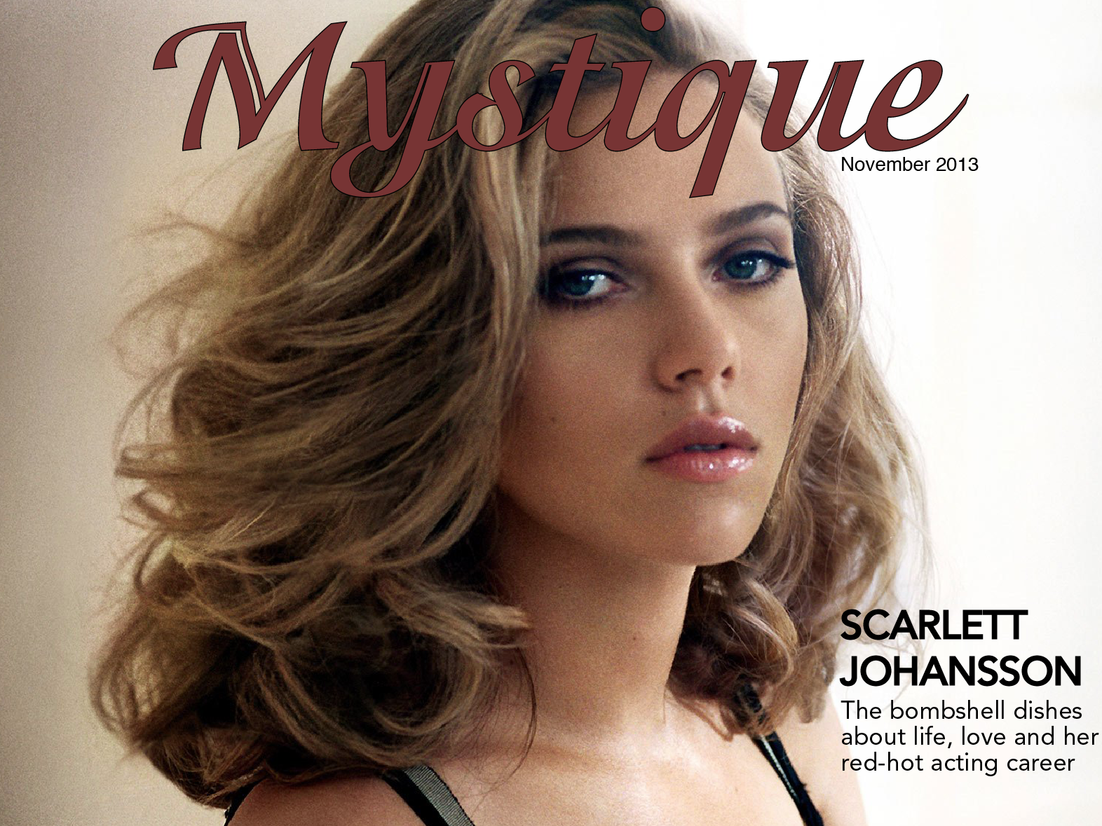
iPad Magazine Cover
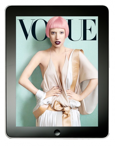
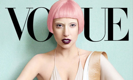
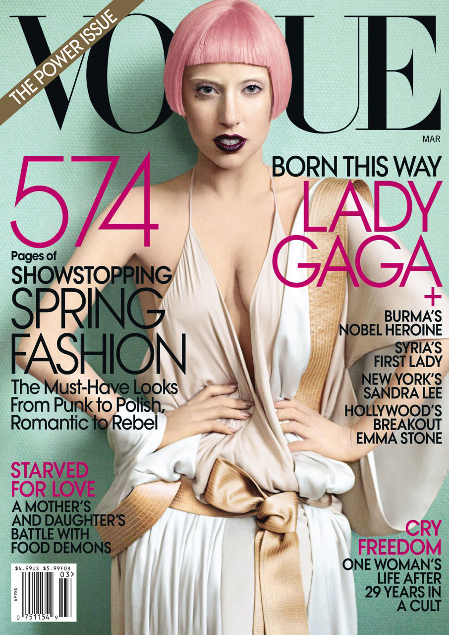
I chose an issue of Vogue with Lady Gaga on the cover for my iPad magazine design. As you can see, the iPad versions of the cover are significantly different than the print cover. The iPad covers are simple with no cover lines – only the magazine name and the image of Lady Gaga are displayed. I think the cover of the print edition looks way more crowded and less appealing due to all of the cover lines, plus the bar code and “The Power Issue” banner. The Lady Gaga image works well both horizontally and vertically. For the horizontal, the designer simply cropped Lady Gaga at her chest so the focus is solely on her head instead of her whole body. With the image cropped so closely, it looks balanced and clean in the middle of the horizontal iPad cover, and there is no need to fill extra white space. The image also works well because Lady Gaga’s head takes the place of the “G” in Vogue. Her shadow makes the cover look dimensional and interesting instead of flat.
Magazine Headline/Deck
Headline: Good Golly Miss Miley!
Deck: Pop music’s wildest child knows what you think about her – and she totally doesn’t care
(From a Rolling Stone article about Miley Cyrus published October 2013)
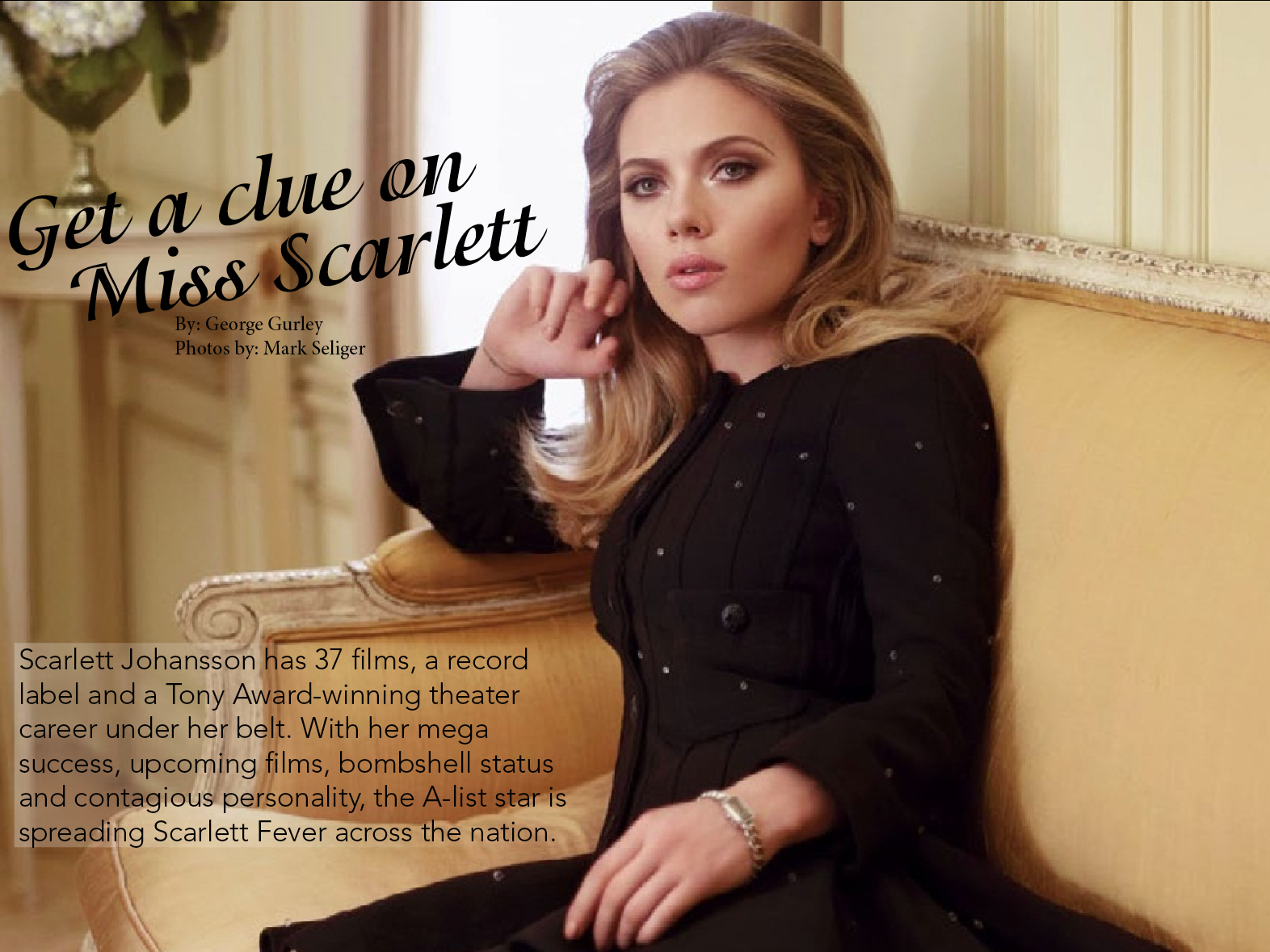
Magazine Spread
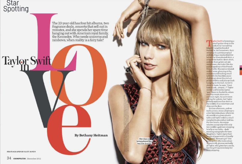
I think this magazine spread is very creative and eye-appealing. Although the feature runs on two pages, the elements work together to create a sense of unity. For example, Taylor Swift runs through the gutter of the spread, connecting both pages together. The image of Taylor also separates the elements in the page. The headline and deck are on her left, while the actual story is on her right. This method ensures that the two elements don’t mix together. The headline design itself is very creative as well. It takes up lots of space and commands reader attention, though doesn’t overpower the photo. The color scheme of the word “love” ties in with Taylor’s dress nicely, and the stacked and overlapped letters create a graphic, artsy feel. The silhouetted photo of Taylor keeps the page simply with its size and lack of background, and her draped hand leads the eye to the headline. Finally, the small elements of the page (like the author’s name placed within the “e” and the red dropcap at the start of the article) make the page look complete against the white background.
Web Interface Project
Personal Logo
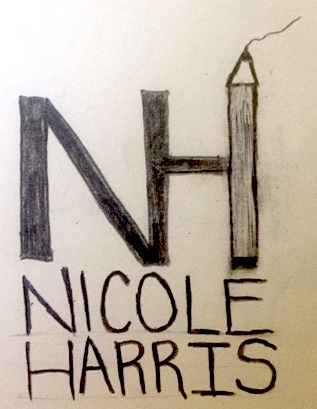
Since the my initials (N and H) both have long straight edges, I decided to combine them so one side of each letter is connected. In my logo, you can easily distinguish between the N and the H but still see them as one unit visually. I wanted to incorporate a symbol of writing in my logo, since I’m majoring in magazine journalism. I made the other edge of the H into a pencil. The squiggly line coming out of the tip makes the pencil look like it’s writing. I also wrote out my name underneath the design, aligning each letter since my first and last name form a true perfect and both have 6 letters.
Resume

Photos in Web Design
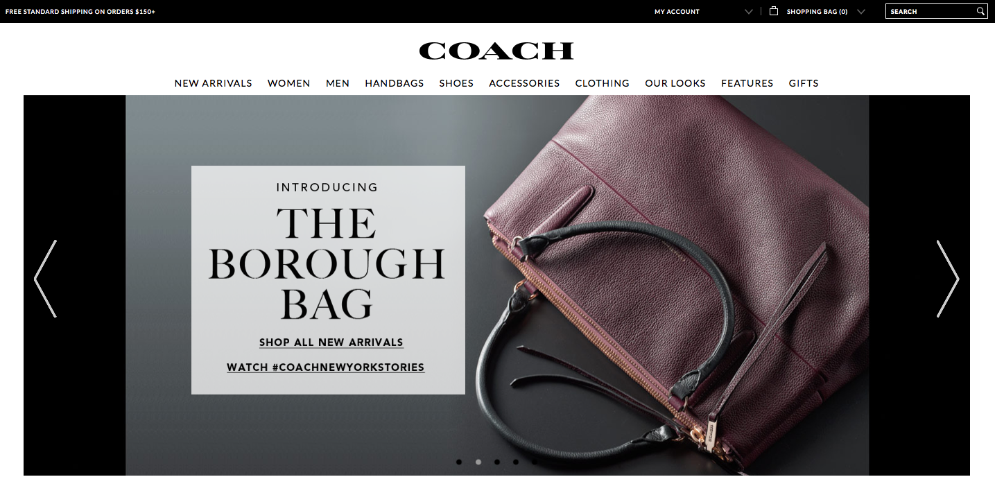
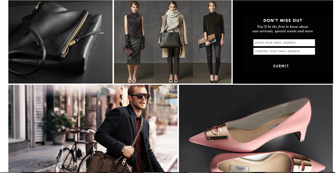
The Coach website relies on photographs to display the products and create visual appeal. The home page is basically a collage of many different photographs. The top photograph, which fits the width of the page, advertises a new or popular product. The colors are warm and neutral, which makes the photo stand out of the page and draws the eye. Since the photo consists of many colors and patterns, black text is placed in a semi-transparent cream-colored textbook to ensure the text can easily be seen and read. The photograph also balances the page because the text box and woman are placed in the correct locations in accordance with the rule of thirds.
Under the large main photograph are other photos placed in a collage-like way with thin white borders between them. The color scheme of these photos is the same as the color scheme of the main photo, which creates connection and visual appeal. Lack of text ensures that the site looks pretty and simple instead of overwhelming.
The target audience of the website is women with enough money to buy expensive handbags, shoes, accessories, etc. The designer chose these images because they display the products and also show the class and sophistication of the brand with darker lighting, neutral colors and simplicity. The photos work together with all of the other elements on the page to create a sense of unity.
Gestalt Principles
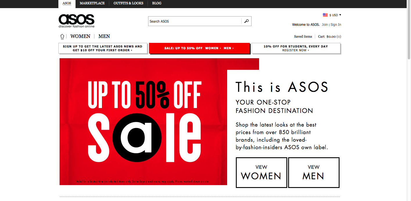

The website I chose was Asos, an online fashion store. The website design relies on simplicity and a black/white color scheme, and incorporates gestalt principles.
Figure and ground: Asos uses simple black text, which stands out against the white background. Occasionally, white text is placed against a colored background, such as red or white, to make the text pop.
Proximity and alignment: A clean, round sans-serif font is used throughout the website. The typeface is the same as that of the Asos wordmark. All of the text is aligned to the left. Almost all of the type is black against a white background.
Continuation: Two drop down menus (“women” and “men”) display different types of clothing that people can shop for. Also, news is placed in a sidebar down the right side of the home page, and also in a horizontal box along the bottom of the page. The viewer of the website can scroll down to access more content.
Visual hierarchy: The headlines are bolded and capitalized, which shows dominance over the body text, which uses a lighter weight and a mix of caps/lower case letters. Although most of the website uses black text over a white background, important content uses white text over a red or colored background. Also, key information is much larger on the page.