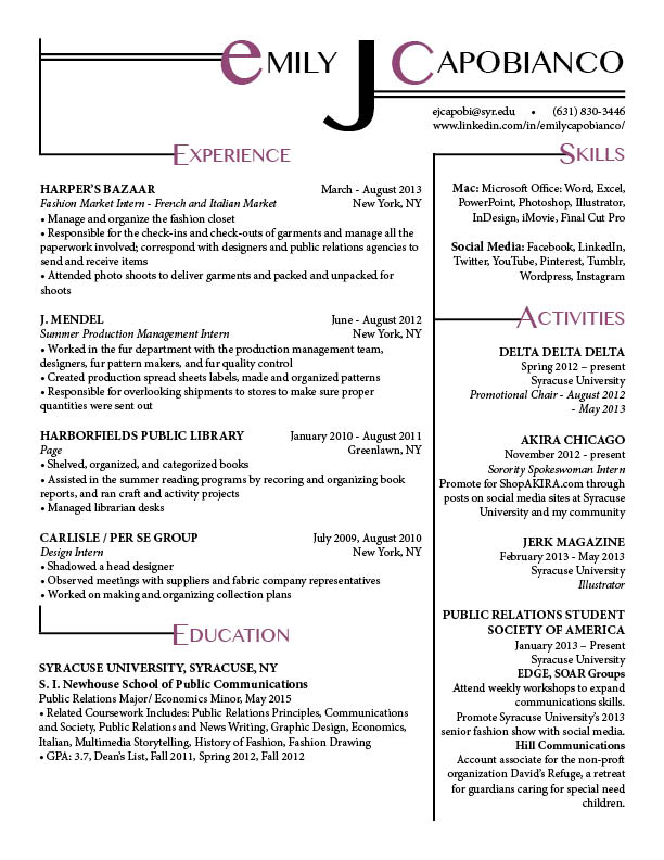
The part of the resume that sticks out to me the most is the initial J for your middle name. This brings the reader’s attentions right to your distintive wordmark. In addition, the use of the purple/pink color for the headings allows the reader to easily transition from one section to another, especially with the black lines guiding the eye directly to them. Overall, a very good resume that would catch any recruiter’s eye.
Kevin is right the word mark is expertly crafted here. Also you do an incredible job of filling the space on the sheet. I especially like how the designs you used to create borders for the different sections are seem to connect. It is fun to look at. The only issue I can see is that the wordmark is completely uniform except for the first “e” it is the only lowercase letter in the wordmark. Otherwise, really nice job with this.
This is a very creative and interesting looking resume. By scrolling through all the submissions, you can tell that this one stands out because of its ability to draw the viewer in. The typography is very cool and fun while the body texts are cleanly organized and easy to read through.