
This class was actually very helpful and I learned a lot from it. First off, I learned all the programs in the Adobe suite and how to use them. I was knowledgable in Photoshop but now having knowledge about the other programs I realized which I prefer and what each program is better to handle. I learned a lot about typography and what fonts to use where and when. Also, I learned what makes a visual aspect effective, especially with advertisements and magazines. I thought it was also very helpful to know how to make a graphic. I thought the resume project was the most beneficial because it is something we could use in the future.
Author Archives: Emily Capobianco

Headline and deck
 This headline and deck work well together because the headline tells of who the article is featuring and what they are focusing on. Then the deck compliments and furthers this, describing more specifics and who will be interviewing the subject, Kate Winslet.
Logo
![]() For my logo, I wanted to make my name look cohesive, because it’s a good way to draw the reader in and get the whole picture. I liked the use of my full first name, because that is more important to me. I then connected the last letter of my first name with my single initial of my last name to have the eye read from first to last name. I like this simple font because it was easy to manipulate, however, I may explore more diverse fonts for the future.
For my logo, I wanted to make my name look cohesive, because it’s a good way to draw the reader in and get the whole picture. I liked the use of my full first name, because that is more important to me. I then connected the last letter of my first name with my single initial of my last name to have the eye read from first to last name. I like this simple font because it was easy to manipulate, however, I may explore more diverse fonts for the future.
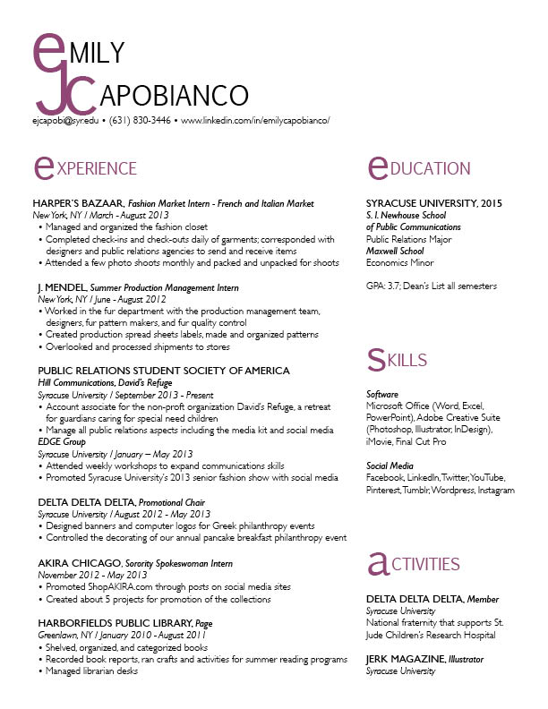
Resume Re-do
Website photography

Toms is a company that sells shoes. However, they are unique in the fact that with every product that is purchased, TOMS helps one person in need – their one for one movement. The photography that’s used on their site for the One for One homepage is very effective. It is showing three young kids laughing and smiling that seem to not be in a wealthy society. But even still their happy, which portrays the image that the One for One mission brings kids in need happiness. This creates sympathy and shows people that they should buy Toms products to give back and help others. The colors are incorporated throughout the page, the orange in the header and text, the blue and green for the fill of text boxes. The colors of the photograph itself are cohesive and is an aesthetically pleasing image to look at. Warmer colors are easier to look at – the color palette of this photograph. This creates a cohesiveness throughout the page. It is also on the top portion of the page which immediately draws the eye in.
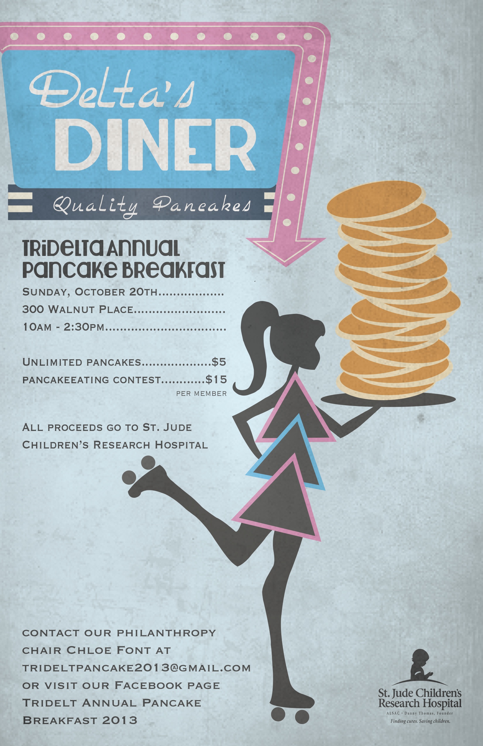
Poster Design
Gestalt Principles
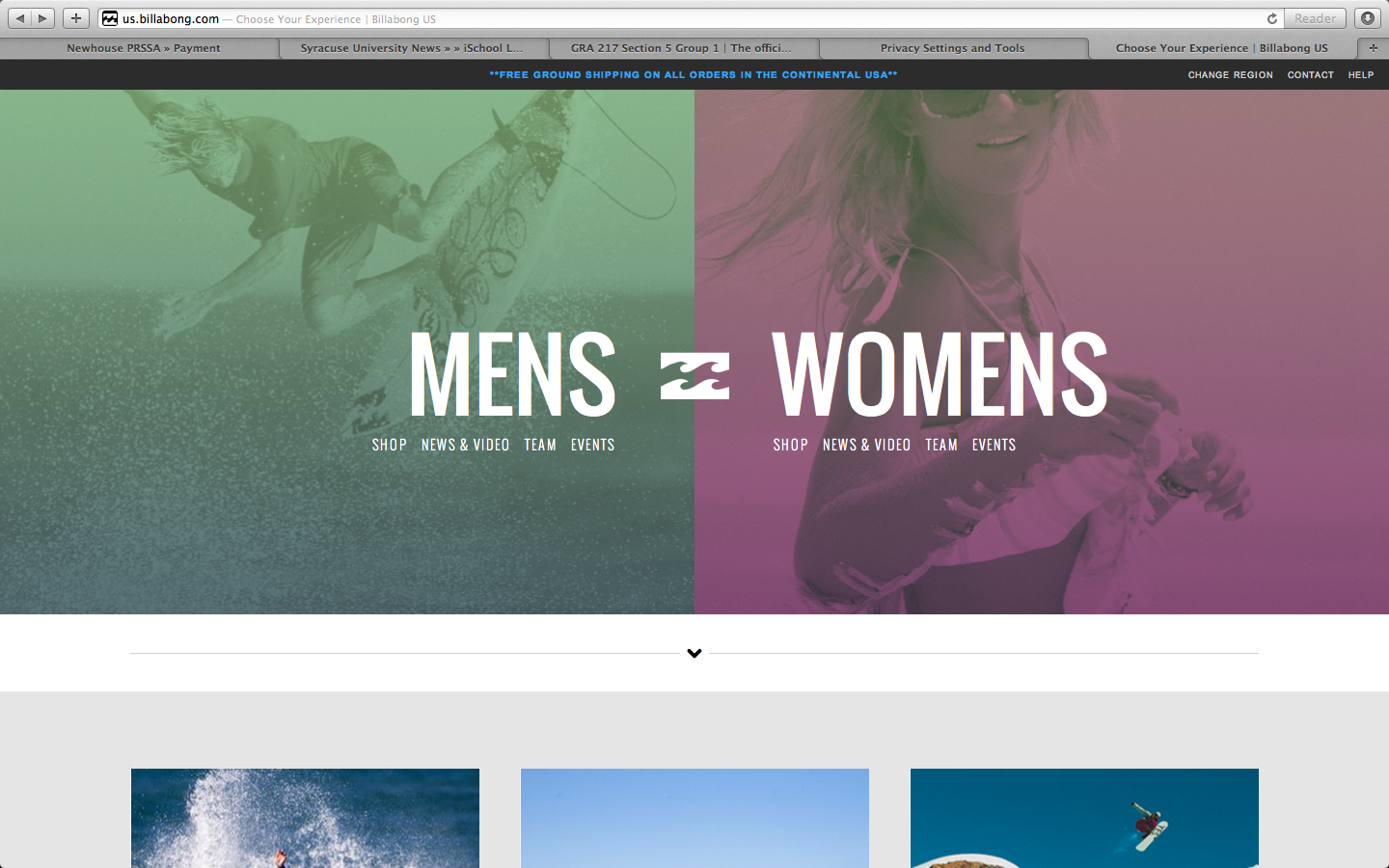
The apparel website Billabong shows the qualities of the gestalt principles, and how the site is organized with visual elements.
- figure and ground: The image in the background makes the text in the foreground stand out. The background is muted colored images, providing a strong contrast with the bold white text over it.
- proximity and alignment: The same font, color, and alignment are used to create unity. This sans serif all caps text creates cohesiveness, and isn’t overwhelming because it is a simple font.
- continuation: The line of larger text, also in line with the logo, creates the first line for the eye to follow. The line of text underneath, in the smaller font, provides a second line to follow.
- visual hierarchy: The two lines as stated previously show readers the order of what is important. The larger words, MENS and WOMENS, show the main categories that the website is organized by. Underneath these words, in the smaller font, show the subcategories of the words in larger font. These provide a breakdown to follow after you have decided to focus on the MENS or WOMENS category.
Website design
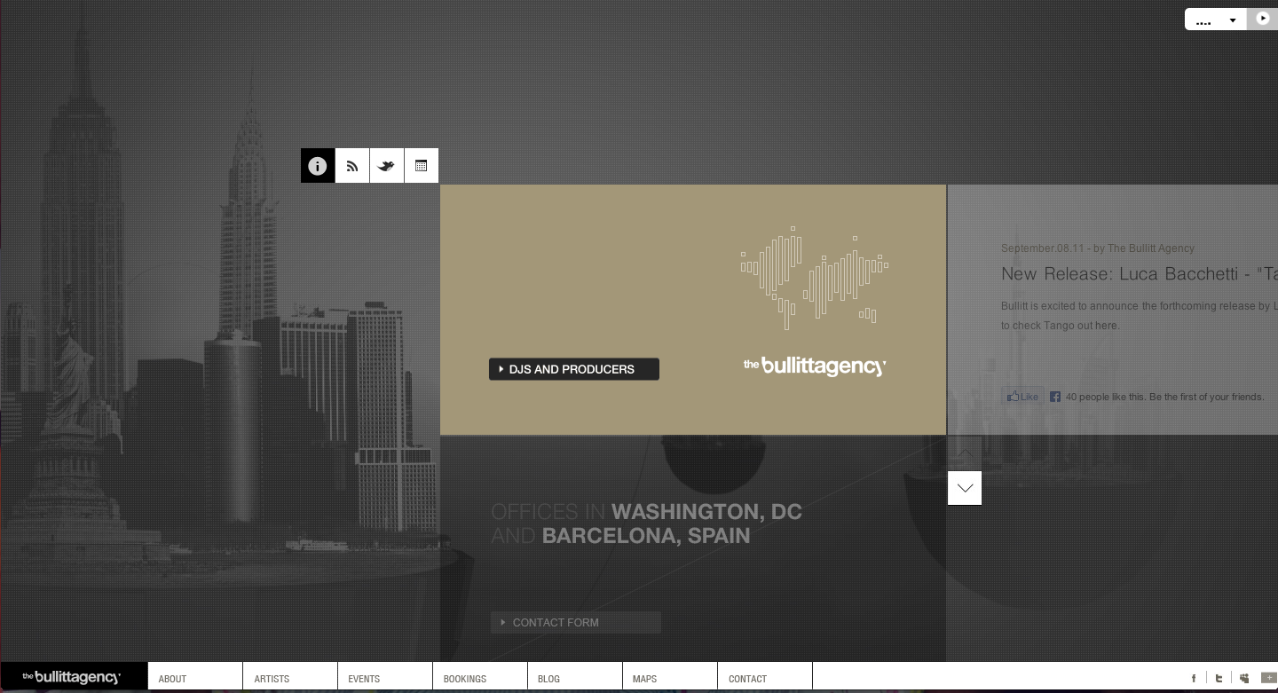
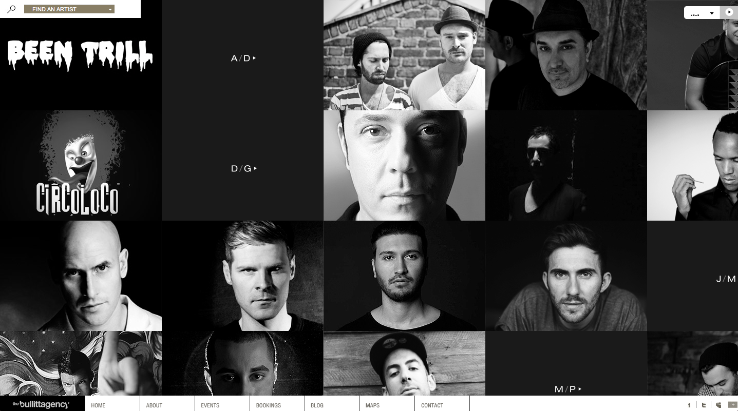 This website design for The Bullitt Agency is really intriguing. First off the home page is visually appealing with plain but contrasting colors. The background is photographs of different cities, representing their global presence. On all the pages, when you hover your mouse over a box it changes appearance giving more information or presenting a different image. Also, the page with the artists and events shows a picture instead of just text, which gives a visual, something that viewers like to see to make a connection. The colors throughout the site are very simple, but it relates to the agency for DJs and Producers, a technologically based company, which the colors mirror. They also have a tab to their blog which is very helpful to viewers. Also, as you move your mouse over the page the page interactively moves with you, which is interesting because it shows that there’s more on the page than the eye can see.
Illustrator Design
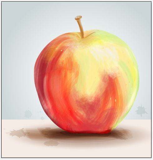 The effect used to create this apple image is very interesting because it looks like a painting, however was just done on illustrator. To do this, you would trace the outline of the apple with the pen tool, then create a bristle brush with the brushes panel and choosing the round fan option. Adjusting the opacity of the brush tool gives variation in the strokes. By overlapping the brush strokes there will be different saturation of color, while changing the color of the stroke to create the multiple colored effect the apple shows. You can paint in white for highlights on the apple to show a 3D effect. I believe you would either delete the image of the apple before painting in the colored strokes, or decrease the opacity so you have a reference to go off of. This whole effect was done with only a few tools on illustrator and gives an image a whole new look. This look is very loose and light and is visually appealing because it resembles a painting.