I really like the color you used for the design and the design itself that comes off of the wordmark. The typeface you used works for the resume, however, there is no contrast between the typeface you used for your wordmark and the one you used for your body text. Also, I love the green border around the education, but it’s the first thing I look at on the page. Maybe you could include the skills in the box too so that the box takes over the right side of the page and makes it even. In the end, this is a great resume.
I think Eric’s resume is clean and professional, and that his font choices make the information easy to read. I like how he added the design at the top (the color makes it a little fun), however it might be more effective if the design lines up with the “E” in his wordmark, instead of sitting slightly below it. I also think that using the green box definitely makes the “education” stand out next to the experience section, but he should try including the “skills” section in that box as well.
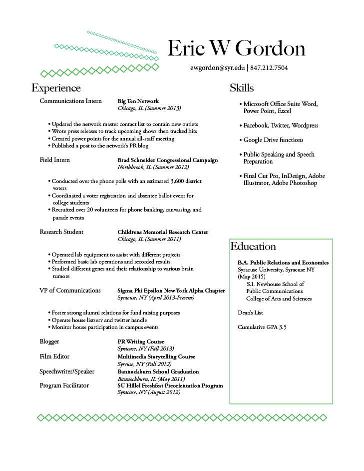