
Author Archives: Eric Gordon
What I Learned
To be completely honest I was dreading this class all summer. I had taken a class in adobe illustrator my sophomore year of high school and knew that I had a tough time with these programs. But I actually learned a lot more than I thought I would and really kind of enjoyed the whole experience. I learned a lot about typography and how the typeface and kerning and leding can all make such a enormous impact in the text you are trying to display. I learned about visual hierarchy and the gestalt principles. And most importantly I learned how to use the basic programs in the adobe design platform. I had a lot more fun playing around with these than I thought I would and even though they are frustrating because they are so advanced, I feel as though I managed to get a decent grasp with all three.
Paul Strand: The Mexican Portfolio
Paul Strand’s exhibit of a depressed and desperate world captured through a set of photographs taken during his two year stint in Mexico provided a very interesting viewing experience. There was not a single picture of a person smiling, and many pictures did not have any people at all. While this depressed and dark state is a trademark of Strands, it is significant that he shows the upset faces spanning across a number of different people. There was “Woman with Child” “Man with a hoe” and “Boy-Uruapan” among others of these very serious and upset looking people.
It is unclear as to whether Strand was trying to broadcast some greater point about these people because the pictures in the exhibit of landscapes were not sad or solemn by the same means. These pictures, while not quite beautiful, showed a open and thriving landscape that is uniquely Mexican.
All of the pictures are taken in the same faded brown duotone which also adds to the viewing effect. With this combination of colors it almost seems like there are no colors at all. They do not register because it is so earthy and plain.
Overall, the Strand exhibit does not spark a sense of enjoyment or even pleasure, but it does interest the viewer. The stern faces and the empty but culturally significant landscapes along with the shots of street murals or statues give the viewer a vivid picture of the world Strand lived in for two years. I believe that this is the intention. It is not create a sense of pity for these sad faces, it is to show that this is the life they live and this is what they do.

This cover for Billboard magazine features U2 front man Bono mid concert in a cool action shot. Both designs use the photo for several reasons, first Bono’s head fits perfectly into the “o” of Billboard and his arms not only lead our eyes to the title of the magazine but they frame it as well. The only major difference between the two layouts is the horizontal layout crops Bono’s legs out of the picture. This is ok as all of the action, emotion and intensity of the image comes from his top half. Also the typeface of the deck head on the horizontal version is slightly smaller than its vertical counterpart but is still big enough to draw attention and generate interest.
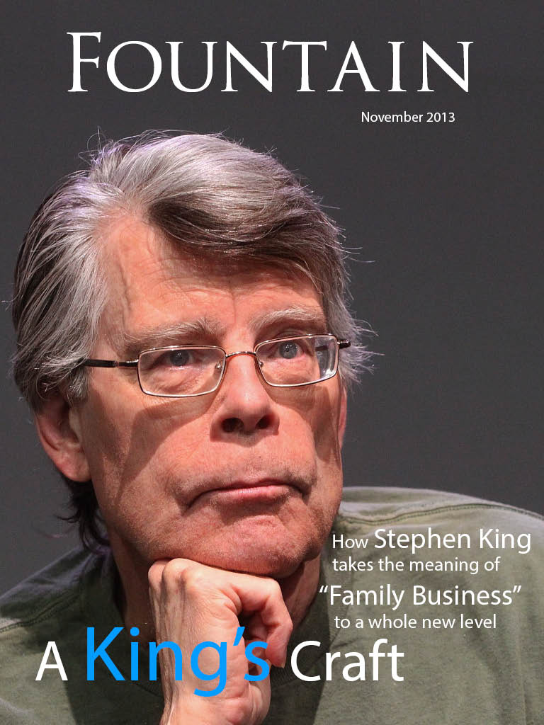
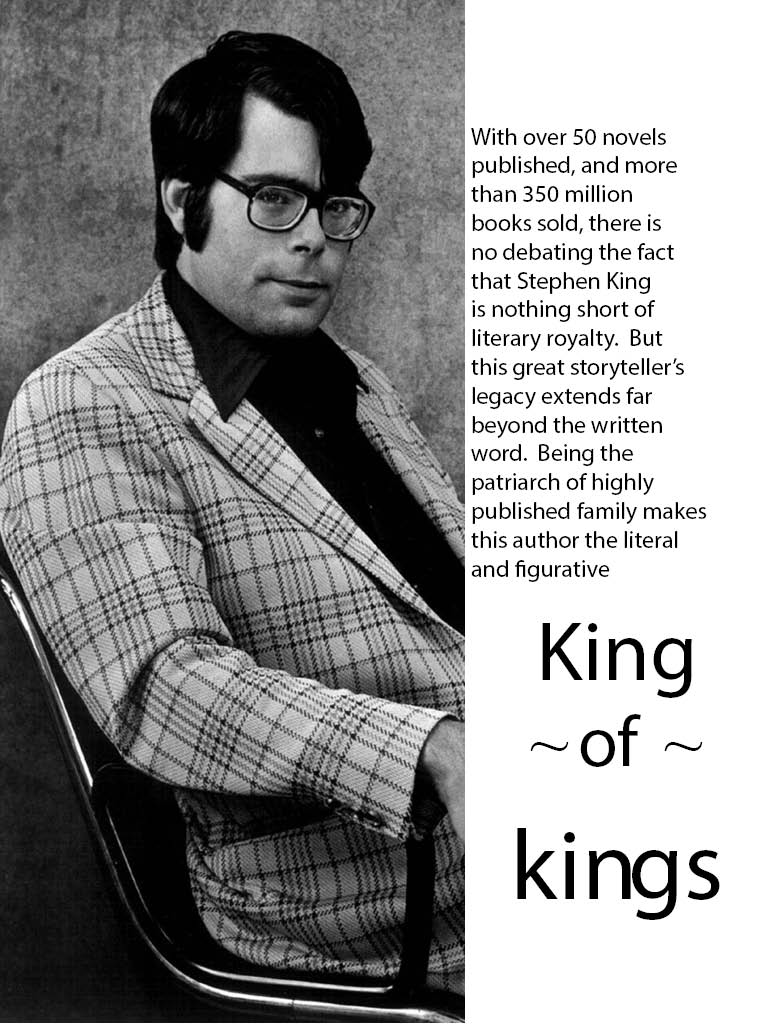
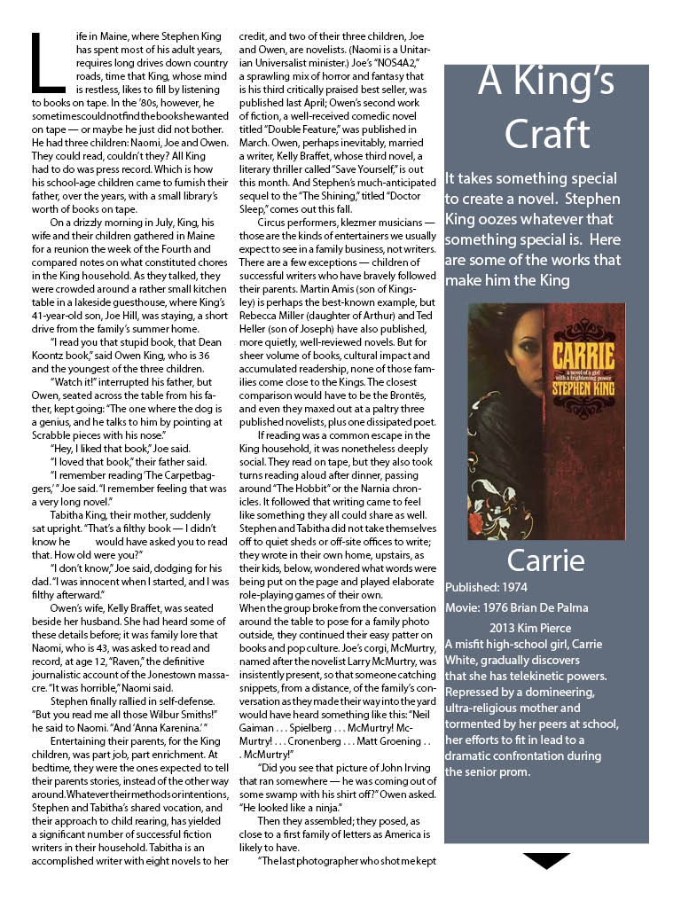
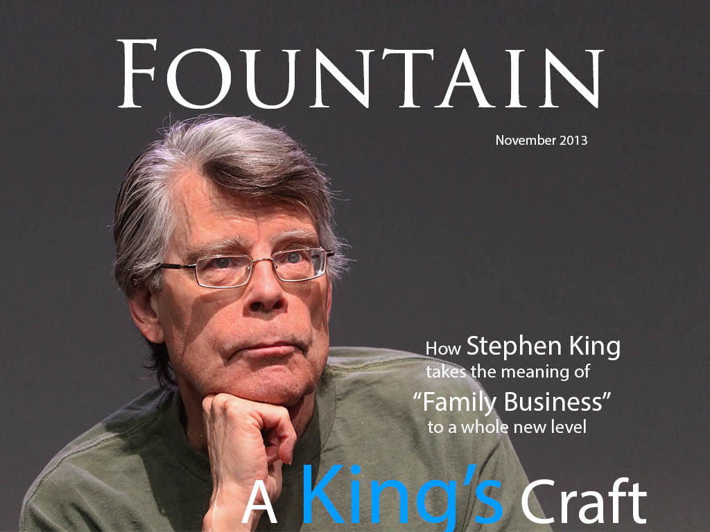
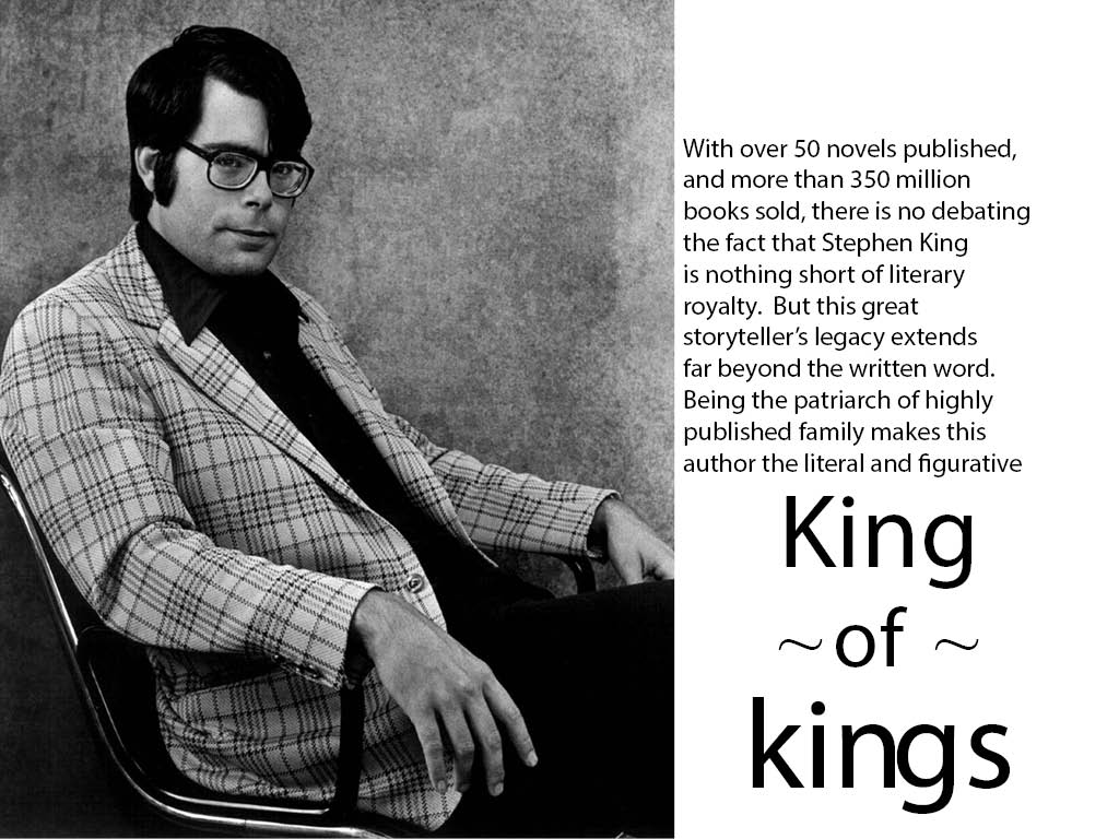
NYT Magazine: “Stephen King’s Family Business
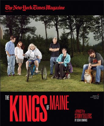
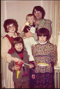
Over the summer the New York Times Magazine published a feature story of The legendary family of authors headed by Stephen King. The spread was very simple but the color scheme was dark and the pictures old and eerie in a similar fashion to his writing style. The article gave timeline info on King’s career and the progression of his family. The pictures are intriguing because they show a very interesting family. They are the main guiding points of the article and most of it is consumed by the text.


Web Design Gestalt
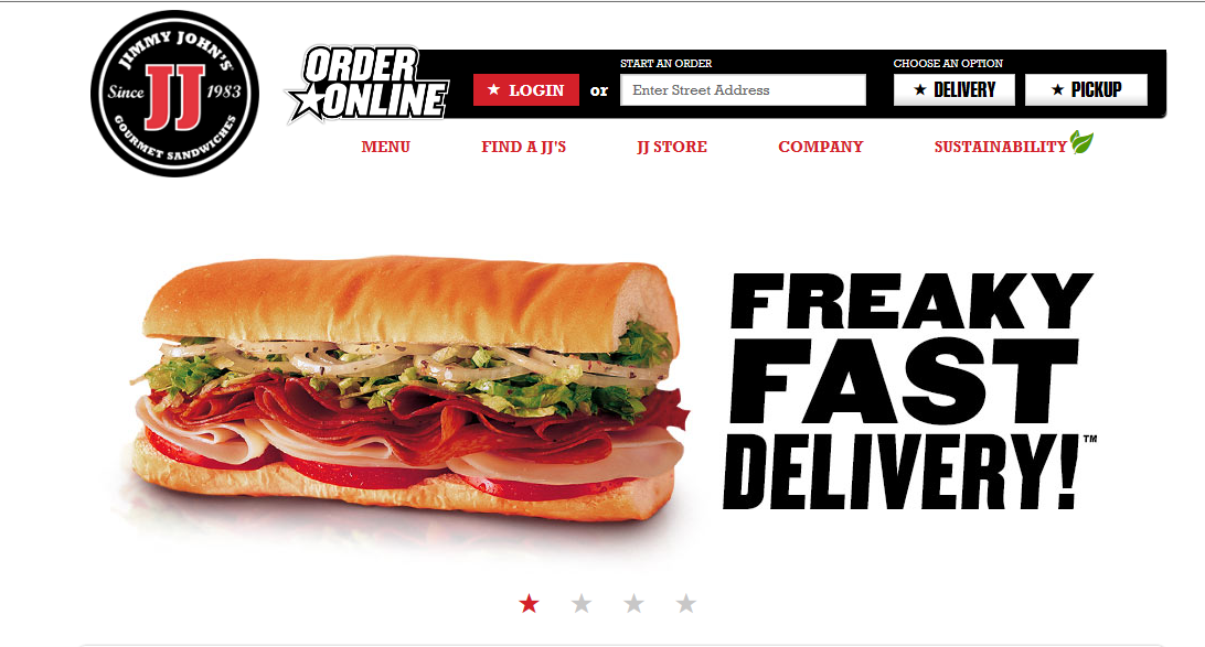
FIGURE AND BACKGROUND: The obvious figure in this case is the sandwich. The background is completely empty which lends further focus to the details of the sandwich and how delicious it looks.
PROXIMITY AND ALIGNMENT: The header, which lies next to the sandwich is in a font that carries all capitals that are thick and strong. There is a slight tilt to the right which suggests motion. These sandwiches are FAST. The menu comes in a different typeface and different color. This creates a contrast to let the viewer know exactly what each component is
CONTINUATION: There is not a lot of content on this page and the simplicity lends to the viewing pleasure. All of the information is grouped neatly at the top right corner in the information bar. To the left is the Jimmy Johns logo and then there is nothing else. Everything is tied together in one continuous form.
VISUAL HIERARCHY: The clear and dominant component of this web page is the sandwich. It dominates the scene with all of its colorful greasy and delicious detail. The web page is an advertisement for the product itself. This is the first and last thing you will see with continued glances back at it during the visual scan of the rest of the page.
Eric Gordon Poster
Web Design Post
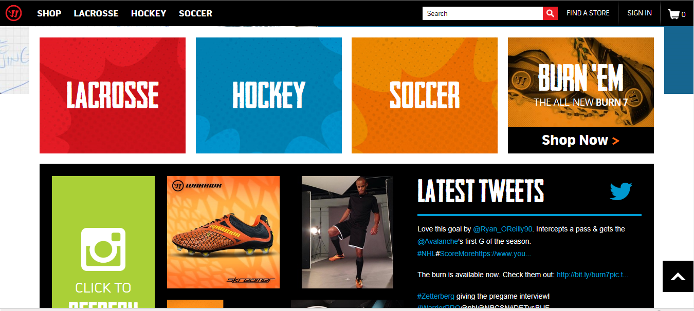
This website uses color scheme and font to appeal to its specific audience of customers. Lacrosse players commonly wear funky shorts with loud colors in absurd combinations. In the same way, this website uses sharp designs and vivid clashing colors to look cool to the lax bros. The menu at the top offers drop options in the same format. While the color on these is not as loud and prominent as the menu on this main page the font is strong and all caps. It is the same aggressive and fun format.
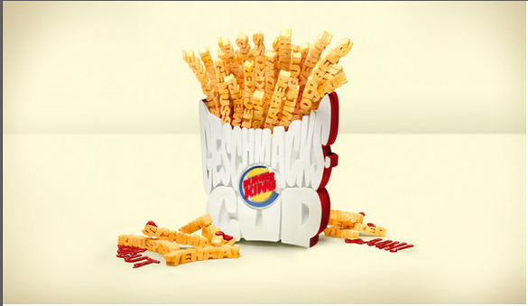
This typographical deign of an order of fires from burger king uses a clever set of bold all caps typeface to represent the popular side order. The typeface is big and fun, just like an order of fries at burger king. However, the design is not spectacular because it is quite difficult to read what the fries are saying. This makes it difficult to interpret exactly how the order of fries is meant to appear. This is actually a fairly major flaw in the design because it interferes with our understanding of the poster. While the idea is clever, the poster itself simply does not work.