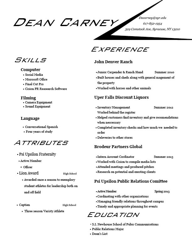
Fairly speaking, the resume itself is ok. It’s pretty clean. You use the margin very well. However, personally I am not a big fan of italic letters. It makes your resume somehow look unprofessional. Your use all of the bold, regular and italic letters in your resume but it seems too much. Secondly, your resume is like half and half. It makes people lose their focus. They don’t know which section they should emphasize on. You need to highlight your experience and education section. Thirdly, there are some dead ends in your sentences, too. It’s not very reader-friendly.
I think your resume is very cool. I don’t know why it makes me think of auto race. I agree with Nan Ding that your resume is like half to half, so it’s a little difficult to figure out which part you want to focus. Personally speaking, I think it will be better if you could make the experience section larger if you want to emphasize that part. I like your design of that arrow, your contact information. It helps people look at the below information. All upper case letter makes me feel a little hard to read, but if you want to consist with your wordmark, I think that’s fine.