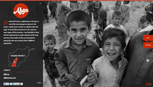
This website is designed to teach people the dangers of living in the featured province in Afghanistan. The website features only black and white pictures that are the full size of the page. I think this is powerful because the image dominates the page and there is no captions/thumbnails/frames/other text to detract from them. The black and white also limits the amount of things the eye needs to look at. A person’s eye isn’t darting around the pictures looking at all the different colors, instead they can settle in and focus on the closeups of the children’s faces. Also, this website uses just pictures to teach people and convey a message. Aside from the one paragraph of text that is set over the image on the left, there is nothing else besides this.
GRA 217 Section 5 Group 1
The official blog for GRA 217 with Sherri Taylor


I also think that the splashes of red paired with the black and white photo are very effective. It gives it a sense of urgency. I also agree that this photo works because it focuses directly on the children’s faces, and they are making eye contact. It speaks to the viewer, creating a sense of empathy. The photo was taken from a bit of a bird’s eye view, making it look like the children are looking up to you (literally and figuratively).
I think this photo is very eye-catching and effective. The website relies on three colors- black, white and red. Since the image is grayscale, it fits with the color palette of the site and creates simplicity, which draws the viewer in. I think the black-and-white effect on the photo makes a greater impact, allowing people to focus on the message of the photo instead of the colors or details. The pops of red on the website provide contrast to the grayscale photo and allow for easy access to the website. In addition, the perspective of the photo puts the children in a position of helplessness, which demonstrates how much they need the viewer’s help. The rule of thirds ensures that the focus of the photo is on the children’s faces.