
The biggest thing I learned this semester was to take advantage of white space. I didn’t realize how much impact a simple, minimal design could have. Going into this class my thoughts were to add and embellish and use effects and colors and repeat images. While yes, these effects might really add to a piece, they’re only going to add to something if they’re used in moderation. Under-designing can in fact be better than over-designing. Before, I may have thought that once I finished a design that I should look it over and think, what else can I add? Now, when making this evaluation, my thought will definitely be, what can I take out?
Author Archives: Julia Burns
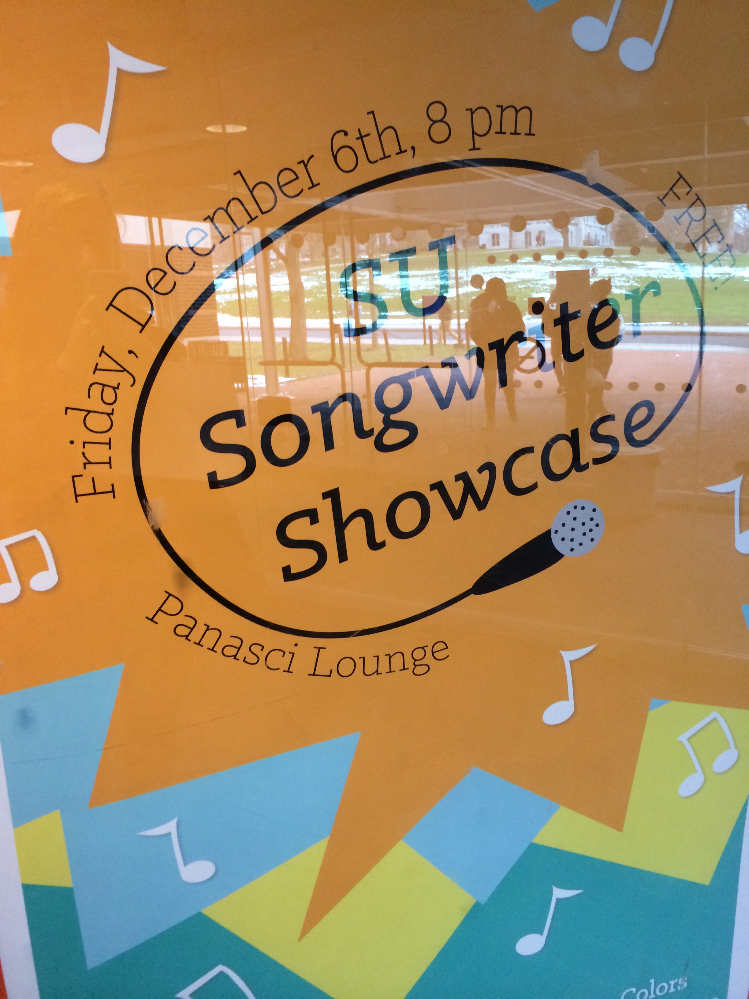
Scavenger Hunt by Julia, Julie, Rosalind & Austin
6. Effective Logo
10. Color repitition from visual to type
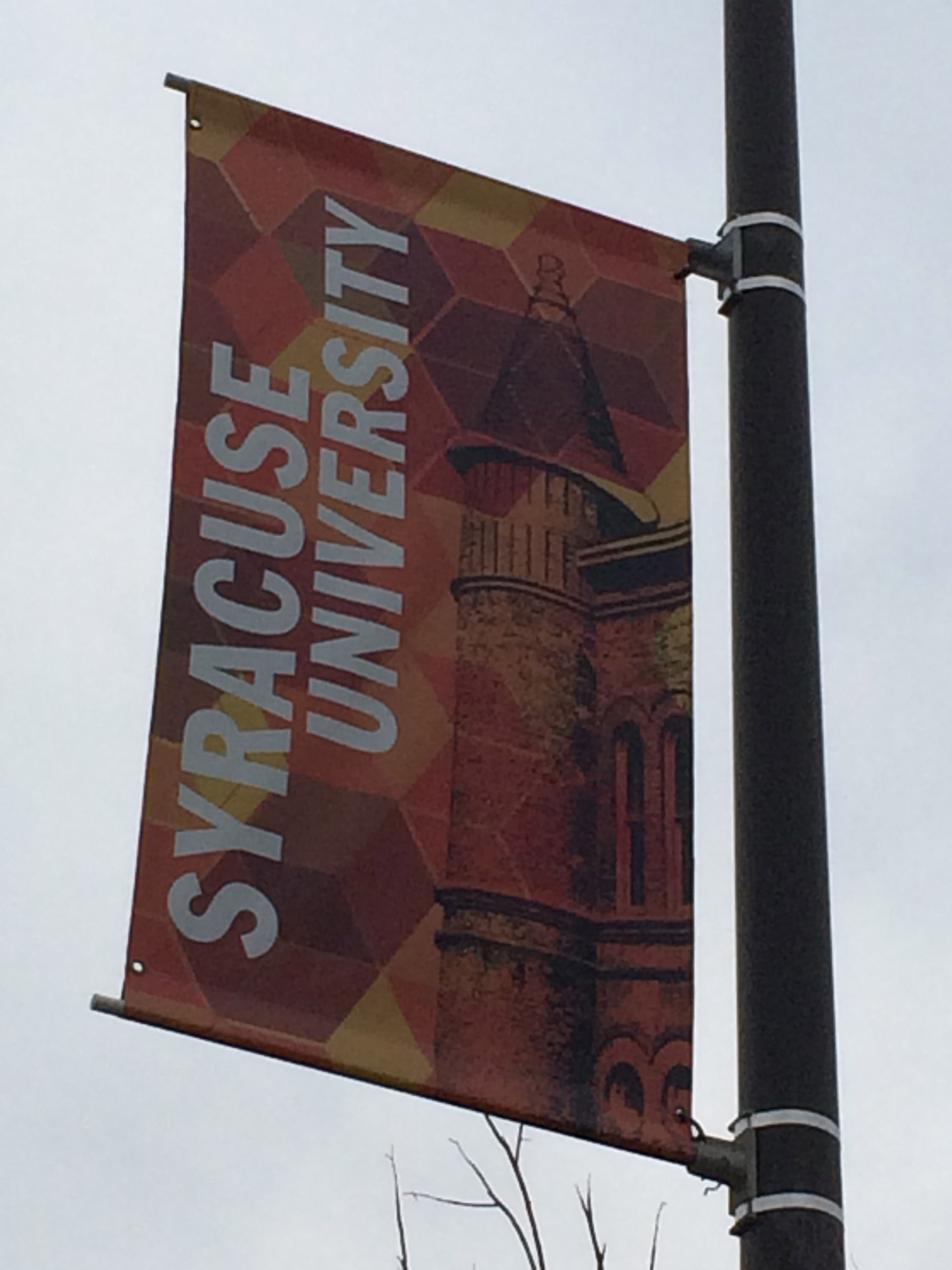
2. Modern serif type in signage
16. Use of a picture showing rule of thirds
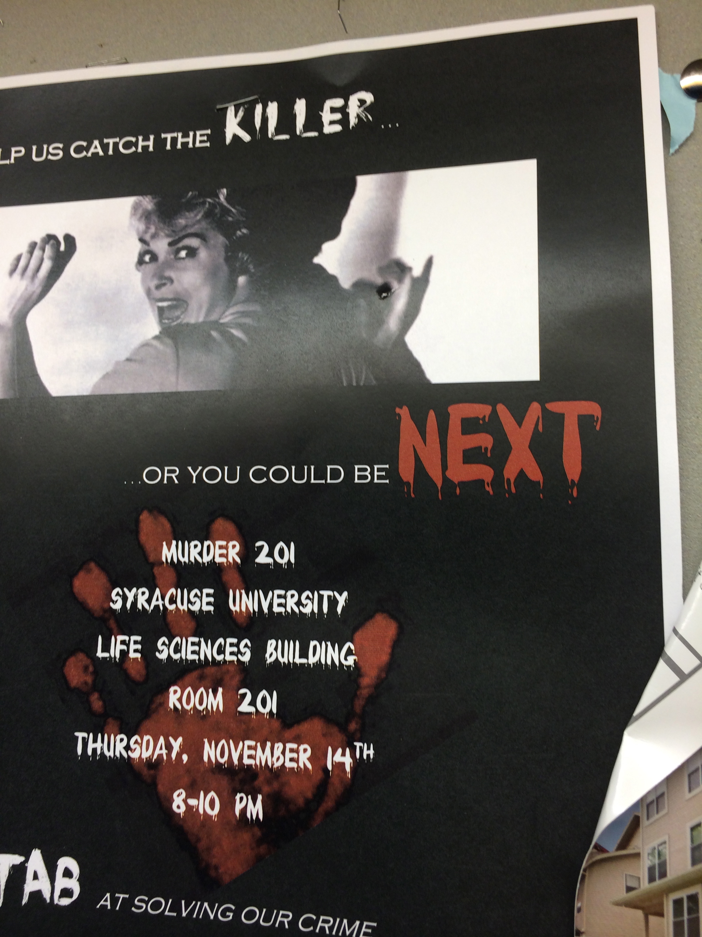
19. Environmental portrait
12. Path or continuation in visual use
14. Word emphasized in color in a type display
4. Slab serif type in signage
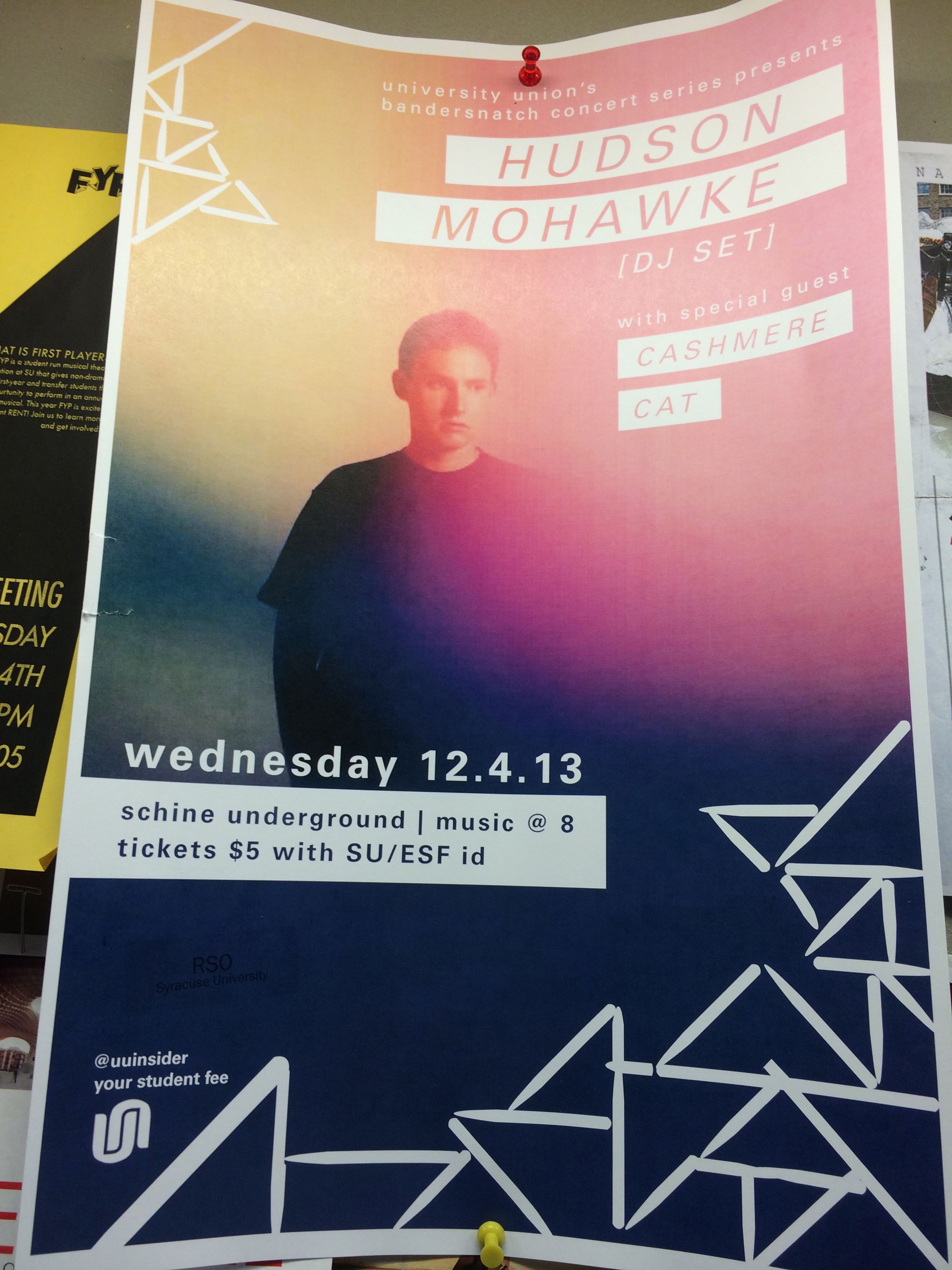
15. Good poster design
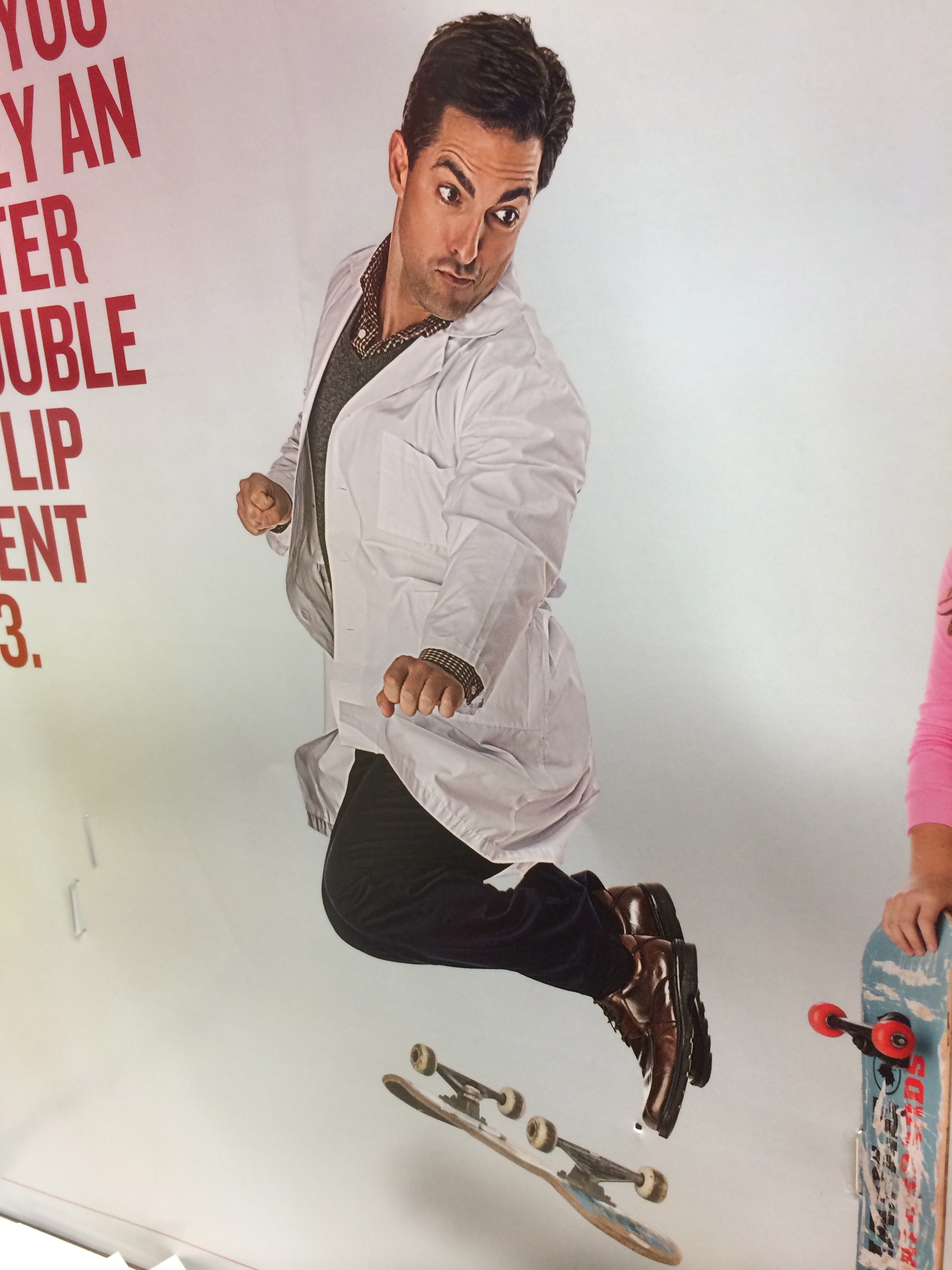
18. Picture showing stopped action
13. Word emphasized in type size in a headline display
8. Analogous colors
5. Pictographic logo
7. Silhouette logo
11. Isomorphic correspondence
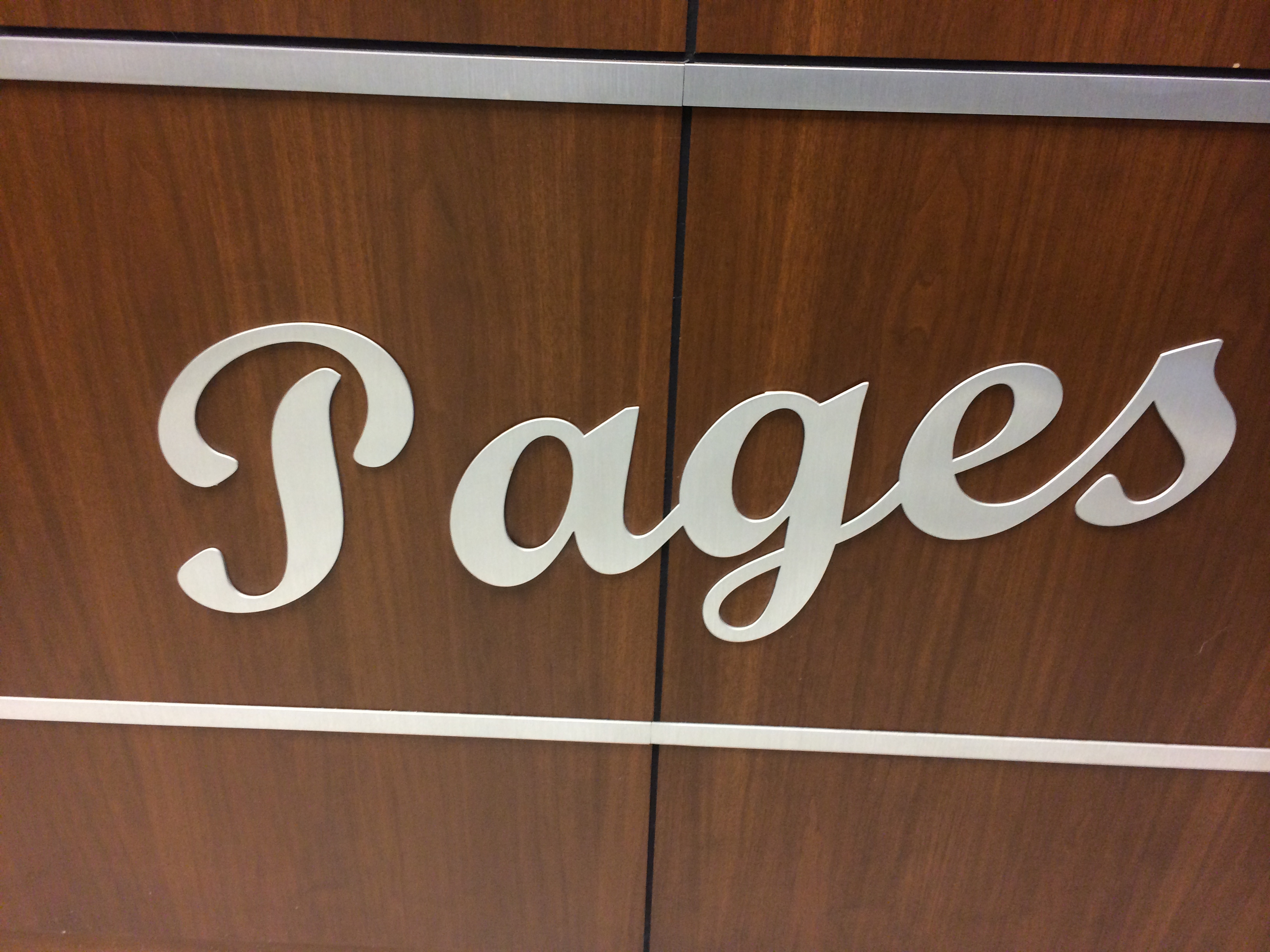
3. Script or cursive type in signage
20. Something in nature that looks like a letter
17. Use of a picture showing a leading line
9. Complementary colors
1. Old style serif type in signage
iPad design
Through working on this project I guess I just came to understand that space on an iPad (or any digital surface) is infinite. It’s not like a newspaper where space is the be-all-end-all dictator of content. You can make things as big as you need or even just as big as you want them to be. So when I was designing my pages I tried to keep that in mind and just make everything big and spread out. Places where I would’ve mushed things closer to save space on previous projects, I left spread out on this one. This is also the first project where I’ve dramatically increased the leading for body text. I thought the most important part of this was to have the pages look inviting and not at all overwhelming, I think I was able to do this by taking advantage of the endless amount of room that iPads offer.
Headline and Deck
Are We All On Crack? How Rob Ford Keeps His Job
A morbid fascination with the urban drug somehow casts the transgressive Toronto mayor as a cultural adventurer.
This is an article that ran in Newsweek. While a lot of the attention grabbing-ness of this story does have to do with the content of the article, the headline was written in a way that grabs a reader. “Are we all on crack?” is not something that you would expect to read when flipping through the pages of Newsweek. By also referring to the drug as “crack” it sounds more casual and friendly. When reading this a person doesn’t think that they are going to be reading a very formal, scientific sounding article. They will be reading something casual, funny and engaging.
Magazine spread

I chose to include a double page ad as well as a magazine spread. As an advertiser, its really hard to cut through the clutter. Its especially hard to make your magazine ad stand out from all the other ads in a magazine. A good way to do this is to really take advantage of the medium you’re using. In this Apple ad, they created a completely new ad from any ad they had existing in order to fully take advantage of the fold of the magazine as well as the double sidedness.
I also picked a regular magazine spread as well. Spreads that stand out to me are ones that have content streaming across the two pages. I feel like a lot of times, despite the two facing pages, content is kept pretty segregated to the left and the right side. Here, content crosses over from left to right and is also filled with a full picture. Magazines are a really good medium for pictures so I really like when magazines feature very big, high quality pictures.
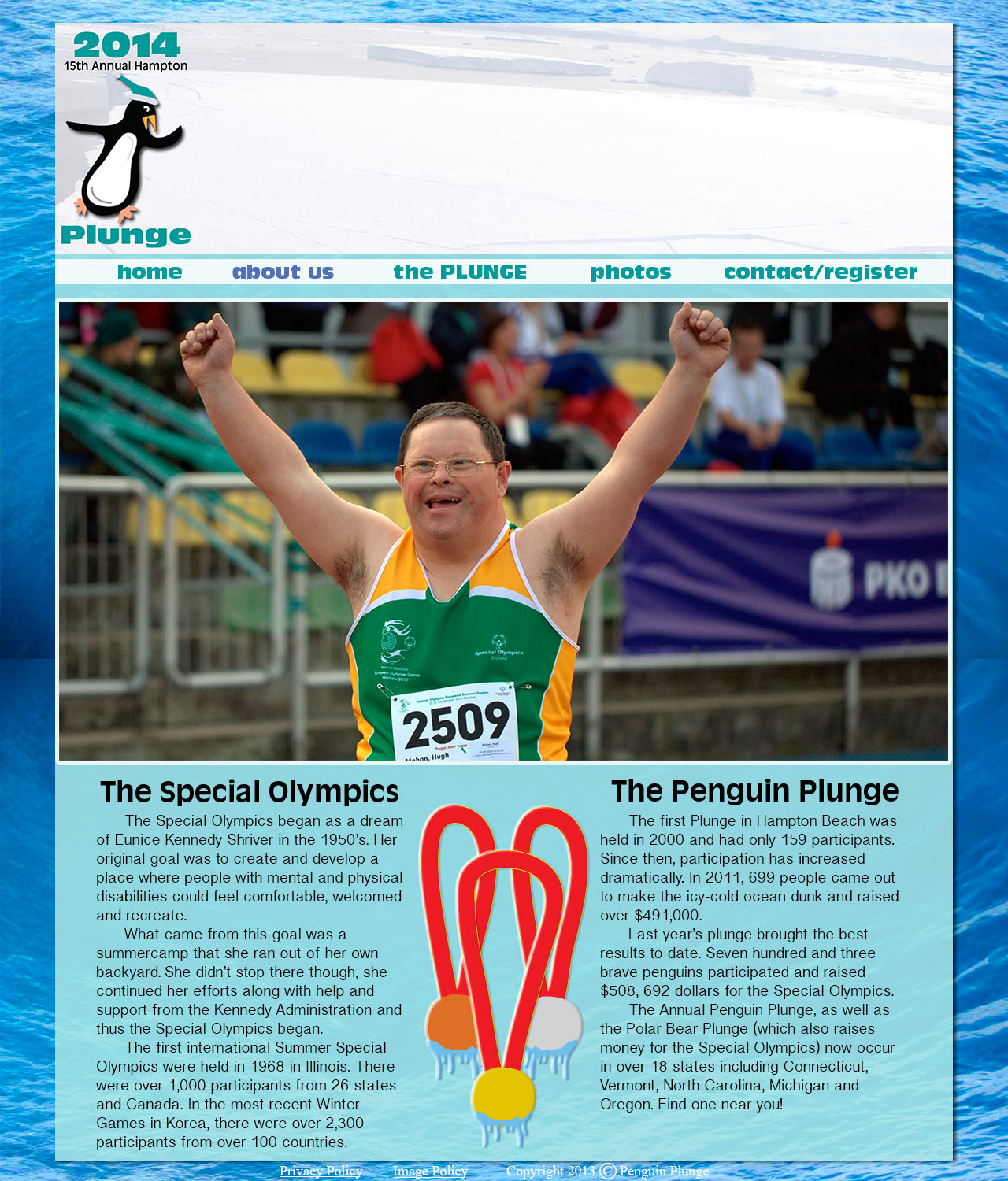
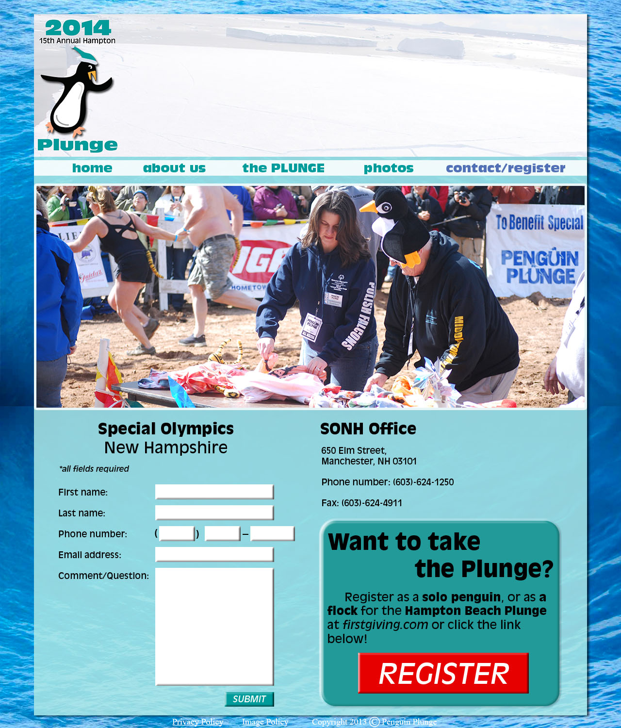
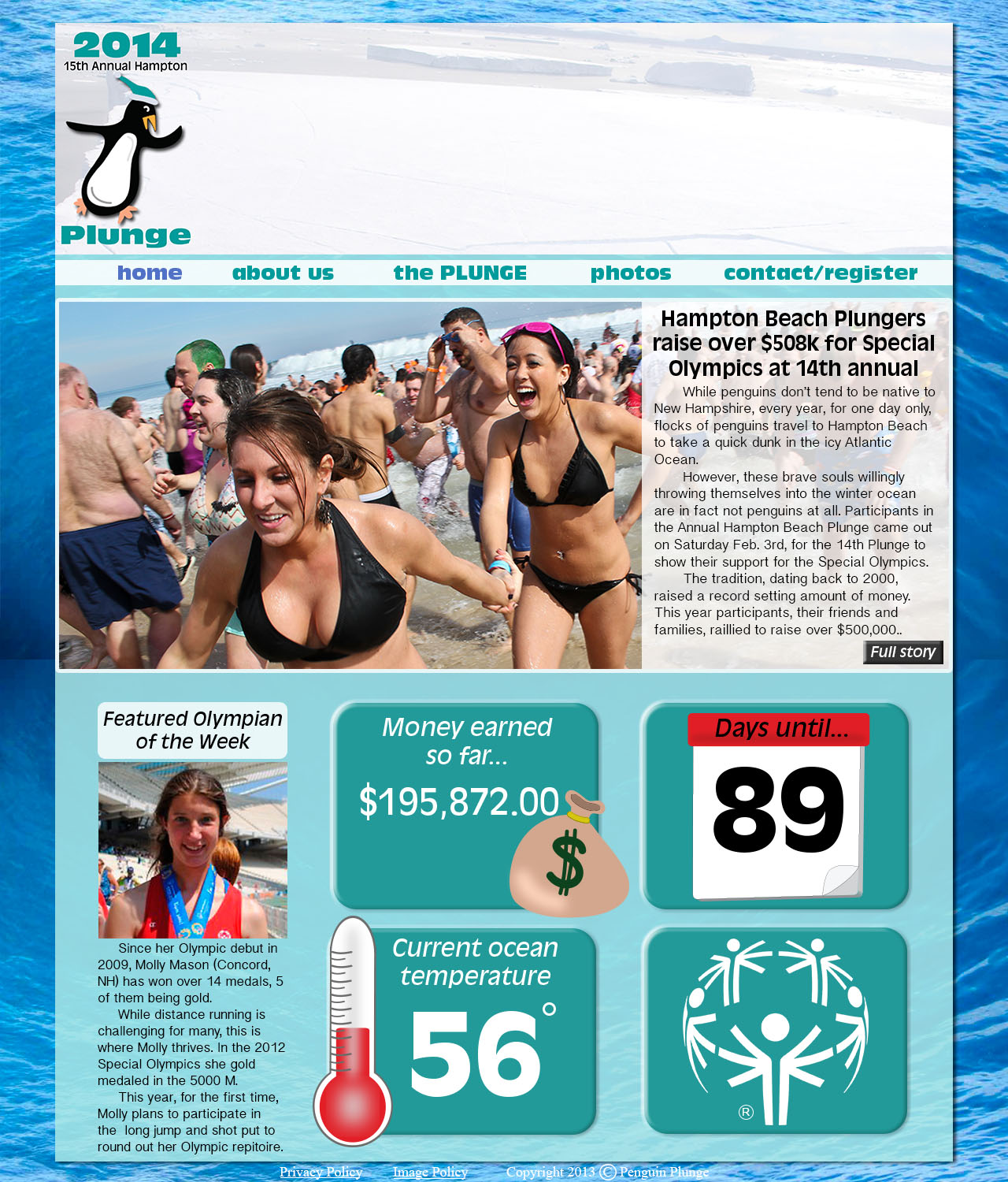
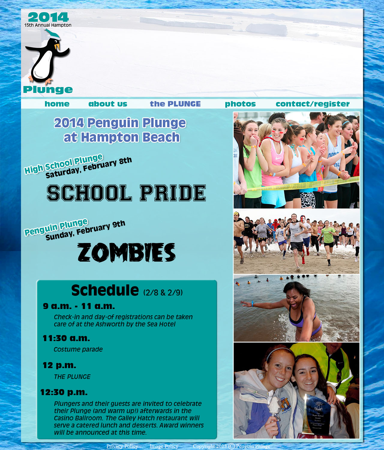
Penguin Plunge

Resume 1B
Website Photography
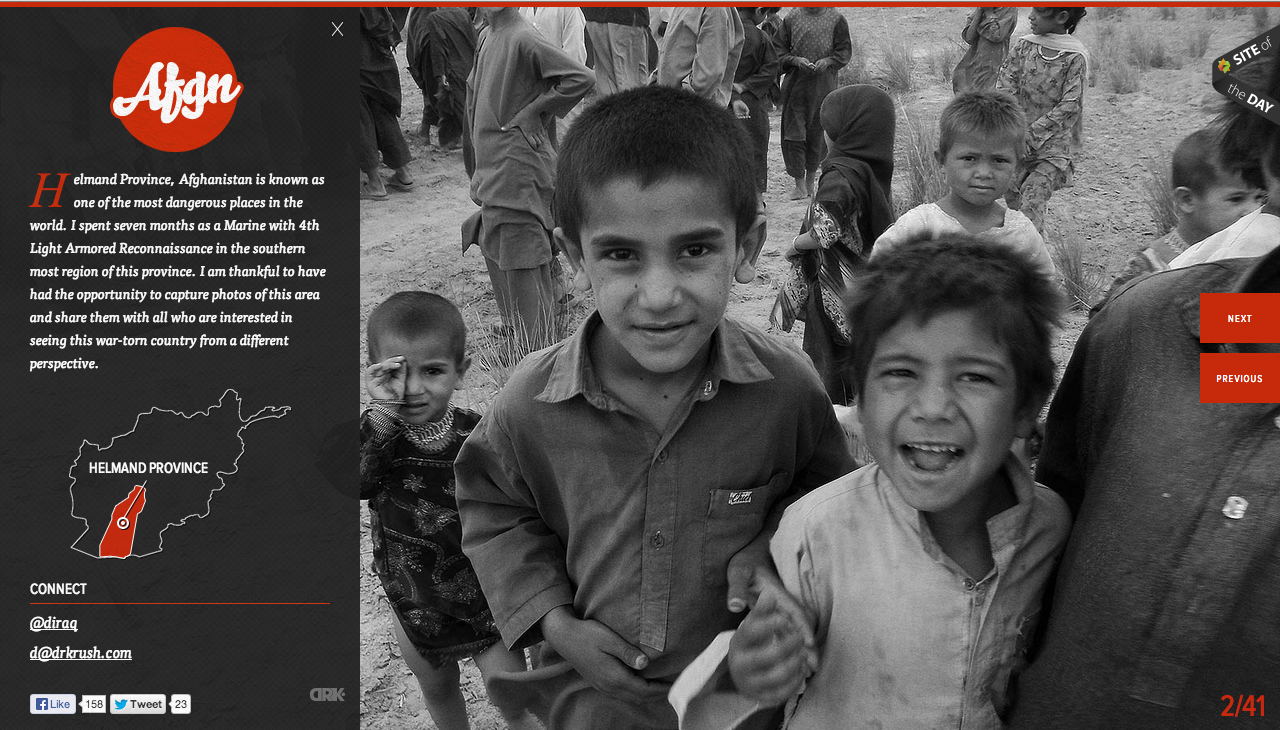
This website is designed to teach people the dangers of living in the featured province in Afghanistan. The website features only black and white pictures that are the full size of the page. I think this is powerful because the image dominates the page and there is no captions/thumbnails/frames/other text to detract from them. The black and white also limits the amount of things the eye needs to look at. A person’s eye isn’t darting around the pictures looking at all the different colors, instead they can settle in and focus on the closeups of the children’s faces. Also, this website uses just pictures to teach people and convey a message. Aside from the one paragraph of text that is set over the image on the left, there is nothing else besides this.
National Geographic Website
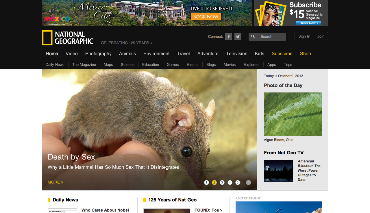
Figure and ground: Nationally Geographic is typically known for its black and yellow colors. However, on the website, black is only present in the navigation bar. The background for the rest of the website it white and the yellow accents don’t stand out very well against it.
Proximity and alignment: The font is a very simple sans serif that looks a lot like Arial. While it is used consistently throughout the website, I don’t think it really engages the viewer. I’d expect a website like National Geographic that is known for its stunning visuals, to choose a more interesting font.
Visual hierarchy: Titles and headlines are bigger than the sub-heads/captions for the things which they are explaining. These main headlines are also highlighted with yellow which does show importance in this case because the other information features no color at all. And for almost every piece of information there is a picture to accompany it. The picture is generally very big and is proportional to the size of the headline. The picture helps to draw readers attention and then their eye will follow below and read the information that goes with the picture.