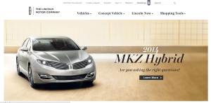
As a brand, Lincoln is known for class, prestige, and luxury. Their website perfectly reflects this image through various techniques. In terms of figure and ground, the picture is set against a white background, and the color scheme of the picture allows the juxtaposition of the picture on the background to be less harsh. Furthermore, the black headers are clearly visible.
In terms of proximity and alignment, the Lincoln all-caps font and logo are present for a wordmark effect, and the font used on the site maintains the image of elegance. The new car within the picture is clearly the newest, best design, and the italicized and bold font help show that it exemplifies the brand while still displaying an aggressive feeling as it bursts into the car market.
In terms of continuation, the website flows very smoothly. This is due to the color scheme, the way the fonts work together, and how those two things are complemented by the picture that was chosen for the new car model.
For visual heirarchy, navigation links are present all along the top of the page. Following the “Z” formation, the reader’s eye hits the left-aligned text within the picture at the middle of the page. Although it was cut out in the screenshot for the post, the bottom of the page has further navigational links that deal with incentive plans, contacting employees, and personalized shopping.


