
Author Archives: Austin Galovski
Website Photography
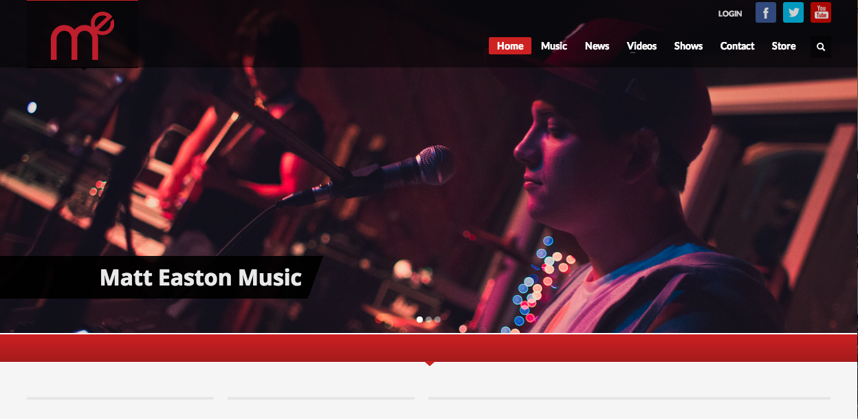
I love all types of music, and I’ve been playing guitar for the past seven years. As a result, I’ve seen tons of artists’ web pages, and all of them take slightly different approaches. Matt Easton is a relatively new rap/alternative artist, and his website is one of my favorites. Besides the great image, his graphic in the upper lefthand corner is great. It’s a stylized initial mark, which punnily spells “me.” Furthermore, the color scheme of the graphic, the website, and the photo all work very well together. The image is focused just on Easton’s form and the microphone, channeling attention on him. However, the viewer can make out the band and sound equipment in the fuzzy background. The effect gives the picture great depth, and also shows that even though Easton is the subject, he’s not the only thing going on. The navigation links are all very simplistic, allowing the viewer to focus on the graphic. I also love that the navigation bar on the top is not a solid color, allowing the graphic to show through.
Lincoln Website
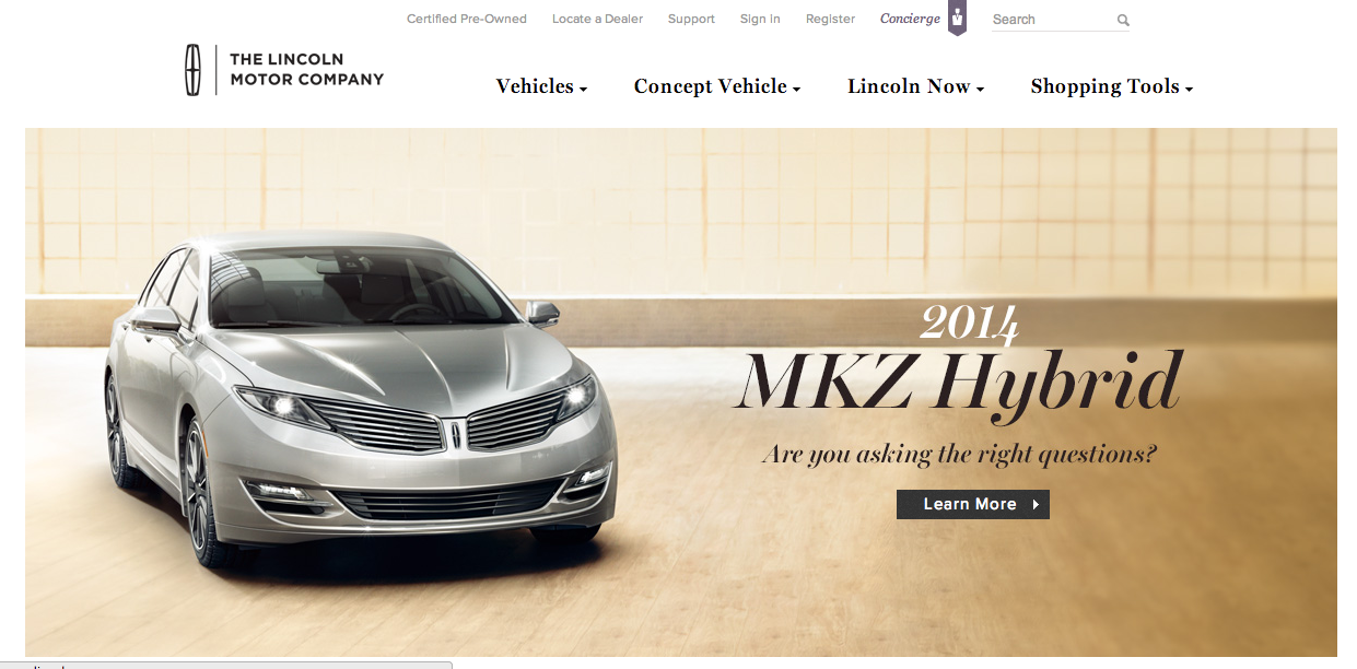
As a brand, Lincoln is known for class, prestige, and luxury. Their website perfectly reflects this image through various techniques. In terms of figure and ground, the picture is set against a white background, and the color scheme of the picture allows the juxtaposition of the picture on the background to be less harsh. Furthermore, the black headers are clearly visible.
In terms of proximity and alignment, the Lincoln all-caps font and logo are present for a wordmark effect, and the font used on the site maintains the image of elegance. The new car within the picture is clearly the newest, best design, and the italicized and bold font help show that it exemplifies the brand while still displaying an aggressive feeling as it bursts into the car market.
In terms of continuation, the website flows very smoothly. This is due to the color scheme, the way the fonts work together, and how those two things are complemented by the picture that was chosen for the new car model.
For visual heirarchy, navigation links are present all along the top of the page. Following the “Z” formation, the reader’s eye hits the left-aligned text within the picture at the middle of the page. Although it was cut out in the screenshot for the post, the bottom of the page has further navigational links that deal with incentive plans, contacting employees, and personalized shopping.
Flowers
This picture could be created using only the pen tool. It would not be difficult, but it would definitely require a lot of patience. First, the actual petals would have to be drawn. Next, the dotted lines that radiate outwards would be drawn, and the setting changed from a solid line to a dotted line. The grid view would be helpful, because all of the intricate curves are proportionately spaced out. In terms of the colors, you would have to open the color palette and then use your mouse to drag the palette down and reveal the large-view spectrum. From there, it would be easy to experiment with slightly varying shades of green, blue and yellow.
Red Hot Chili Peppers
I loved this piece of typographic art because I feel that it very accurately portrays the entire attitude of the Red Hot Chili Peppers. The Chili Peppers are my favorite band, and I’ve listened to literally all of their songs over the years. The artist’s typeface is firm and confident, and the band has always been known for their incredible energy and stage presence. Additionally, the words are chaotic and mashed together, which represents the awesome, crazy attitude of all the band members. The picture is of the bass player, Flea, who is by far the wildest out of all the members. Lastly, the words spelled out are all song lyrics and names.
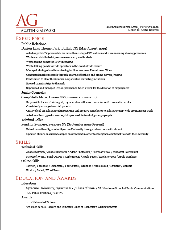
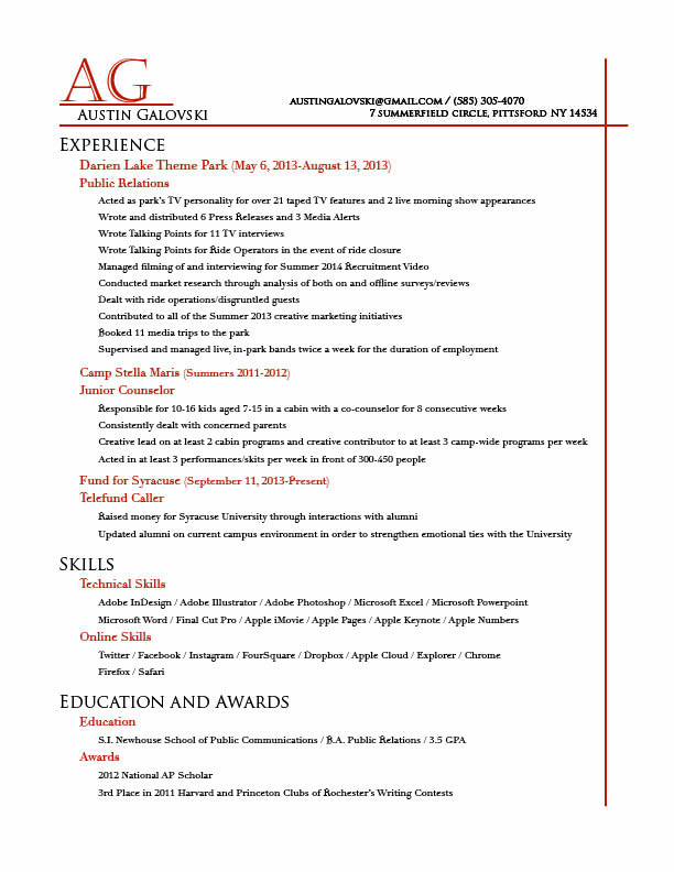
Galovski Resume
Watchmen Poster

When I thought about this assignment, the Watchmen poster immediately came to mind. It’s a perfect example of how good graphic design can have an emotional effect on the audience. For me, the best part of this poster is that it has very little copy. Besides the title, release date, and “From the visionary director of 300,” which tells us nothing about the actual movie, there are no words. However, we get a great feel for the emotional tone of the film. The sharp contrast between the bright, happy yellow of the smiley face and the deep red of the blood spatter makes us uneasy, and the extreme closeup of that smiley face creates a claustrophobic, anxious effect. All of this is largely achieved through a respect for visual heirarchy, or the “Z” formation that our eye follows. Starting in the upper left, my eye was drawn to a white clockface, and then a sudden splash of red blood. I moved from left to right, seeing the smiley face, and then diagonally leftward and down, watching the blood drip down the face and reading the blurb about the director. In the bottom left is the release date, and then, as the eye travels left to right again, all of the logos for the companies involved in the film’s production. Throughout all of this, the vertical title “Watchmen” is ever present, ensuring the audience remembers it.