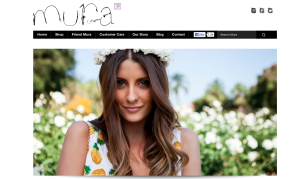
I chose the website for Mura Boutique for this weeks post. The photo here is used to show a model wearing the clothes the website is trying to sell. The photo is lovely and its goal is to make the consumer want to feel that way wearing their clothes. The target audience is girls in their mid teens to early 20’s. The designer probably chose this image because of the setting that it portrays. I think it’s awesome for the homepage of the website.


I think the photo used on this website’s homepage is used very effectively. Since the model is looking directly at the camera it appears that she is looking directly at the viewer, which automatically engages you. The photo is very bright and fun, which is a good representation of their products. I also really like how close the photo was taken and cropped because it makes the site feel more personal and friendly.
I like the image as well, but I don’t know if it’s the at the moment that you used the screen grab, but the fact that there was no call to action or words on the image is a little bothersome to me. If I didn’t know that this were a shopping website, I’d probably think this were just some random girl posing for a photo and not trying to sell me anything. I do like the image and how bright and inviting it is, though.
I love the image because it is very alluring. The model is placed using the rule of thirds which makes the image very appealing to look at. The image also gives a good sense of the company’s personality, however, I feel like the photo is too focused on the model so you do not actually get to see the product that the company is trying to sell to you. Also, I find the background of the picture distracting to some extent.