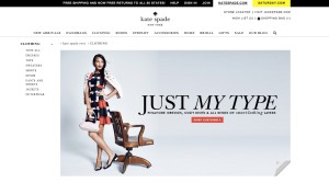
I like this photo in Kate Spade website. The background of this website is very clean. I think the color of the photo matches the whole website.
This photo is shown in the clothing section. The photo is very simple, but the clothes which the model wears is really standout because the model wears a very colorful clothes. The model’s arm and the chair all pointing to “Just My Type”. This is a very good way to lead our visual. The words “shop clothing” using red background really come into viewer’s eyes. In addition, because the whole page is very simple, when I first look at this page I will only noticed by the clothes and the call to the action. There is another thing I really like about the photo is that the right corner at the bottom. Views could click the right corner to explore about more different clothing. It just like open a new page.


I like the call to action, and I agree with you on the fact that the pop of the model’s clothes against the simple background is very effective. however, I don’t understand what “Just My Type” is there for. It understand it’s a phrase, but I don’t feel as if it’s directing me to look at anything. It’s not directing me to look at the model or anything else. To me, it just kind of seems as if it’s floating.
I am fond of Kate Spade’s clean design of website as well. The clothes have already had colorful images therefore, if the website applies the same colorful and complex design, it would be just too much. The combination of dress of color is very consistent and harmonious. The pink on the dress consistent with the color of the cashmere and the handbag. The black – shoes’ color – is consistent with the dark color on the dress and the headline. The grey as the background color suits the whole image very well.
This is a great image for the Kate Spade website. It’s asymmetrical, the model being in the left side of the photo, and the words fit into the curves of the model (the biggest words being on top, where she is the smallest). Additionally the colors in the dress are the same colors that the model is wearing, which keeps the image coherent with the rest of the webpage.